Loop Signs
I developed the complete brand identity for Loop Signs, a new startup based in Canada. The project involved building everything from the ground up, including concept development, defining the target market and audience, establishing a consistent tone of voice, and creating the logo and branding.
I also designed and developed their website, integrated an e-commerce store, and ensured a cohesive brand experience across all touchpoints.
Challenge
Target
Establish a strong brand presence for a new startup in a competitive market, ensuring the brand identity resonates with the target audience and differentiates Loop Signs from competitors.
Outcome
Successfully created a comprehensive brand strategy and digital ecosystem that not only met but exceeded the client’s expectations, leading to a cohesive and recognizable brand identity across all platforms.
Highlights
1
Led the development of Loop Signs’ brand identity from concept to completion.
2
Built the website using WordPress and the e-commerce store with Shopify.
3
Integrated AI tools like Zapier, GPT, and MidJourney to automate processes and create assets.
4
Set up omnichannel marketing tools, including Klaviyo, Gorgias, and Pipedrive CRM.
5
Ensured seamless integration of all tools to support business operations (point-of-sale, lead generation, customer support).
6
Focused on creating a cohesive and efficient digital presence across all platforms.
Visual Identity
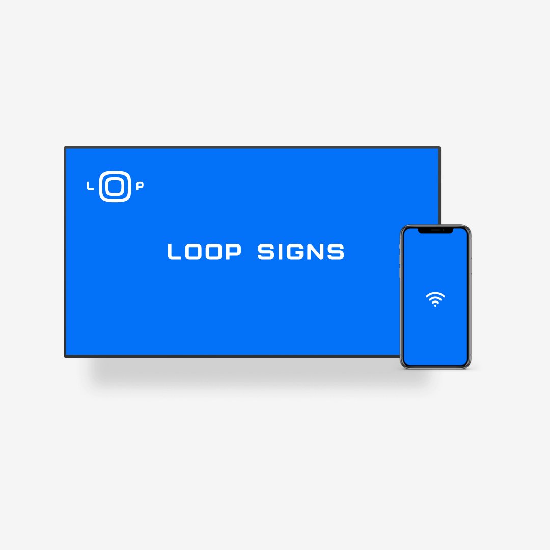
The visual identity for Loop Signs is designed to be bright, professional, and reflective of the brand’s technological focus. The logo features a unique robot logomark, where the ‘OO’ represents digital screens, and the ‘L’ and ‘P’ form the robot’s hands, with the ‘P’ as a waving hand. The primary color, a midtone blue named ‘Billboard Blue,’ was developed exclusively for the brand through multiple rounds of iteration to ensure it perfectly captures the essence of Loop Signs.


Design System
Loop Signs’ design system has been crafted to align with the energetic and modern look of the new logo. This comprehensive system includes an updated color palette, distinctive photography styles, and new formats tailored for social media and digital advertising. The design system is built to reflect the brand’s customer-centric approach and is being rolled out across all physical and digital properties, including the website, e-commerce store, and product offerings.


Digital Properties
To further enhance the new brand presence, the visual system has also been extended to digital properties and external partners. As a company dealing in audiovisual equipment and services, it was crucial for the brand to be consistently represented on third-party platforms, including screensavers on digital streaming services.


Website
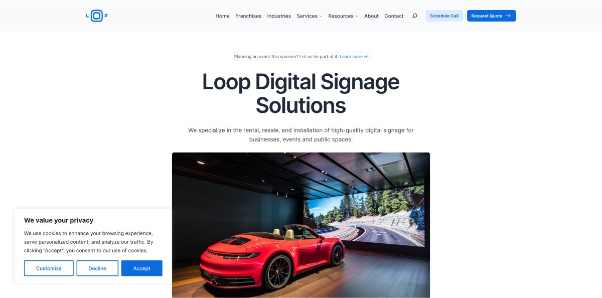
The website was developed to amplify and further convey Loop Signs’ brand messaging and voice. It offers a cohesive experience across all pages and screens, ensuring a seamless and consistent reflection of the brand’s identity.


Final Thoughts
I thoroughly enjoyed working on this project, as it truly pushed the limit of my development. From conceptualizing what the brand would look like, conducting market and competitor research, designing the logo and visual identity, to developing the website and e-commerce store, every aspect was carefully thought about.
Ensuring cohesiveness across all touchpoints, including often-overlooked details like email signatures, invoices, and business cards, was both challenging and rewarding. This project pushed the limits of my abilities, introduced me to new tools, and ultimately led to a successful outcome. I’m proud of what was achieved and the strong brand presence established for Loop Signs.
