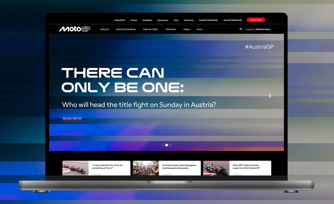
MotoGP has introduced an all-new brand identity, in collaboration with visionary design studio Pentagram. Unveiled by MotoGP Promoter and Rights Holder Dorna, the new design refresh was revealed at Museu Nacional d’Art de Catalunya (National Art Museum of Catalonia) in Barcelona during the first-edition MotoGP Awards ceremony where Jorge Martin was crowned 2024 MotoGP World Champion.
For the first time since its debut in 1997, MotoGP has revamped its logo and identity. The 2025 design takes a minimalist approach, trading the previous complex forms for a simple, bold wordmark that feels more versatile and future-ready. It’s part of a wider visual identity refresh that includes updated visuals, motion, type, and a verbal identity designed to work multi-platform — from digital assets to live events and apparel.
The rebrand comes at a time when Formula 1 owner, Liberty Media closing in on its acquisition of Dorna, with the entertainment conglomerate expecting to receive all regulatory approvals by the end of 2024.
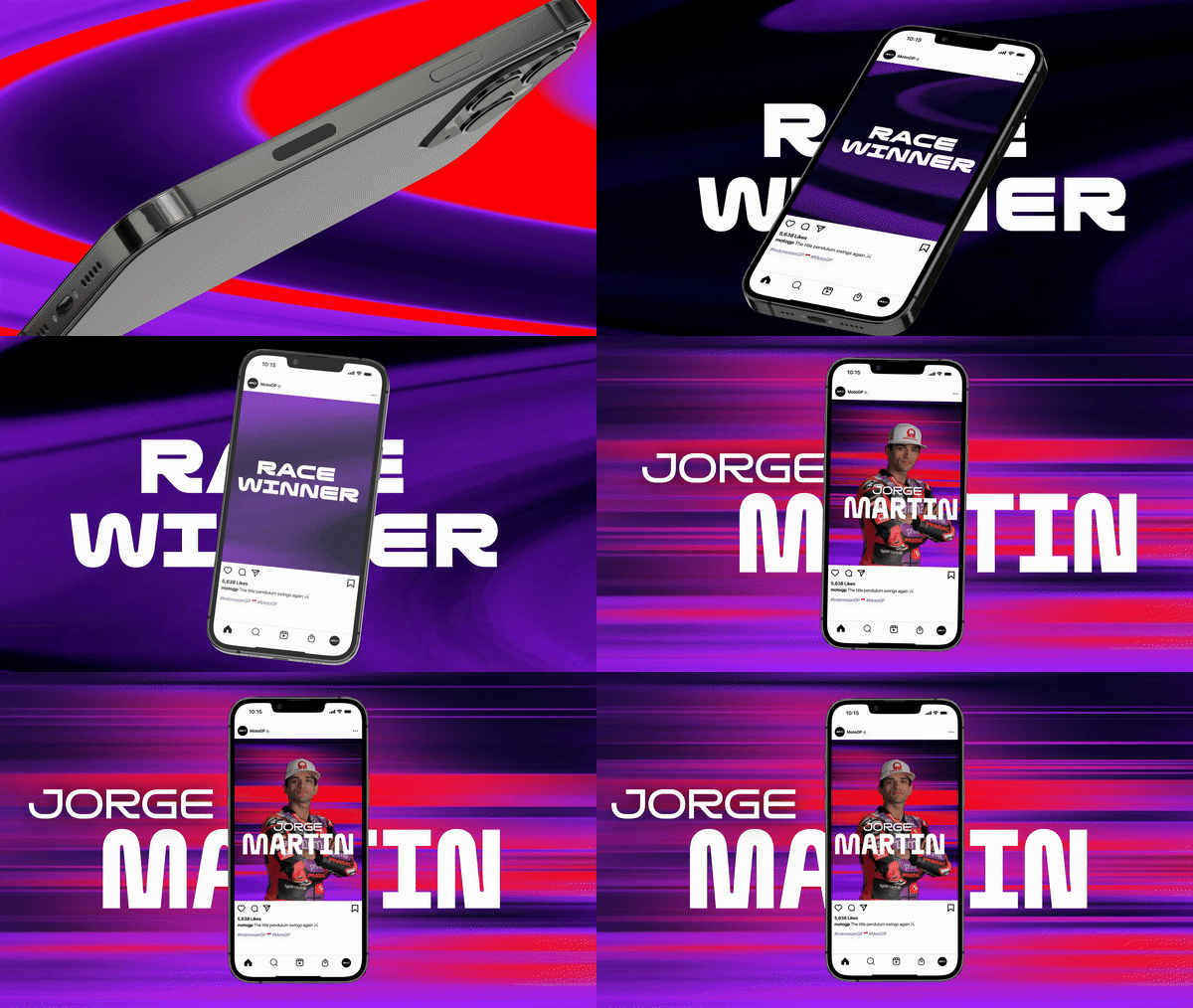
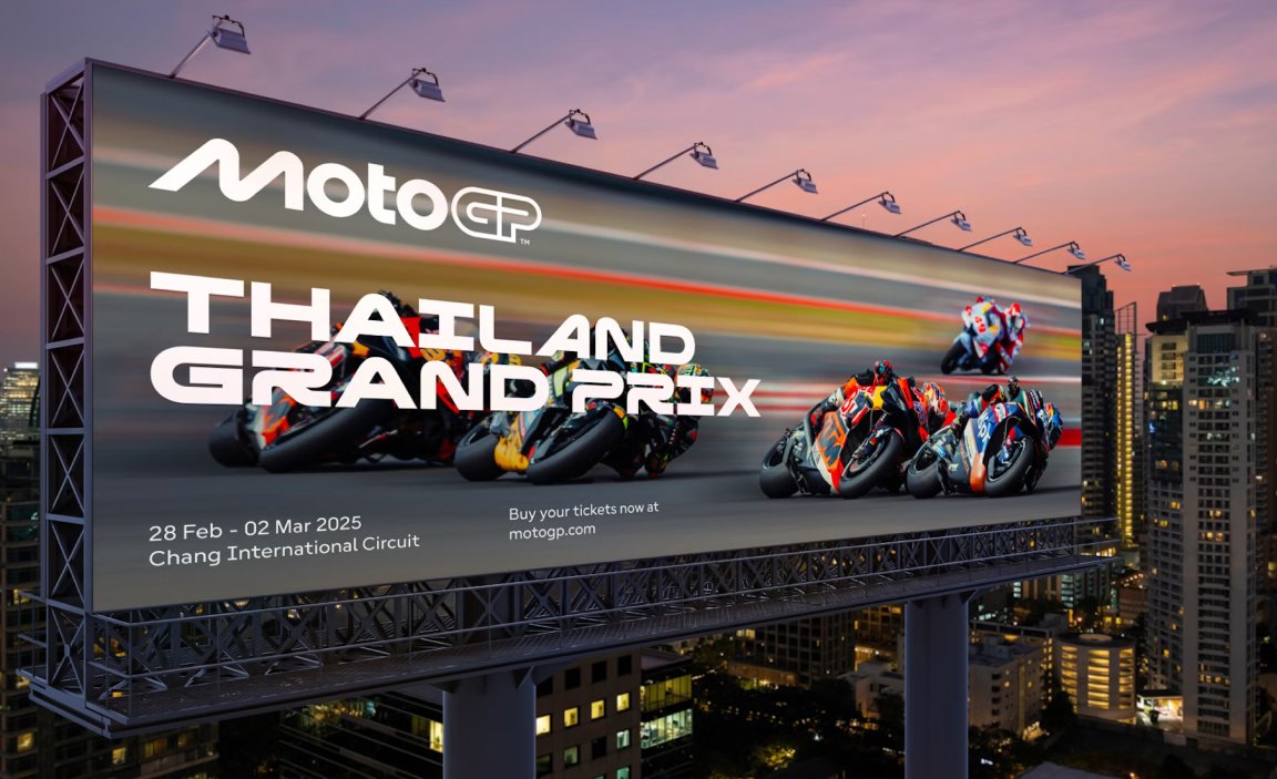
Visual Identity
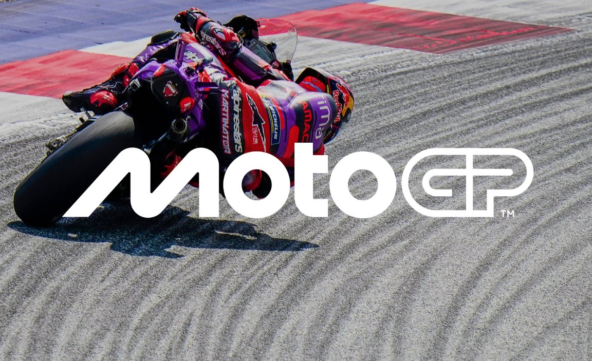
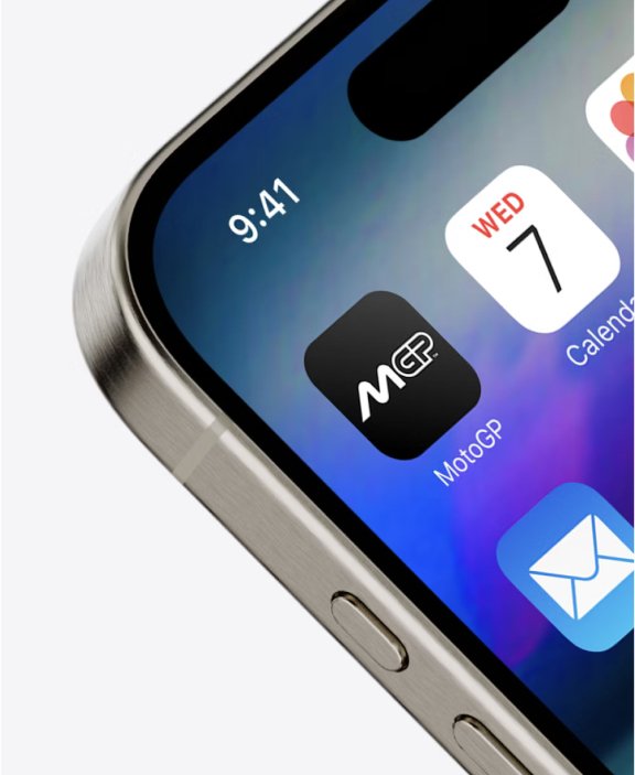
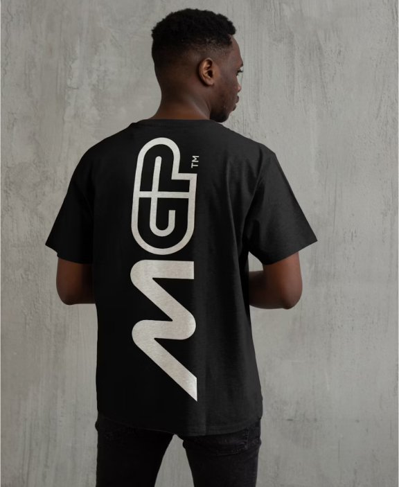
Pentagram’s challenge was to present MotoGP as “the most exciting sport on earth” , to transform the world’s greatest motorcycle event into a digital-first global entertainment brand. At the heart of the new MotoGP logo is its simplicity and adaptability. The “M” icon functions as a standalone mark, while the streamlined wordmark provides consistency and clarity. Together, they create a design that’s easy to recognize across the board, from out-of-home (OOH) to merchandise.
Pentagram explained that the new logo is directly inspired by the sport itself, taking its rounded form from the lean of the riders as they go around corners at incredible speeds, something which is unique to riders and becomes more apparent due to the track-based nature of motorsport. This lean is reflected in the letter “M”; the “O”s suggest the wheels’ geometry, with the “T” representing the rider between them. The “GP” evokes the track and helps the logo retain a strong, sporty aesthetic.
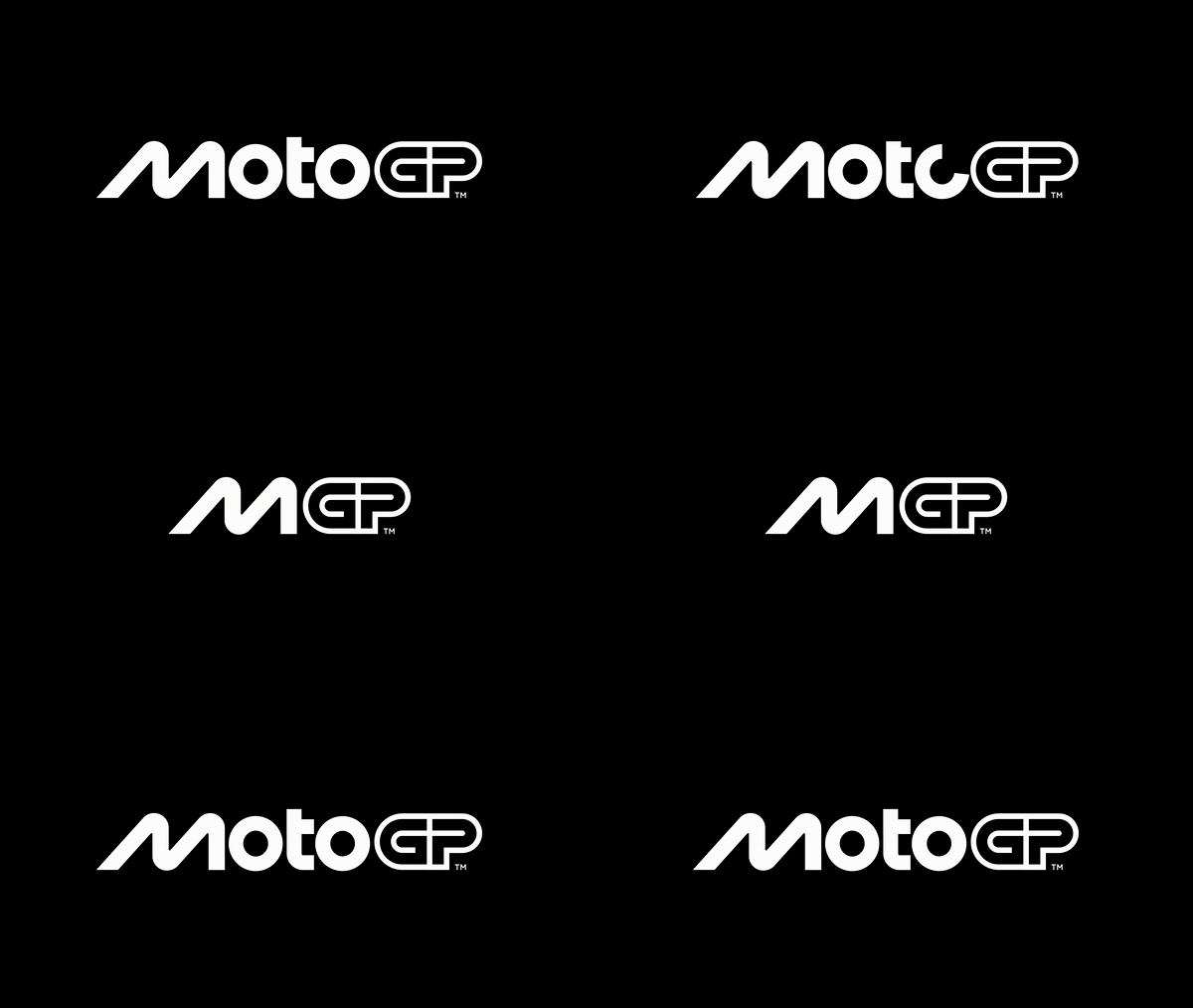
The updated M logo is reflective of our social-media first era. The brand has acknowledged how media consumption has evolved, requiring designs to work multi-format and multi-platform. MotoGP’s logo now feels aligned with modern motorsport while retaining a connection to its storied legacy.
“We’re very excited to reveal our new identity and invite fans around the world to meet the new MotoGP,” said Carmelo Ezpeleta, CEO of Dorna. “Working with Pentagram has been an incredible adventure leading to what we hope our fans will agree is an incredible result. A brand is more than a logo, and MotoGP is more than a sport. The process has taught us a lot about both and we’re very proud to show the world the results. The key question throughout has been; What is MotoGP?, both now and looking forward to who we want to be, and we hope this new identity communicates every aspect of that, from the speed to the passion and everything in between. For us, it’s incredible how different this logo and brand is to our previous, and yet it feels like the perfect fit — and has done from the beginning. This is MotoGP.”
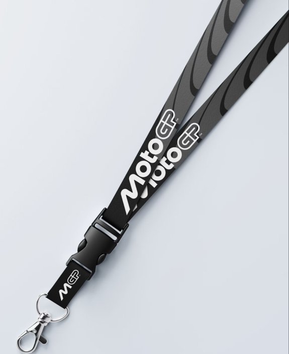
The existing MotoGP brand, which evolved over many years, no longer reflected the core of the sport today. While the original 2002 and 2007 logos retained brand equity and are iconic outside of MotoGP’s core audience, it lacked visual clarity, especially in digital environments. The revamped 2025 system goes beyond the logo. It’s an entire ecosystem of elements that ensure MotoGP looks and feels cohesive across all online and offline touchpoints. Every touchpoint — be it race-day merchandise, website banners, or mobile apps, now shares a unified visual language.

Design System
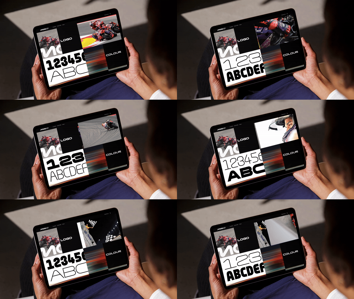
Pentagram developed a highly flexible design system that captures the energy and dynamism of the sport while accommodating its many teams and global locations. The Pentagram team crafted a new MotoGP brand strategy, architecture, verbal identity, messaging, fan manifesto, new logo, consolidated sub-brand system, along with a color system, motion design guidelines, patterns, and iconography (Wow that was a mouthful).
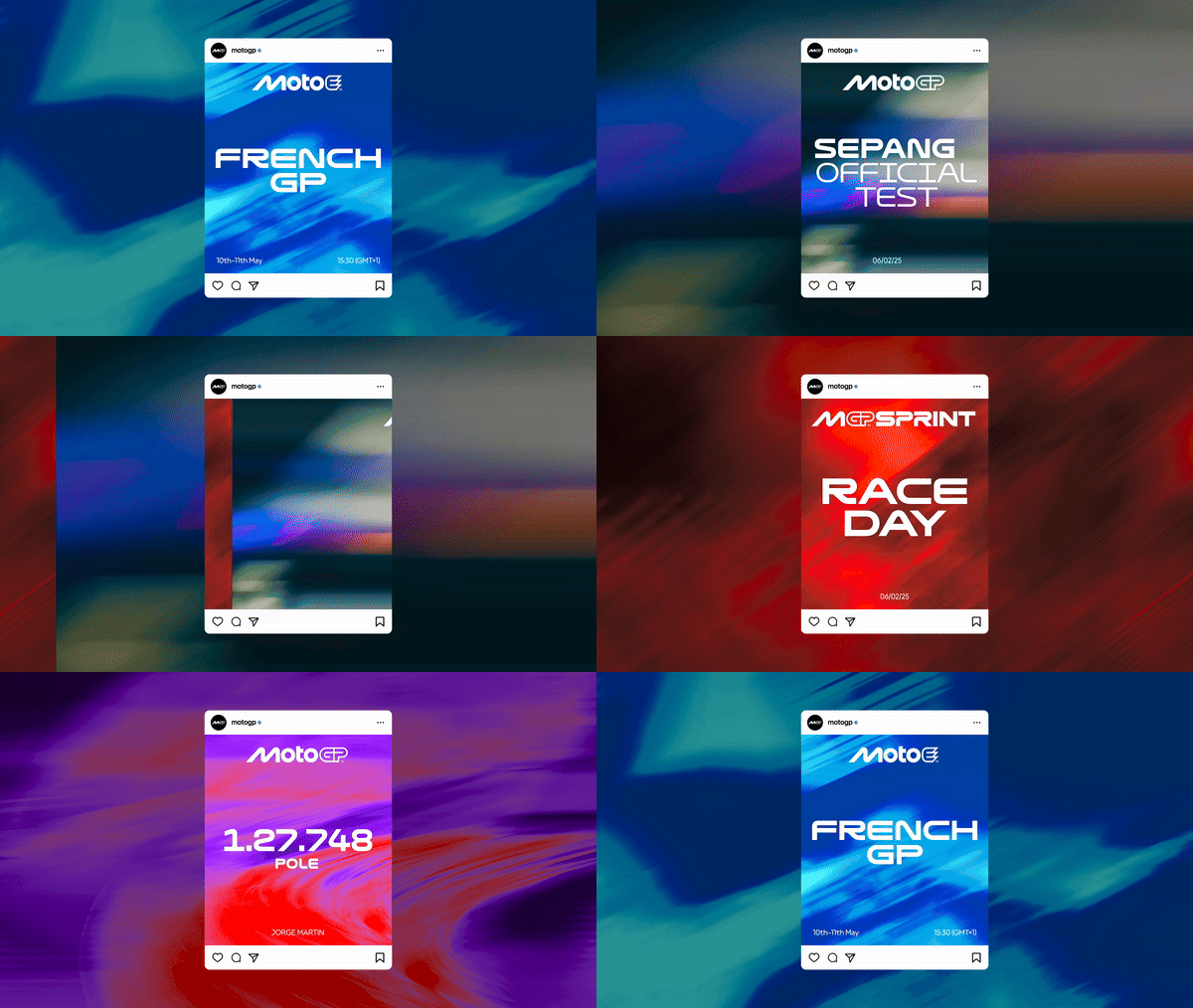
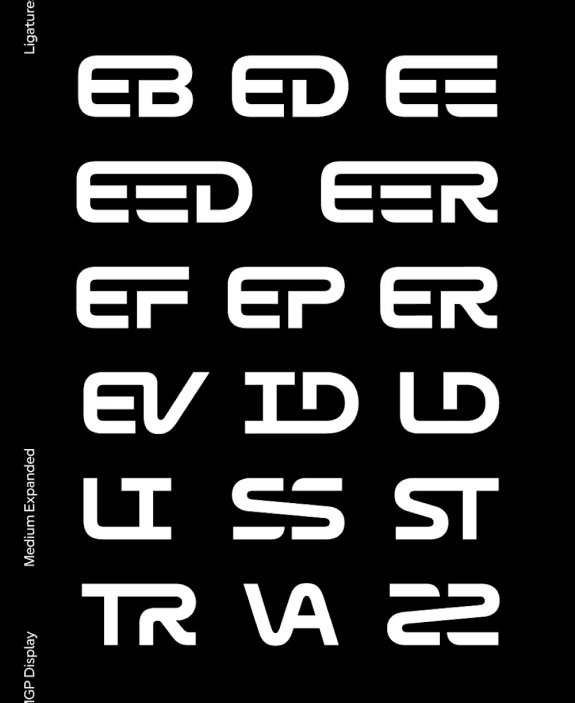
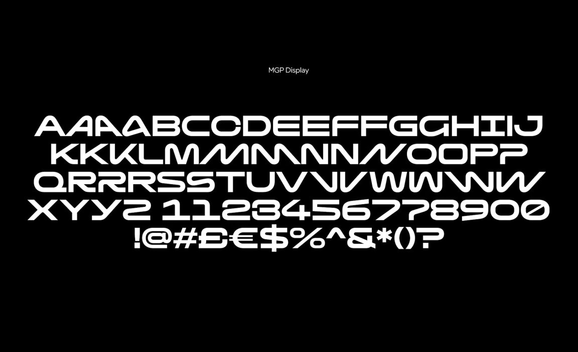
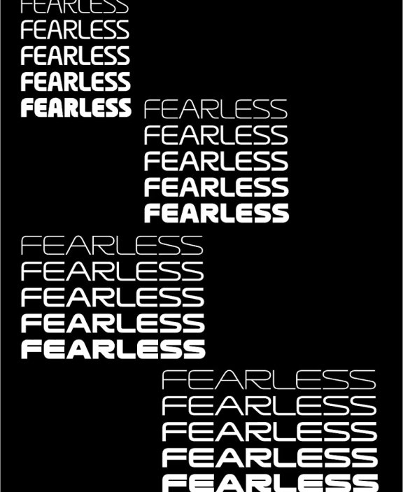
The rebrand standardizes a minimalist black and white as the primary color palette. A secondary palette of high energy visuals adds mood and flexibility to the visual system, allowing the brand to balance its high-energy environment with a more minimalist brand appeal. A custom typeface, MGP Display, was developed in collaboration with F37® Foundry, the new custom MGP typeface features a set of alternate characters that inject energy and movement. The variable typeface provides maximum flexibility, working particularly well in motion as a dynamic brand element.
“Working on the new MotoGP identity has been an incredible honour.” said Pentagram Partner, Angus Hyland. “It was great to collaborate with the MotoGP team to reimagine this iconic brand, and impossible not to get caught up in the excitement of the competition and the people who shape it. We hope fans around the world will embrace the new look and feel as MotoGP races into its next chapter.”
The current MotoGP fan base is extremely loyal to the brand, but to better engage these fans, MotoGP needed a better understanding of each facet of its audience and more effective ways to engage them, as well as strategies to reach new fans across different geographies and cultures. It also needed to tell a single, cohesive brand story that truly fits “the most exciting sport on earth”.
The core idea revolved around keeping the master-brand neutral, so it sits outside the myriad of different team, sponsor and track colors. This allows the main MotoGP brand to work well with any color combination, giving flexibility and longevity for future seasons. Different sections of the color wheel were assigned to the different business areas and sub-brands (including Moto2, Moto3, MotoE, and eSport).
During events, the bikes blur into a mix of color and sound as they speed past. This motion, along with the shifting directions and seemingly impossible angles of riders as they take corners, is mirrored in the animated brand elements, creating a series of energetic, and vibrant brand moments.
The new palette aims to strengthen MotoGP’s connection with its audience and partners and engage a new tech-savvy generation of fans.
