Founded in 2000, Tripadvisor was born from a simple idea that the best travel advice doesn’t come from guidebooks or glossy brochures, but from people who’ve actually been there. For over two decades, travelers have used TripAdvisor to share their honest opinions, posting over 830M contributions and helping more than 460M people each month navigate the world. This momentum has helped Tripadvisor become a trusted travel companion.
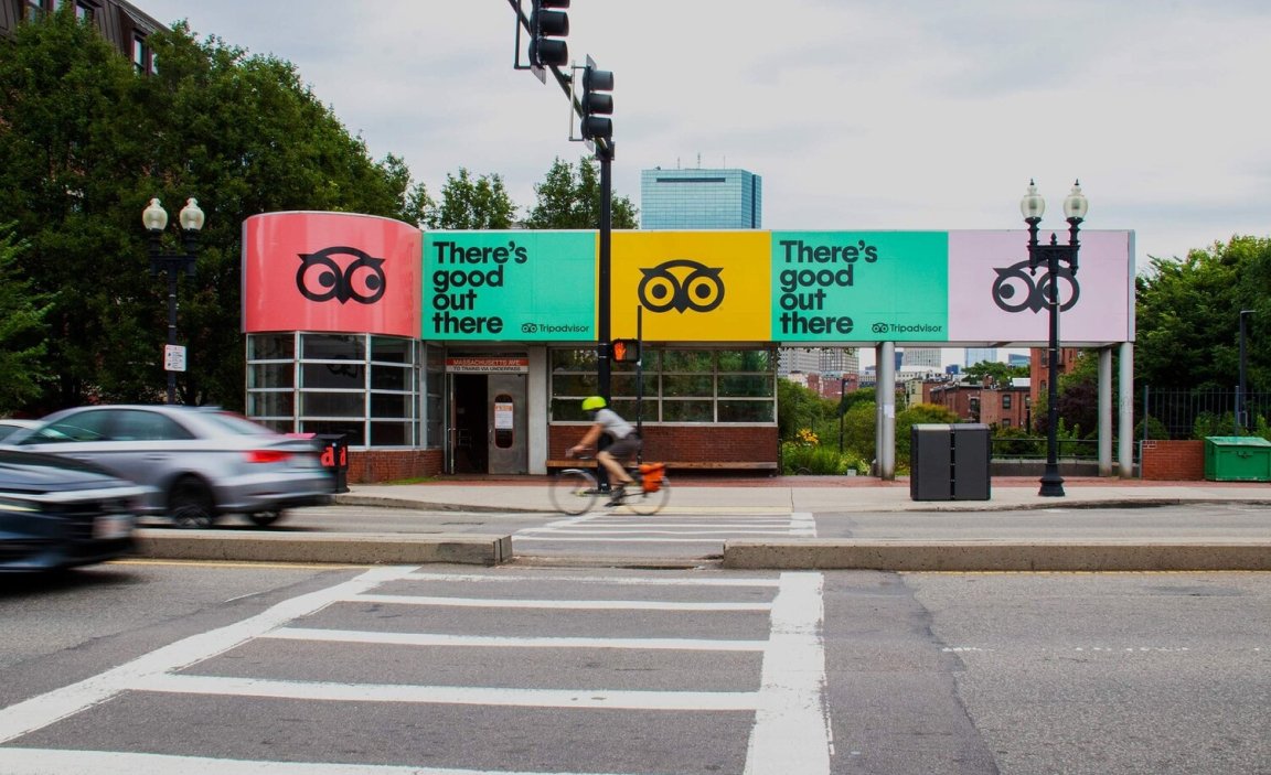
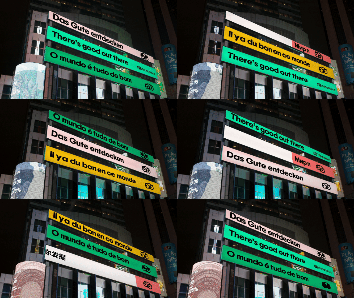
But as travel evolved, so did the expectations around it. Tripadvisor realized they were still operating under an identity shaped by a very different internet, one where ratings and reviews stood alone. So they partnered with independent brand and design company Mother Design to modernize their brand, sharpen their positioning and ultimately reconnect with the human heart of travel. The result is a rebrand that doesn’t run from their past but reclaims it. Affirming the core belief that There’s Good Out There.
Design Strategy
The goal of the rebrand was to reshape TripAdvisor from a static database of reviews to a dynamic source of People-Powered Planning. Tripadvisor no longer wants to be known just as the place where you check if a restaurant has good pasta. They want to be the place you trust to shape your entire trip. That meant consolidating a patchwork of tools, services and interfaces into a clearer, unified brand experience, something that feels less like a search engine and more like a travel guide you’d actually want to talk to.
Mother’s job wasn’t to change who Tripadvisor is, but to help them show it more clearly. They helped the brand articulate a consistent voice, one that could hold together across their app, website, awards programs and community initiatives. A deeper commitment to serving travelers with better clarity.

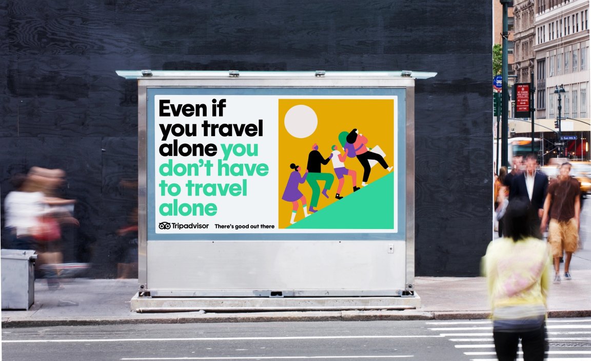
Reimagining the Owl
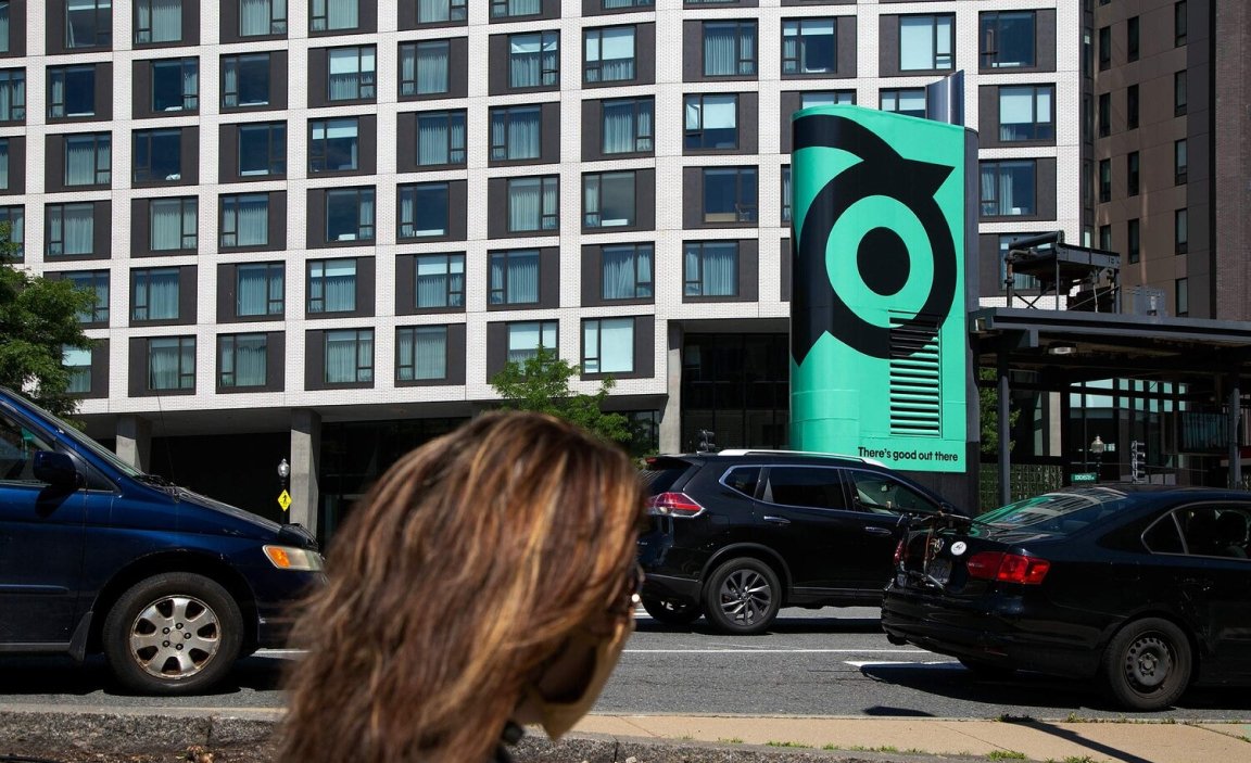
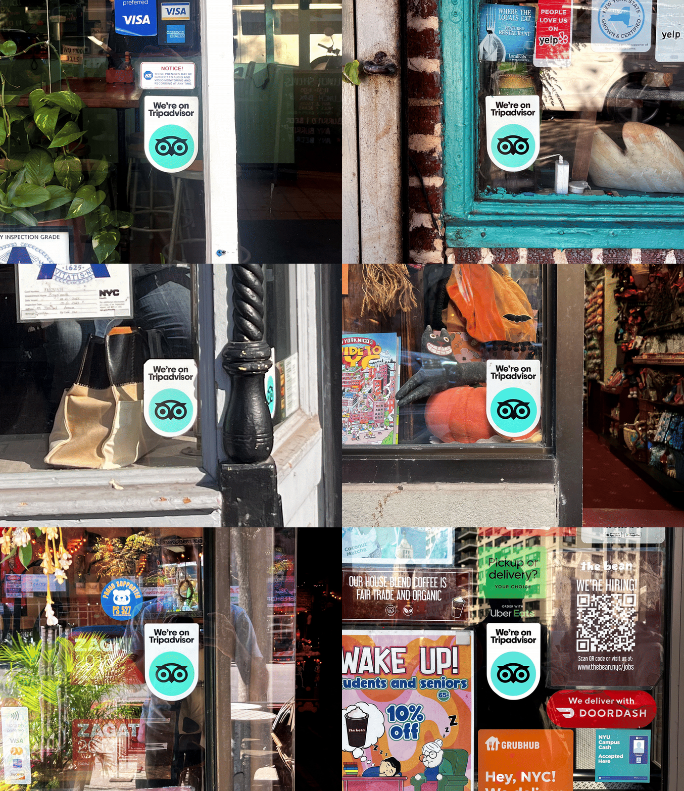
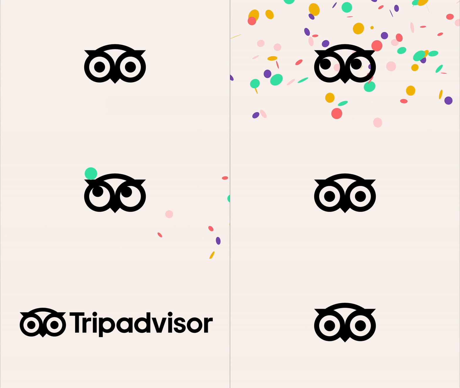
At the center of the refresh is the TripAdvisor Owl. A familiar face, now made sharper. Instead of replacing the beloved logo, Mother refined it to reduce visual clutter while keeping its charm intact. The geometry was simplified for legibility, especially at small sizes and the result is an icon that travels well, literally. Whether you see it stamped on a business window or in a mobile app, it still says “Tripadvisor”just more clearly.


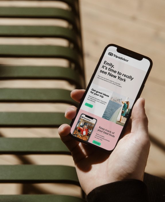
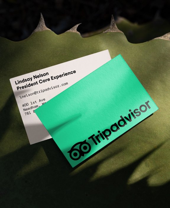
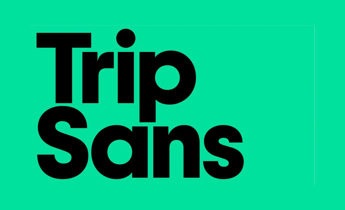
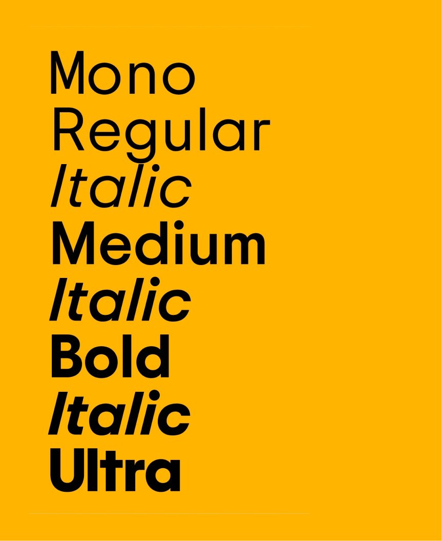
The wordmark now sits in Trip Sans, a custom typeface developed with Colophon Foundry. Inspired by early geometric sans-serifs, Trip Sans mirrors the logo’s round forms. It feels confident but not cold, sophisticated but not sterile. It’s the kind of type that works equally well when welcoming someone to a boutique hotel or guiding them through a bustling city map.
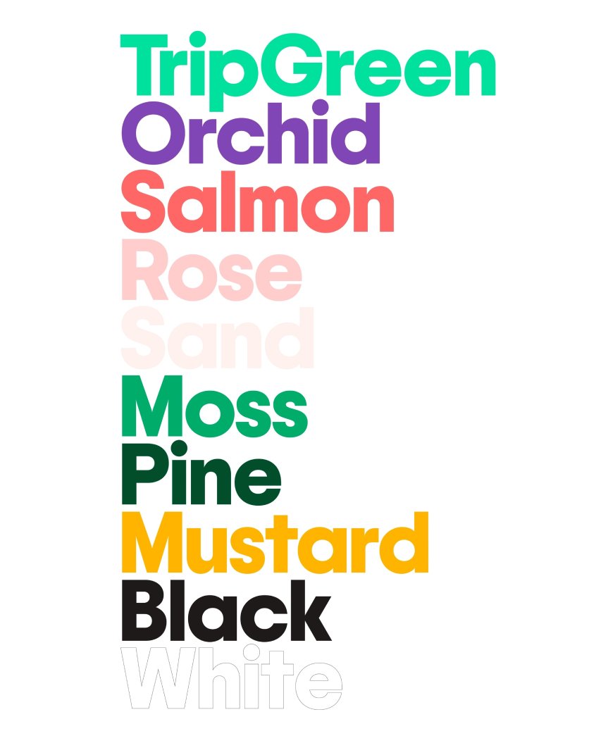
Trip Green, their signature color, was reworked and brightened for digital use. It’s fresh, clear, and easy on the eyes. Supporting colors add depth without distraction. The new iconography system is built with the same radial logic as the typeface to balance functionality with warmth.
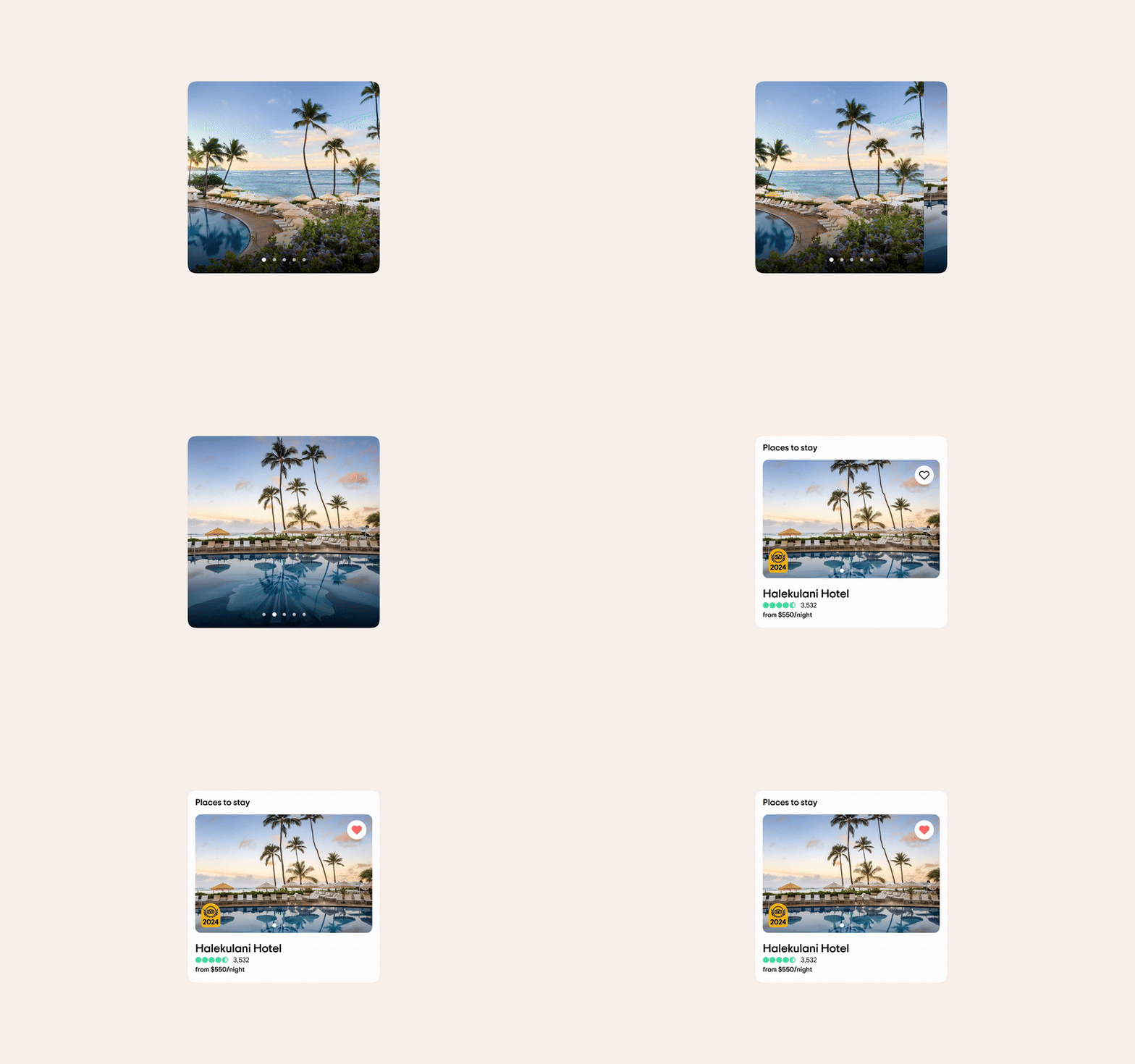


Designing for a circular world
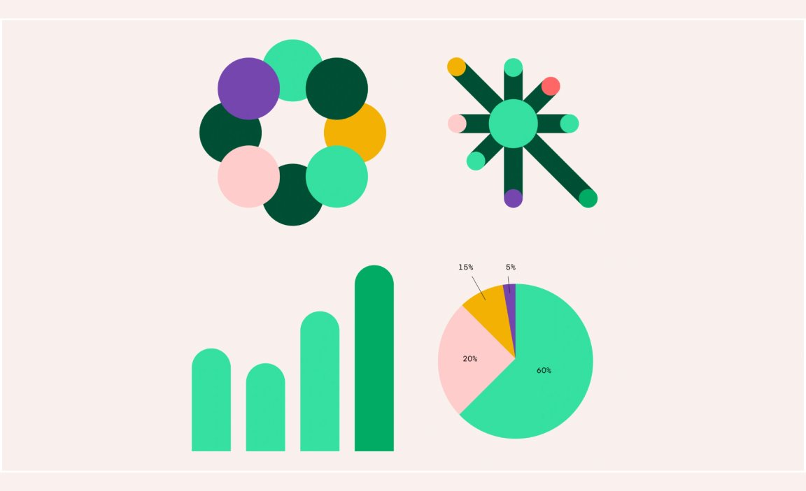
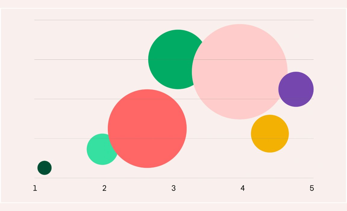
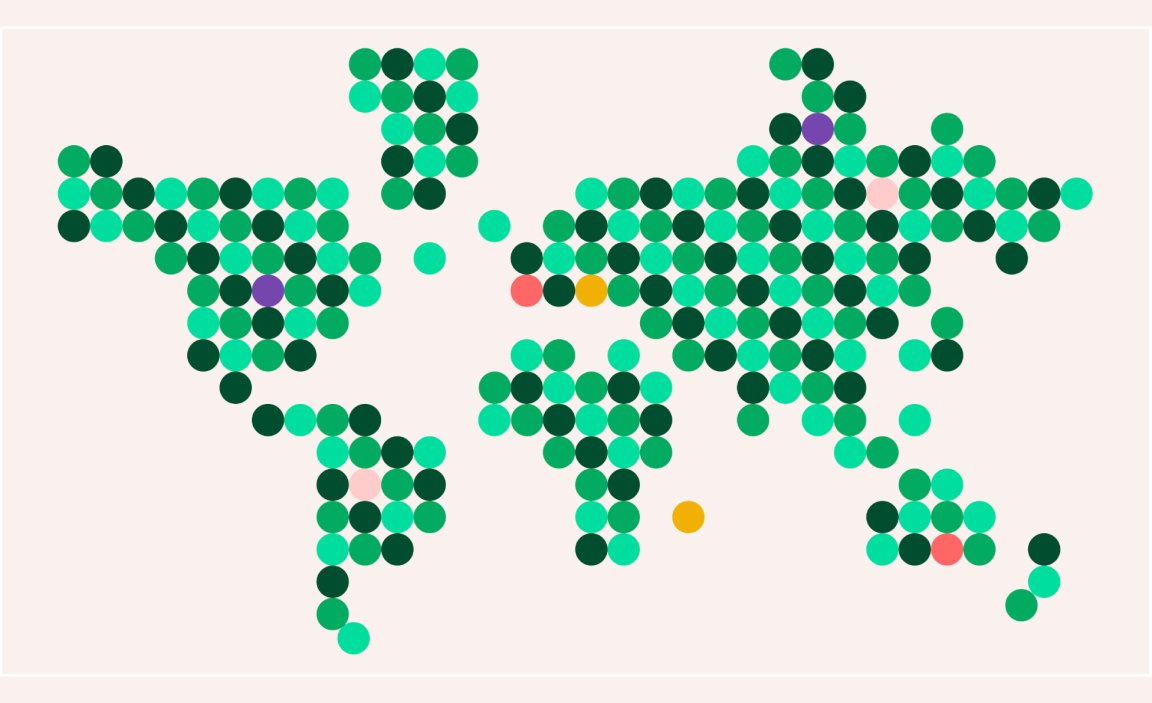
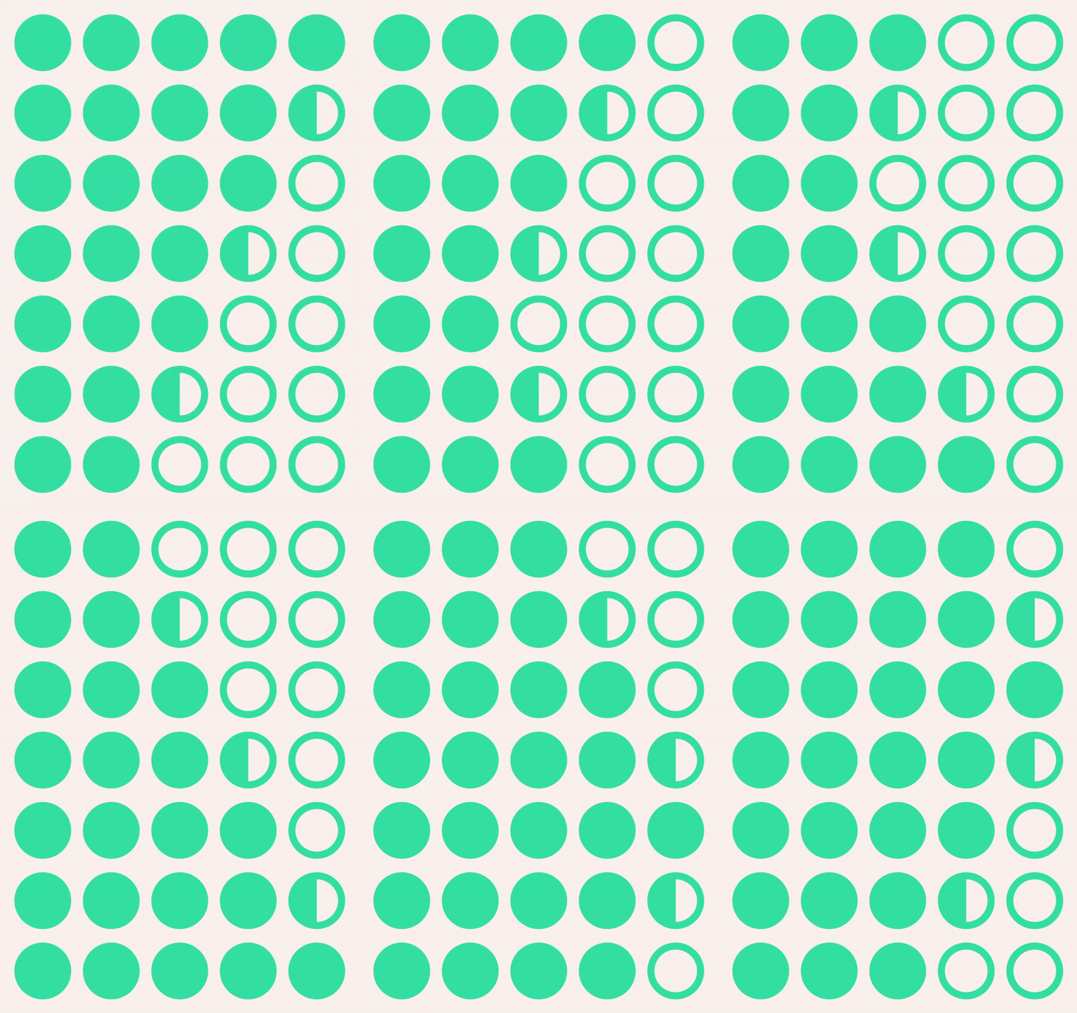
The design system follows a shape language built around the circle, not just as a nod to the owl’s eyes, but as a broader symbol of connection, reciprocity and planet-scale travel. This logic plays out across the entire brand, from the website and app to infographics and from buttons to illustrations. There’s consistency without rigidity, a kind of visual rhythm that feels global but grounded.
Circles carry motion without forcing direction. They roll, spin, repeat… implying movement without telling you where to go. In Tripadvisor’s system, that quality brings a sense of flow and openness. It invites exploration, not instruction. Unlike hard-edged icons or rigid grids, the circular forms feel curious, approachable and quietly confident.
Illustration brings a looser, more emotional tone. In collaboration with Giacomo Bagnara, the illustrative work introduces scenes that are not only just circular by nature, but they also feel spontaneous and human. Sometimes showing vast destinations and diverse people, other times focusing on small, vivid details of a trip. It’s all meant to reflect the reality of travel: unpredictable, memorable and deeply personal.


A brand that believes in optimism
At its heart, this rebrand is both about giving TripAdvisor a new look and recommitting to the values that made them matter in the first place. Travel, when done well, opens us up to new people, places and perspectives. Tripadvisor wants to be the connective tissue in that experience… not only the place where you find the right hotel, but where you’re reminded that good people and good things still exist.
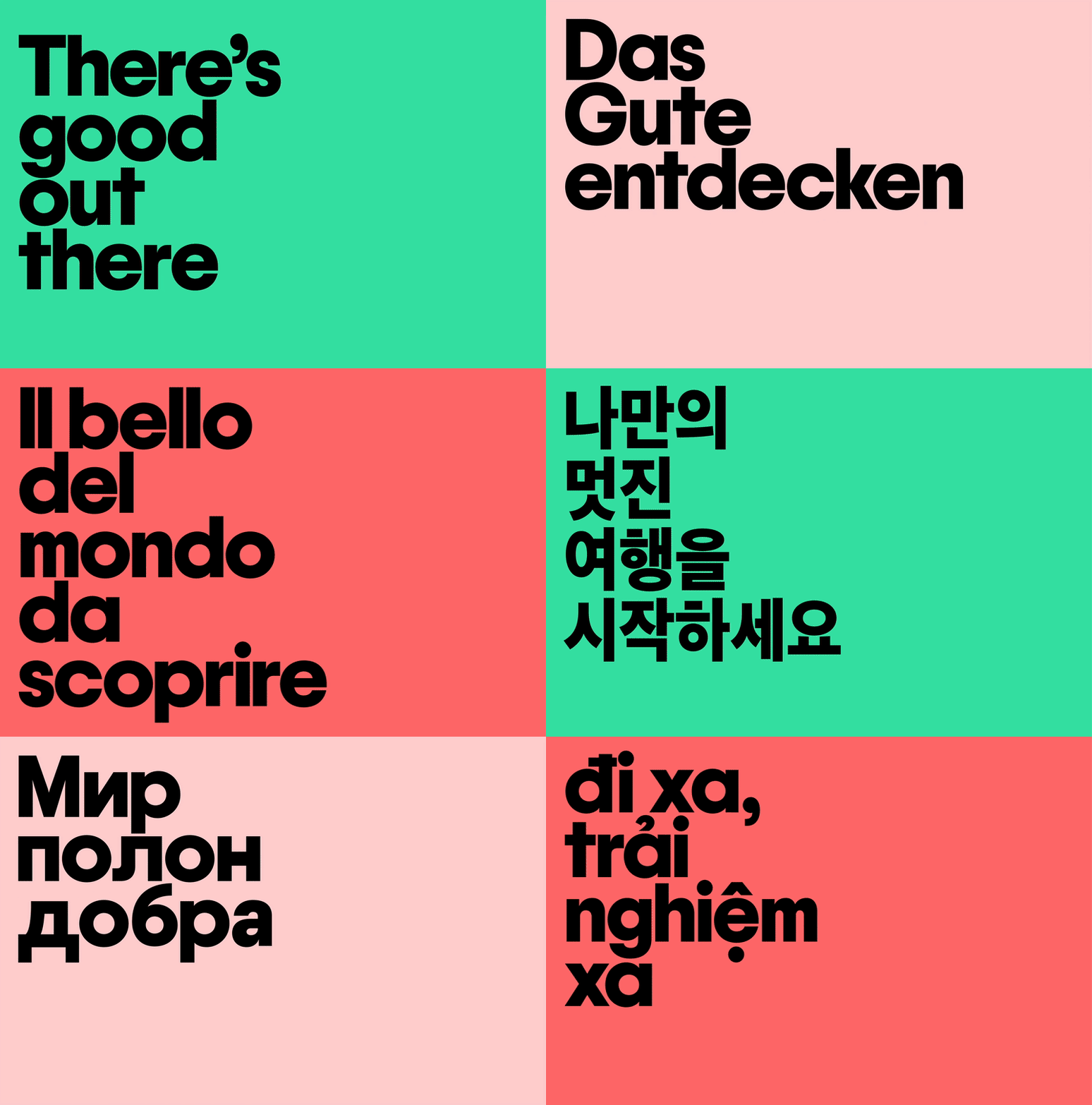
There’s Good Out There is a really thoughtful tagline, it’s also challenge. In a time where travel often feels complicated or transactional, Tripadvisor’s goal is to remind us to trust each other again. To plan a little, explore a lot and share what we learn along the way.
Mother Design helped it catch up to who it’s always been. And in doing so, they’ve given us a brand that feels ready, not just for the next trip, but also for the next generation of travelers.
