In March 2024 Canva acquired Affinity, the professional creative software suite developed by UK-based company Serif in 2014, the acquisition reportedly worth $580 million, brought Affinity’s three flagship applications Designer, Photo and Publisher into the Canva ecosystem. Affinity had built a loyal following among professional designers with its perpetual licensing model, with Serif positioning the brand as a direct challenger to Adobe’s subscription-based Creative Cloud.
In October 2025, now fully in the hands of Canva, Affinity underwent a complete brand transformation, with a unified application, a bold new visual identity, and a refreshed business model completely free, forever. Within one week of launch, over 1 million creatives worldwide had joined the platform.

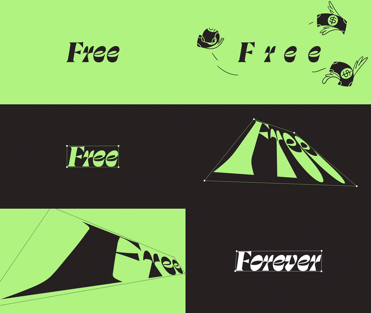
Design Strategy
The rebrand was led by Canva’s Creative Director for Europe, Tom Carey. Tom brought an impressive background to the project, having previously worked at renowned design consultancy Wolff Olins and Meta Reality Labs, and worked on the Sydney Opera House redesign For Carey, the challenge was clear: create an identity that felt connected to Canva while maintaining independence and credibility with professional designers.
As he explained, “It needed to feel connected to Canva, because otherwise what’s the point? But it couldn’t just feel like a version of Canva. To get creatives on board, it had to feel independent and stand for something.”
The rebrand was a collaborative effort between Canva and Affinity’s in-house creative teams and Barcelona-based design studio Design by Twist. Carey praised the partnership with Twist, noting their thoughtfulness and care, and describing them as feeling like “part of the team, actually the heart of the team.”
The project also involved Canva’s advisory board featuring industry luminaries:
• Debbie Millman, Designer, author, educator and host of the iconic Design Matters podcast.
• Eddie Opara, Designer, speaker, author, Partner at Pentagram.
• Lisa Smith, D&AD President, Global Chief Design Officer at Uncommon Creative Studio
• James Martin, Author, Designer, Brand Re-thinker & Founder of MBJ Studio.
• Verònica Fuerte, Founder of Hey Studio, celebrated designer, speaker, and mentor.
• Jessica Hische, Lettering artist, illustrator, and author of multiple New York Times best-selling books
• Pablo Stanley, Designer, illustrator, and co-founder of Blush, Musho, Lummi, and Together.Art.
• Johanna Roca, Brand designer and creative director at Koto,
Canva’s Designer Advisory Board and Pro Panel provided guidance throughout the process, ensuring the rebrand reflected the needs and values of professional creatives.
Giving Affinity a voice
With multiple stakeholders and strong opinions about how the brand should balance its Canva connection with its independence, Carey employed a pragmatic strategy. Rather than endless discussions about whether Affinity should be “70 percent Canva or 30 percent Canva”, he created two working prototypes early in the process, one distinctly Affinity-focused and one resembling a professional version of Canva.
As Carey explained: “Rather than people debating words on a page, like ‘it should be 70 per cent Canva or 30 per cent Canva’, I wanted to share designs early, show what that would look like, because as soon as people see stuff, they change their minds. It was a really informative exercise.”

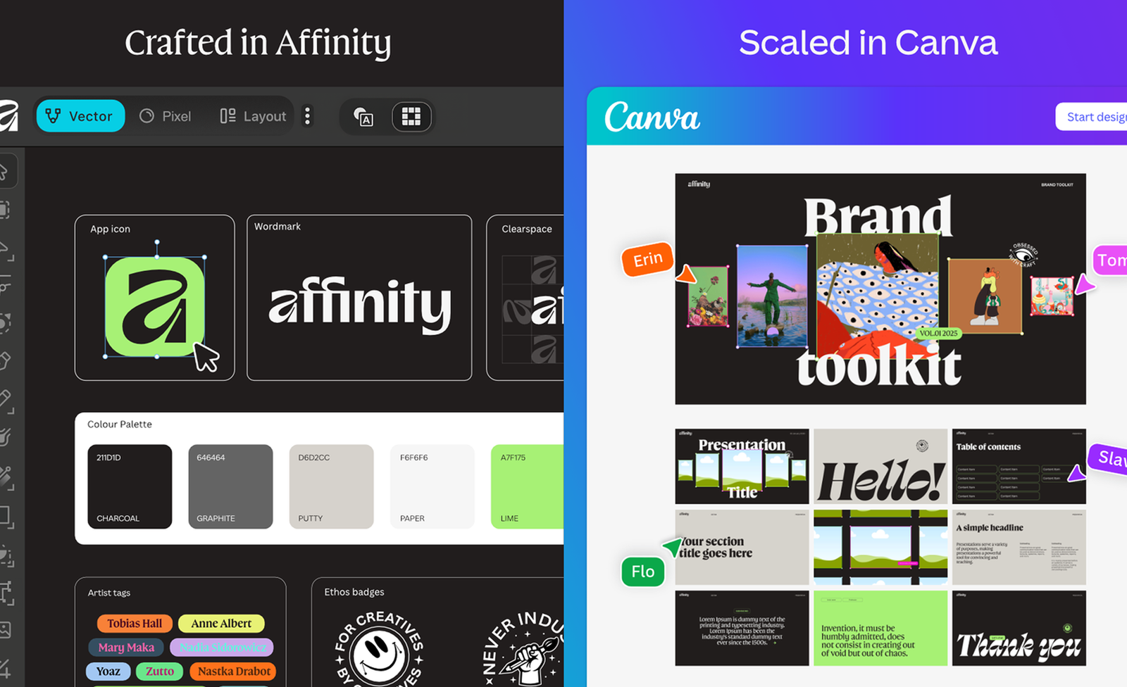
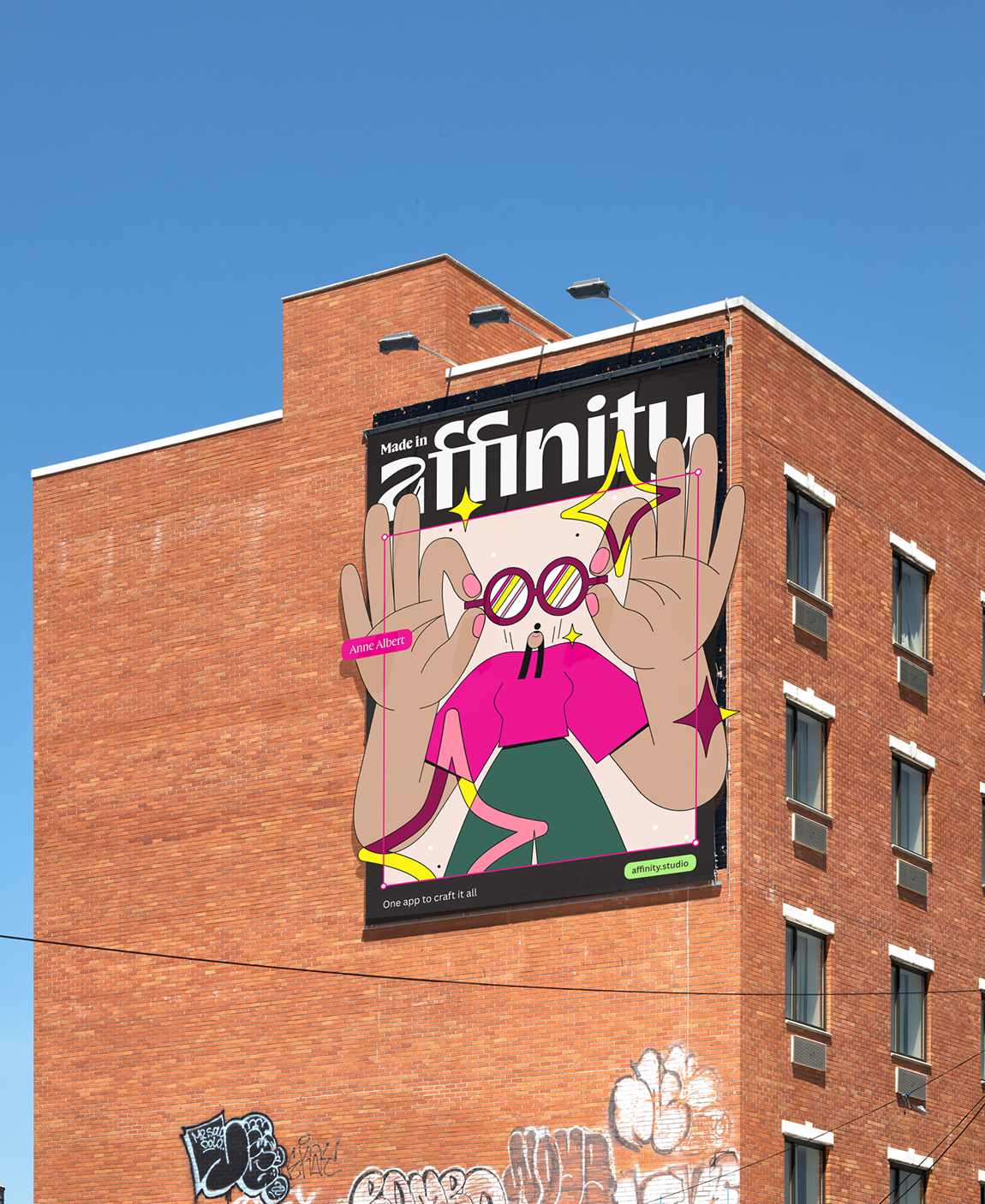
The identity needed to depart from Affinity’s previous angular aesthetic while also differentiating itself from competitors in the professional design software space. Carey noted that other professional design tools were “really complicated, getting more and more corporate and costly for individuals and brands”. To challenge these norms, Affinity’s new brand identity embraces playfulness and approachability while maintaining precision and professionalism.
Carey described the final design system as modular and adaptive, comparing it to jazz: “with design elements acting as instruments to be played.” The system was built to have strong brand DNA with emotional intelligence that can flex and adapt its tone for different audiences, from typographers to illustrators to photographers.
Learning from past experience, Carey and his team aimed to create a brand that could sit alongside Canva as its “refined sibling, who has recently come out of their shell,” while maintaining the ability to speak authentically to professional creative communities.
Visual Identity
The custom typeface, Affinity Serif, was developed in partnership with Ohno Type Company as a bespoke adaptation of their typeface Swear. Ohno Type, known for their philosophy of emphasizing “organic over geometric, lively over perfect and good spacing above all else”, created a versatile serif family for Affinity that is able to live across multiple surfaces and touchpoints.
Swear, the source typeface designed by James Edmondson at Ohno, is characterized by its exploration of rotating pen angles with a flat brush. The original Swear family comes in four optical sizes (Text, Deck, Display and Banner) and six weights, with roman, italic and a unique “Cilati” reverse-contrast italic style. For Affinity, the typeface was customized and comes in six weights.
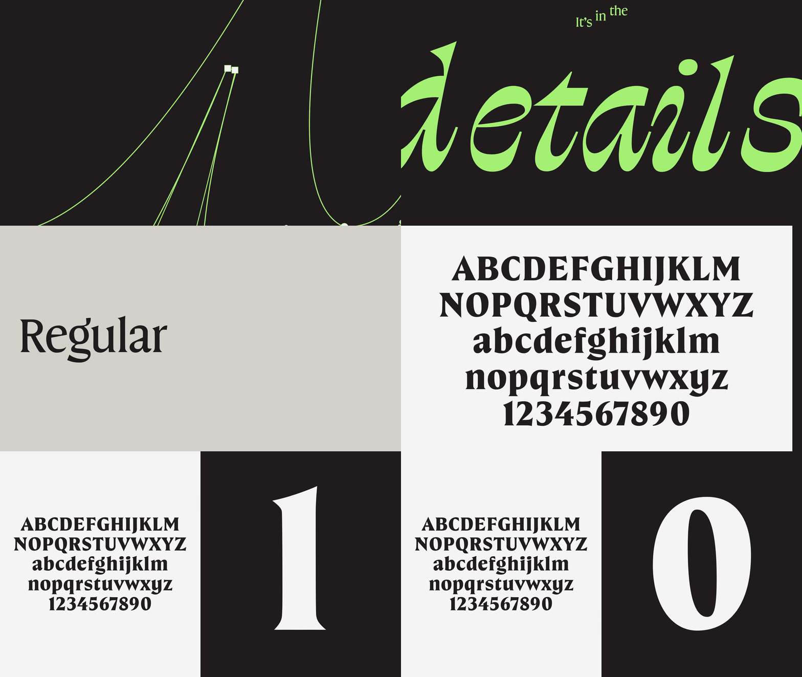
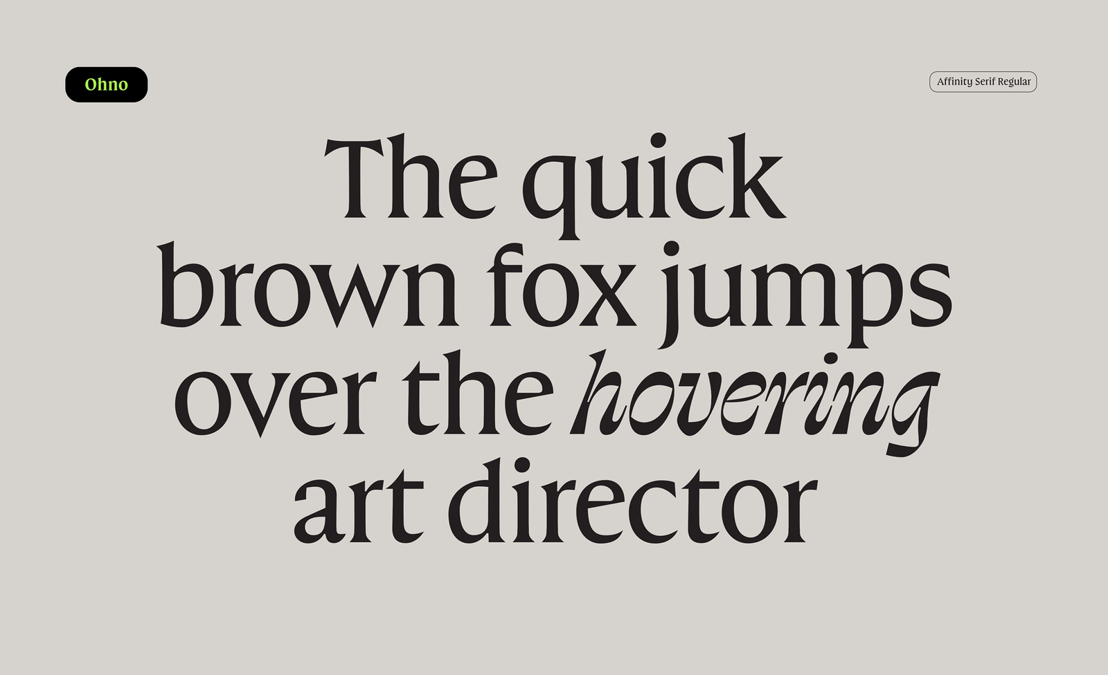
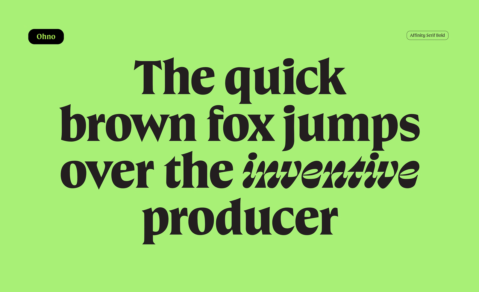
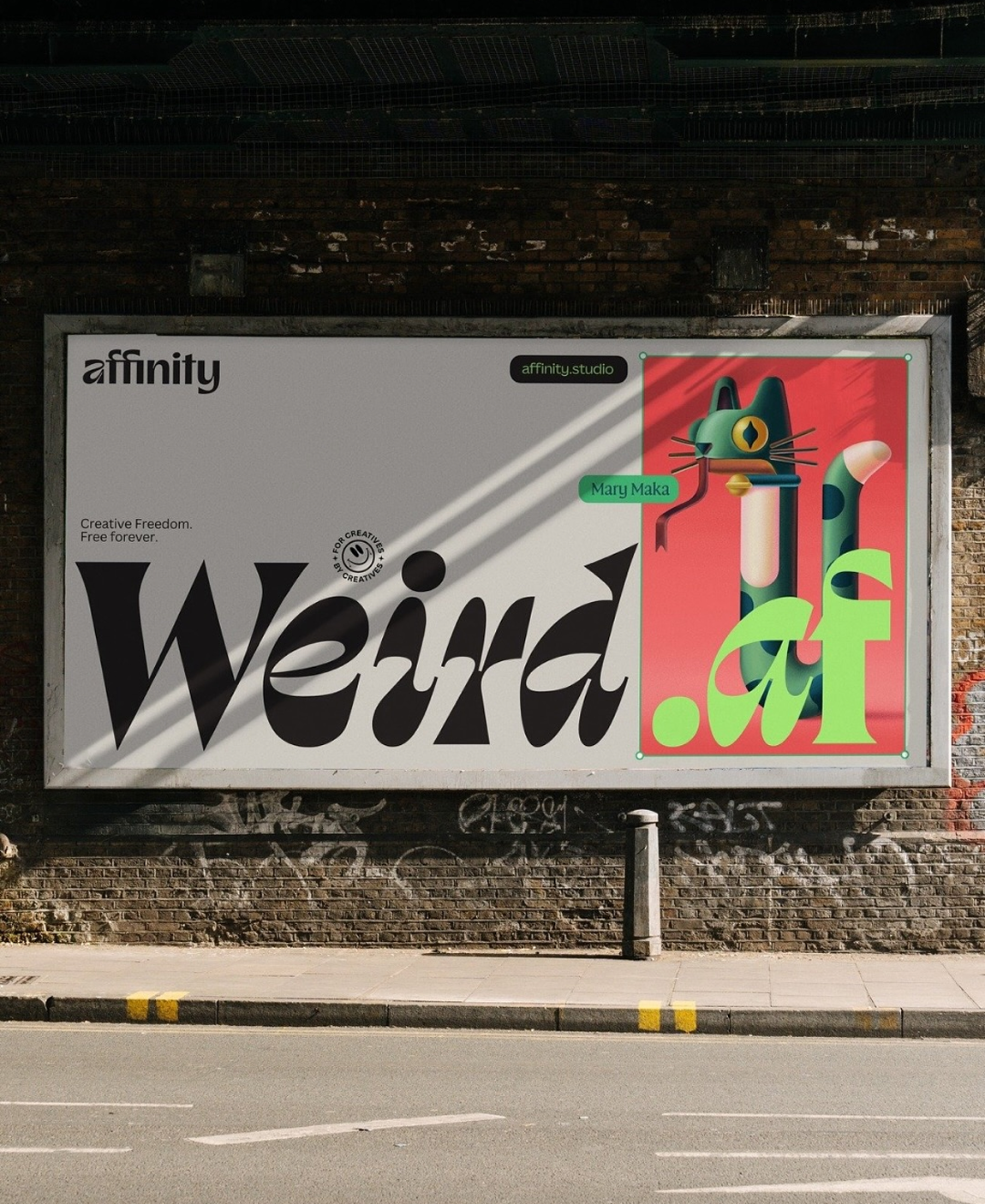
Carey explained its adaptability: “When used light and small, it’s super precise and premium; in its big, fat, expressive italic form, it looks more bold and a bit weird.” This range allows the typeface to shift tone depending on context, refined and professional for technical documentation, bold and expressive for marketing materials.
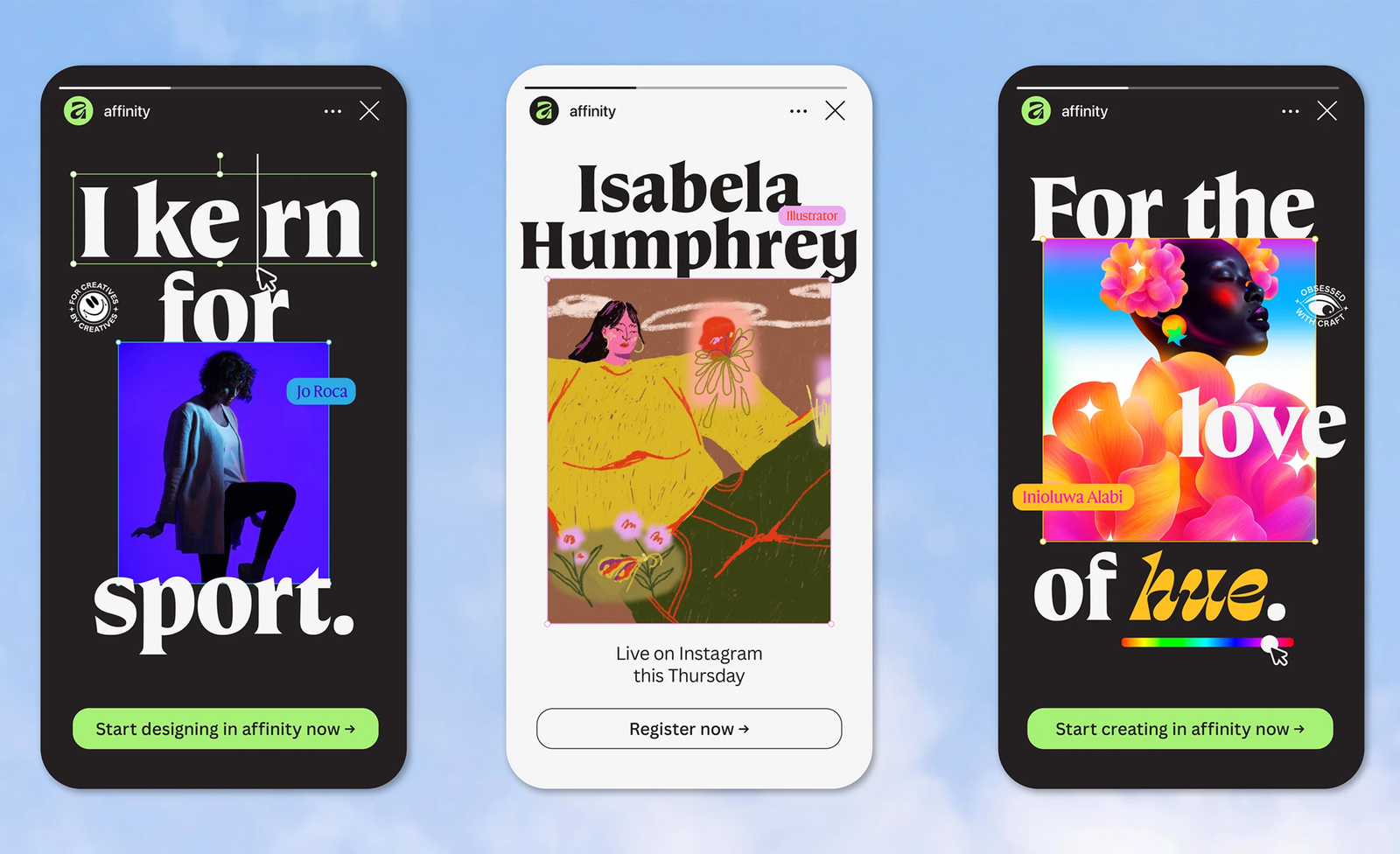
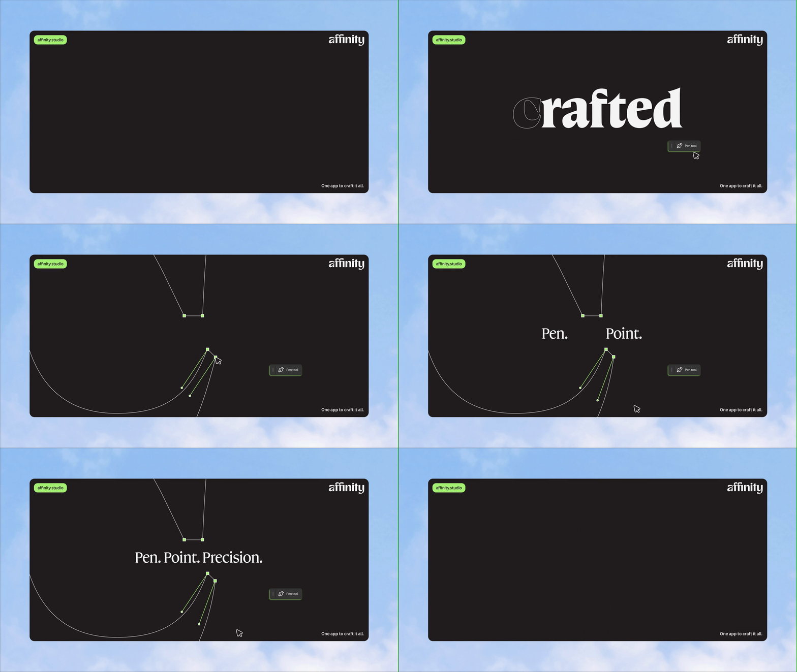
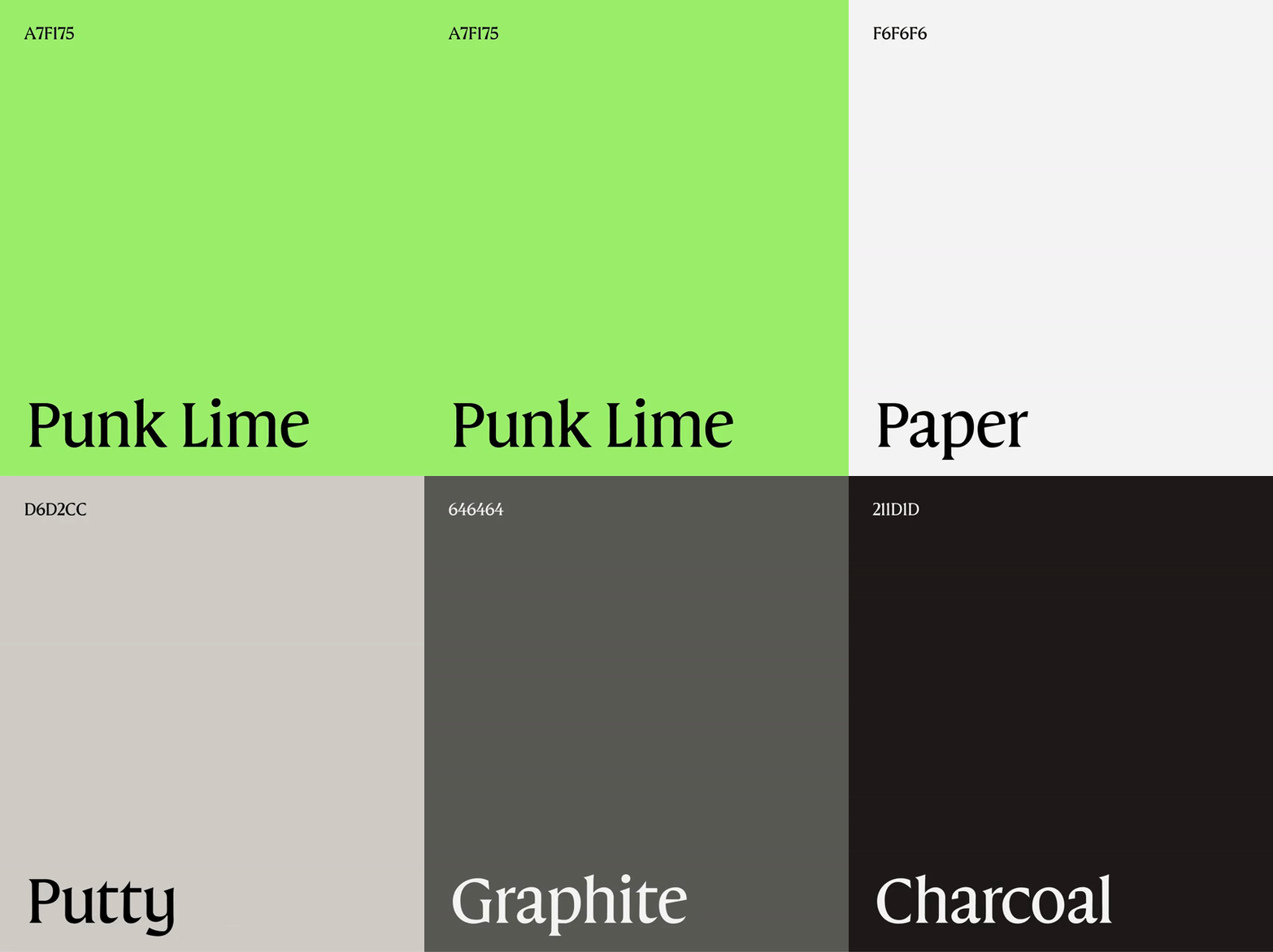
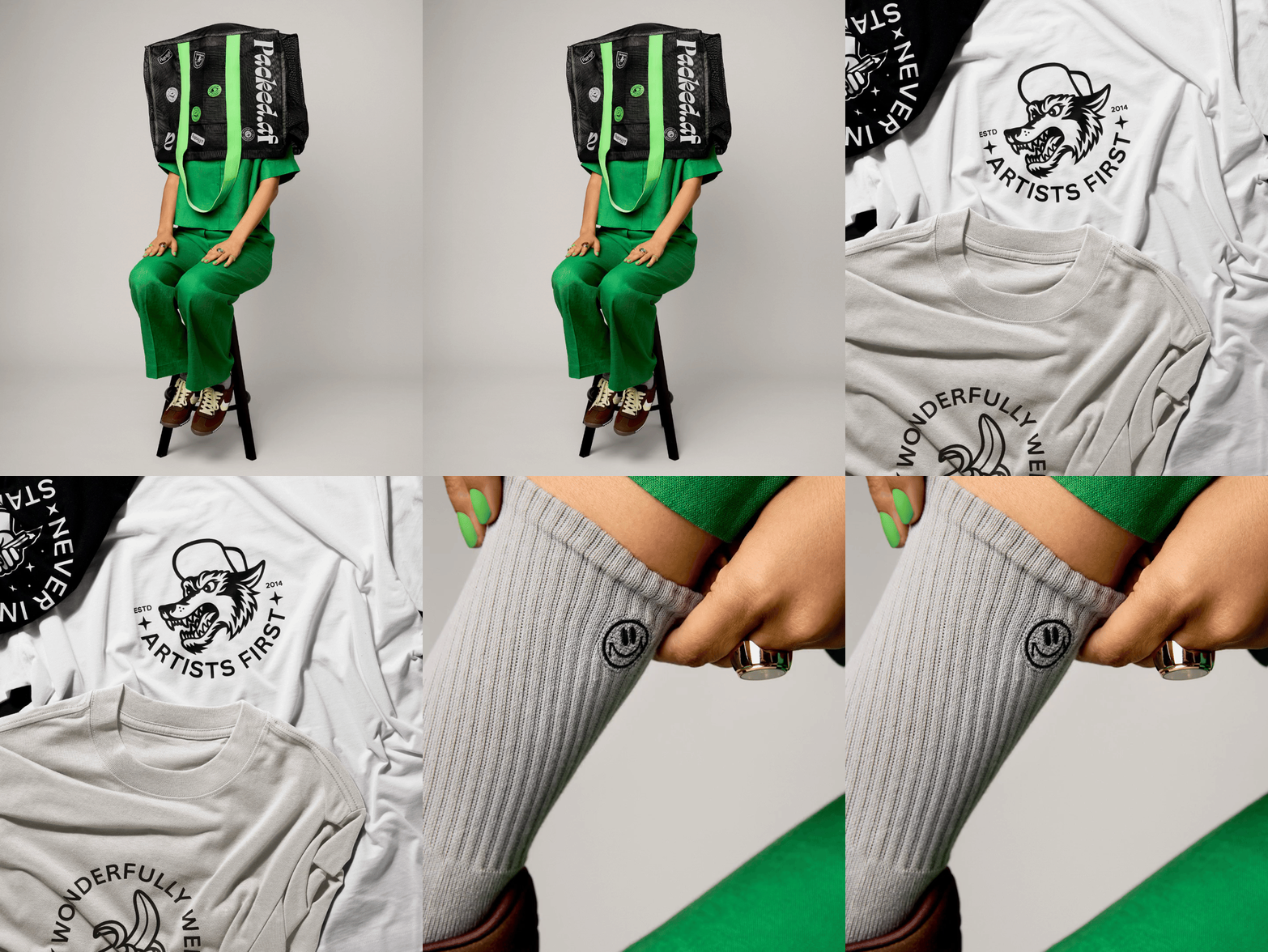
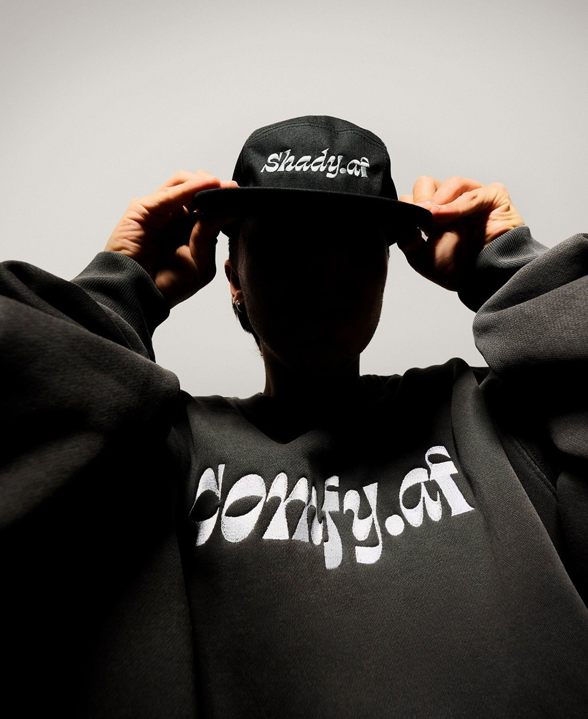
Rather than straightforward monochrome, Affinity’s color scheme draws from tactile, material-based colors inspired by artists’ tools: Charcoal, Graphite, Putty and Paper. These neutral tones are highlighted by lime green, described as a punch of punk. This restrained palette has a strategic purpose which acts as a muted backdrop that allows creative work to take center stage, reinforcing Affinity’s ethos of prioritizing creators and their output.
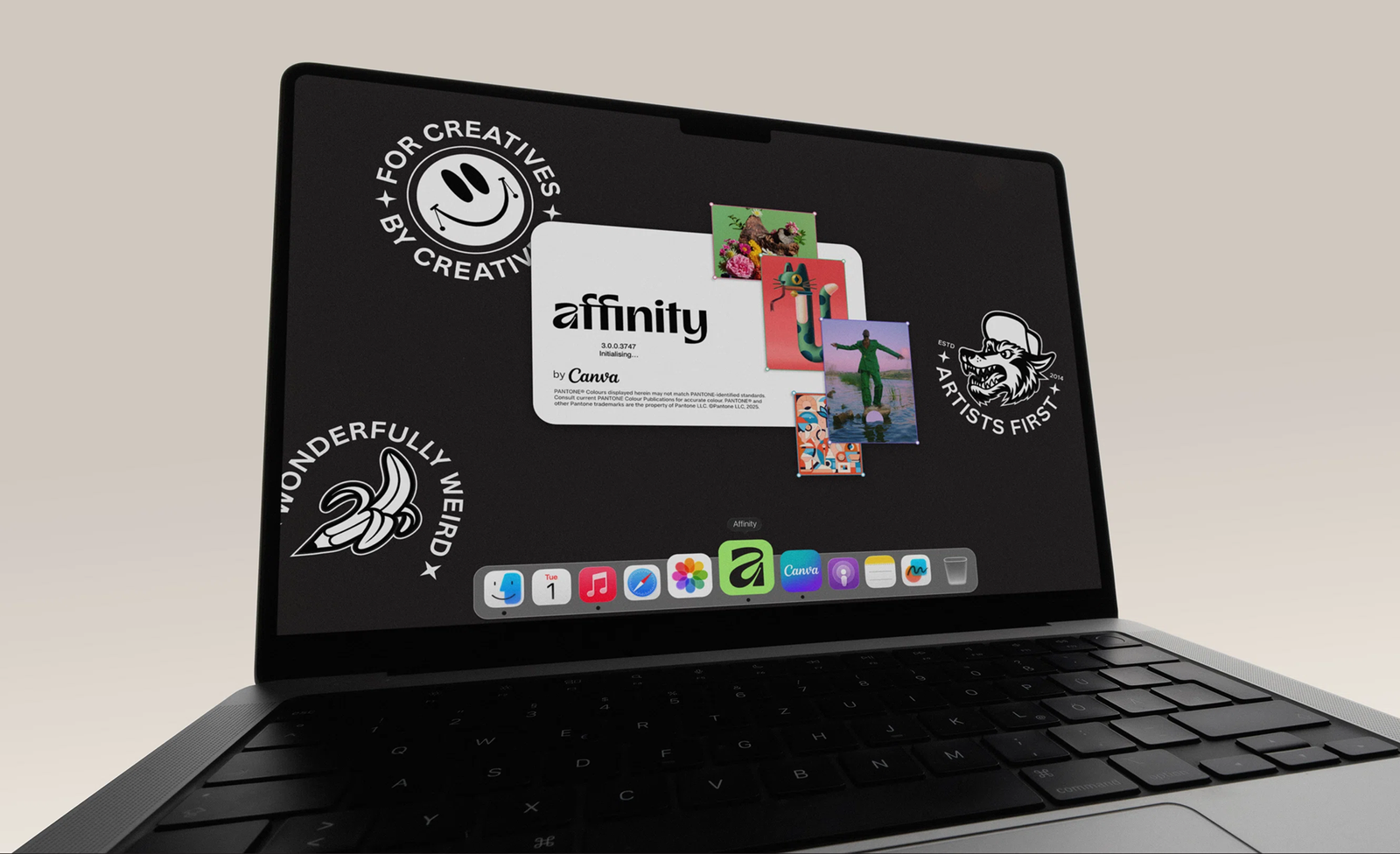
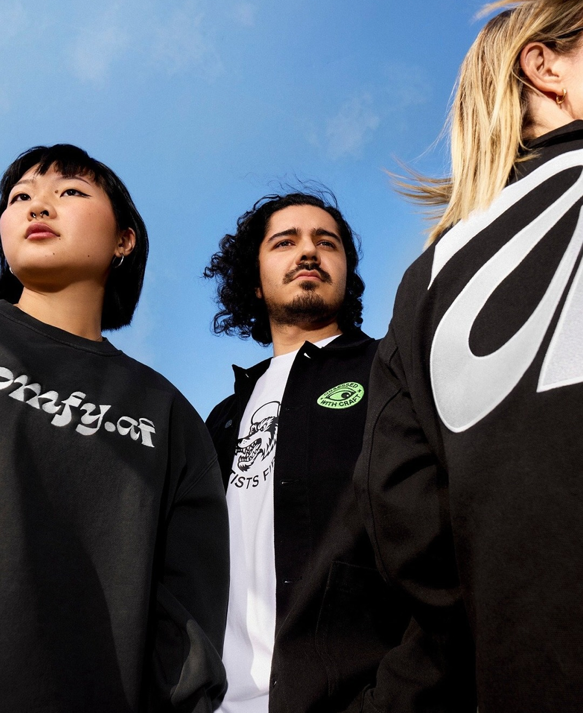
The brand features six ethos badges created by James Martin, known professionally as Made By James. Martin, a UK-based graphic designer and advisor to Affinity, runs design studio Baby Giant Design Co. and serves on Canva’s Designer Advisory Board. His playful graphic assets add personality to the brand while reinforcing its core values.
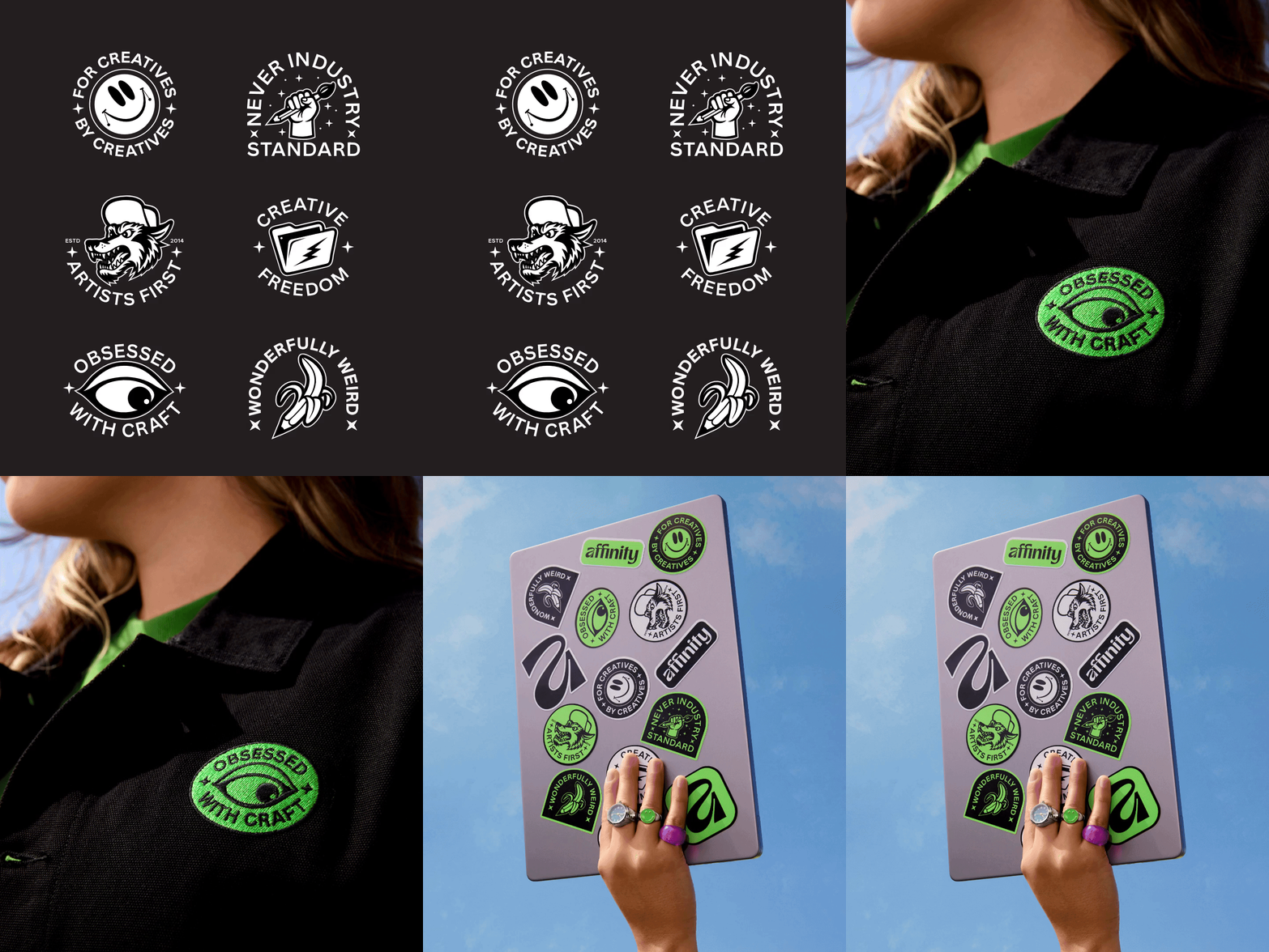
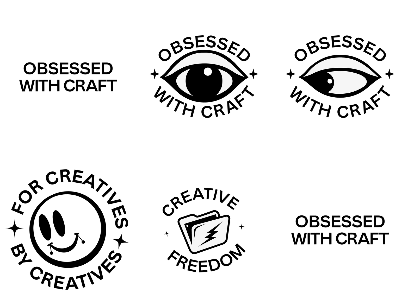
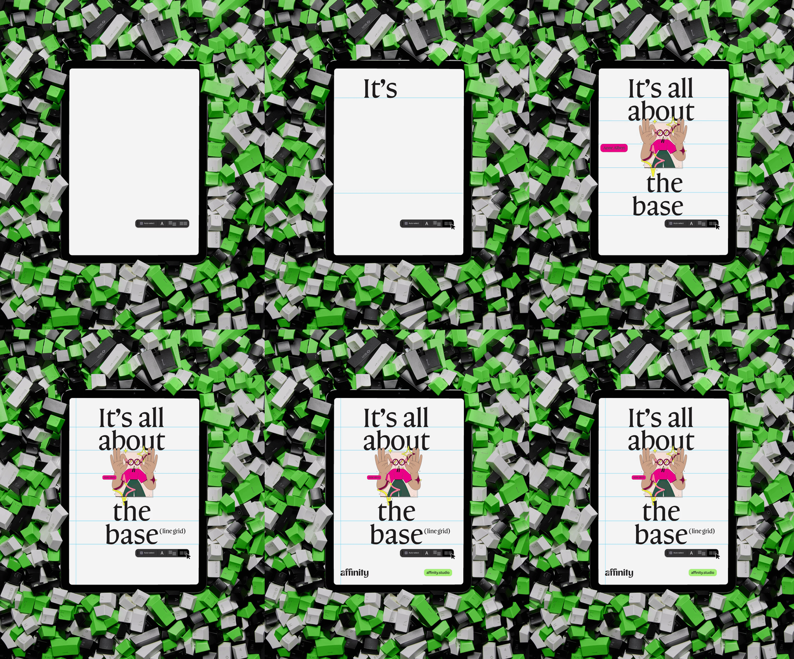
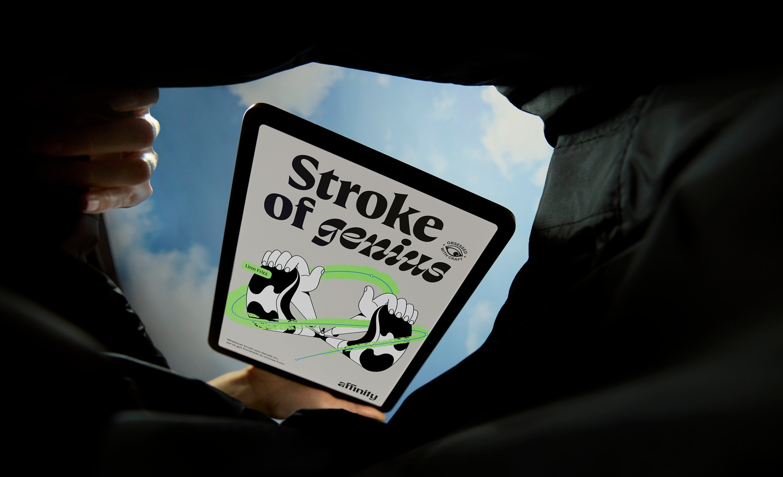
The refreshed visual identity successfully evolved Affinity from looking punk to feeling punk, a brand that celebrates craft, collaboration and the creative process itself while maintaining the precision and power that professional designers demand.
Reimagining the “a”
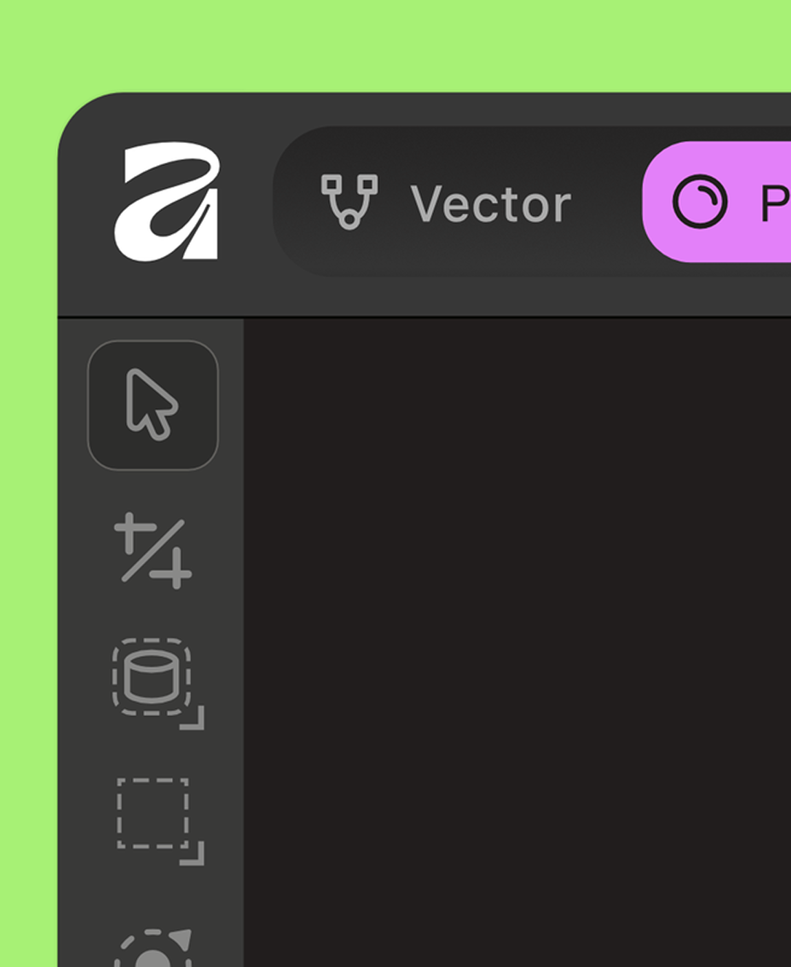
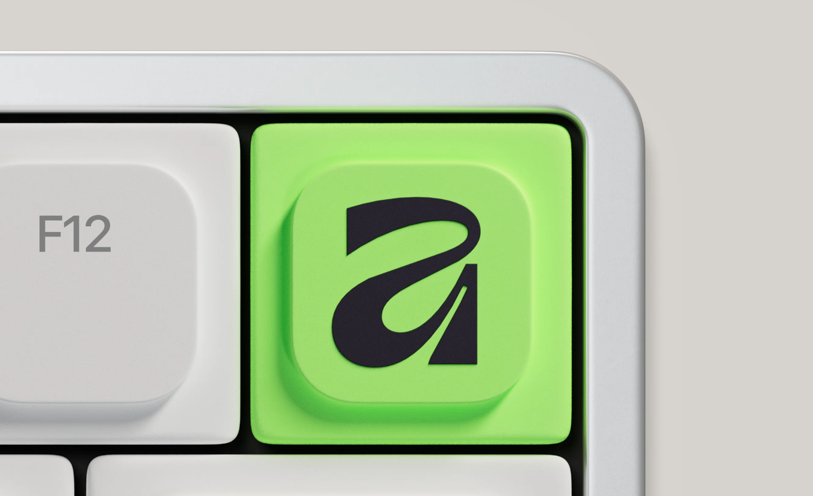
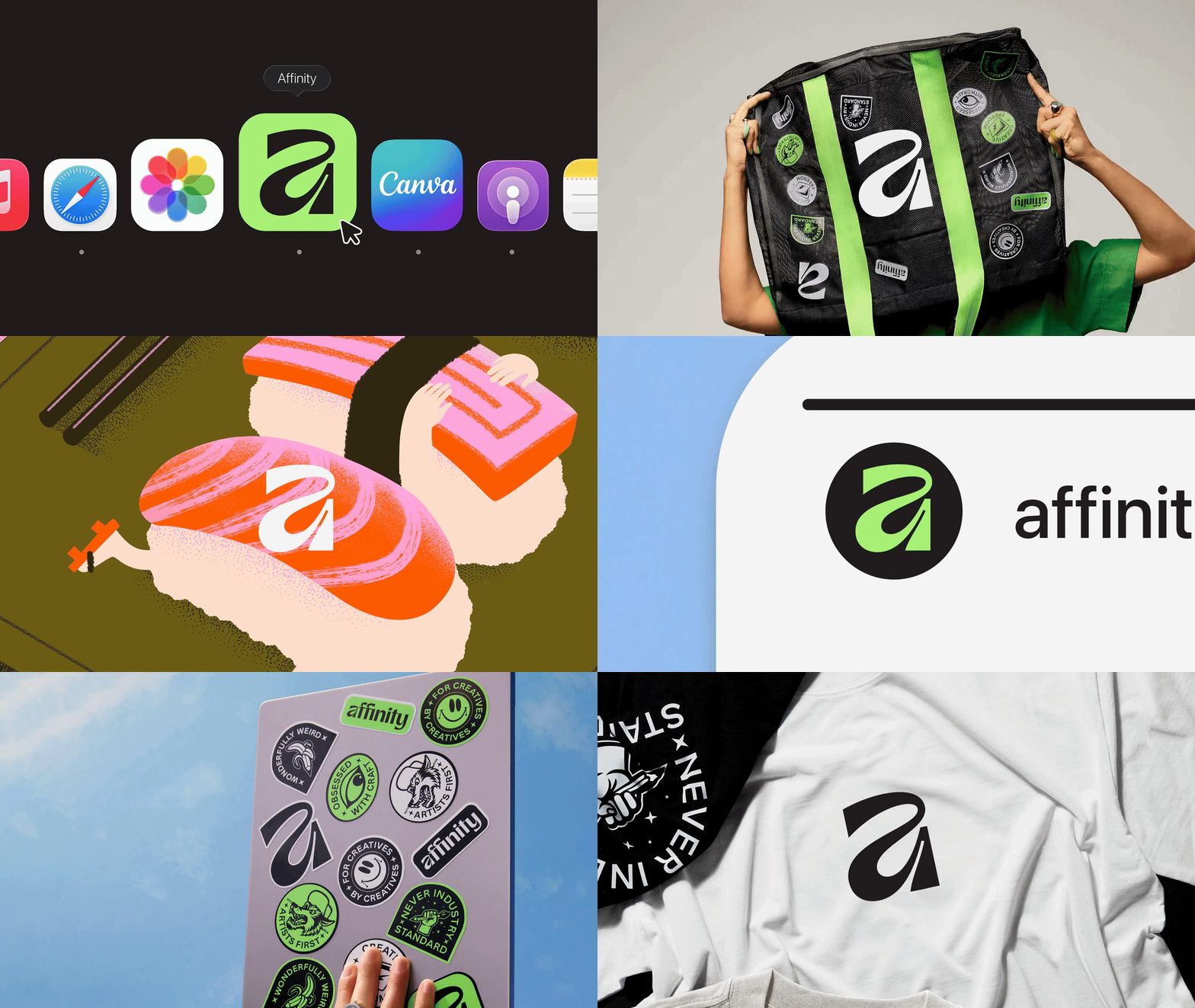
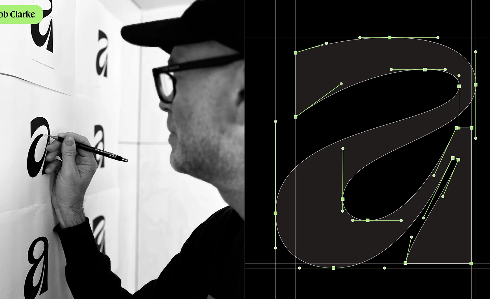
At the heart of the rebrand is a distinctive lowercase serif ‘a’ logomark and symbol, crafted in collaboration with designer Rob Clarke. The choice of lowercase was a deliberate departure from the uppercase, geometric logos common in software branding.
“There’s lots of uppercase, geometric, graphic brands in the world of software,” Carey explained. “We wanted to have something that felt more approachable and wonky.”
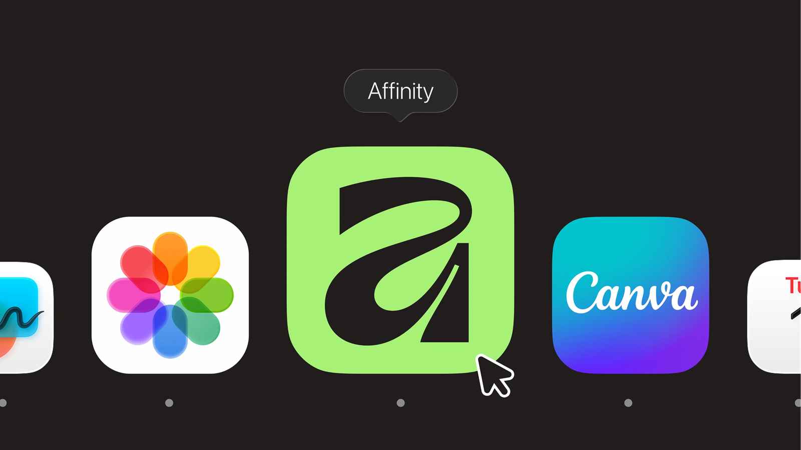
The logomark features swooping curves that represent the expression of artists and illustrators, balanced with super sharp and precise points that acknowledge graphic designers. As Carey described the challenge: “Trying to get all that out of a symbol was challenging, but we landed on something recognisable for that desktop row of icons.”

.af, a new unified file format
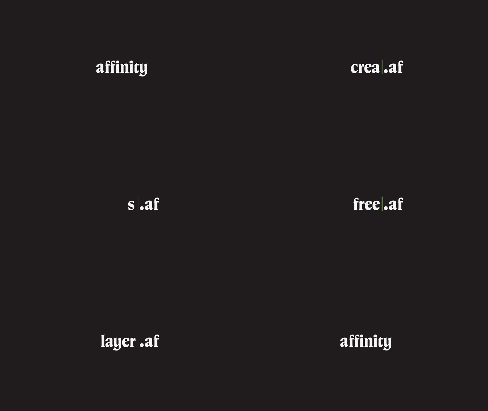
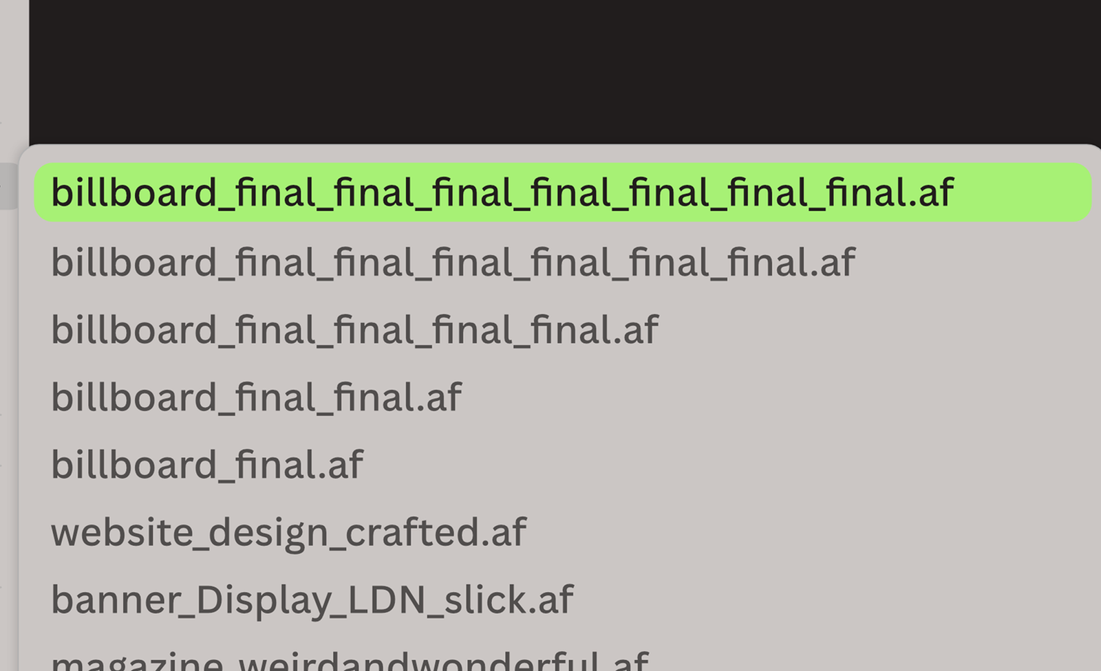
One of the most clever branding decisions is the new file extension .af. Every file exported from Affinity now carries this extension, which functions both as a practical identifier and a cultural reference. The brand playfully uses “af” as a suffix across marketing materials and merchandise, creating moments like the Sketchy.af notebook.
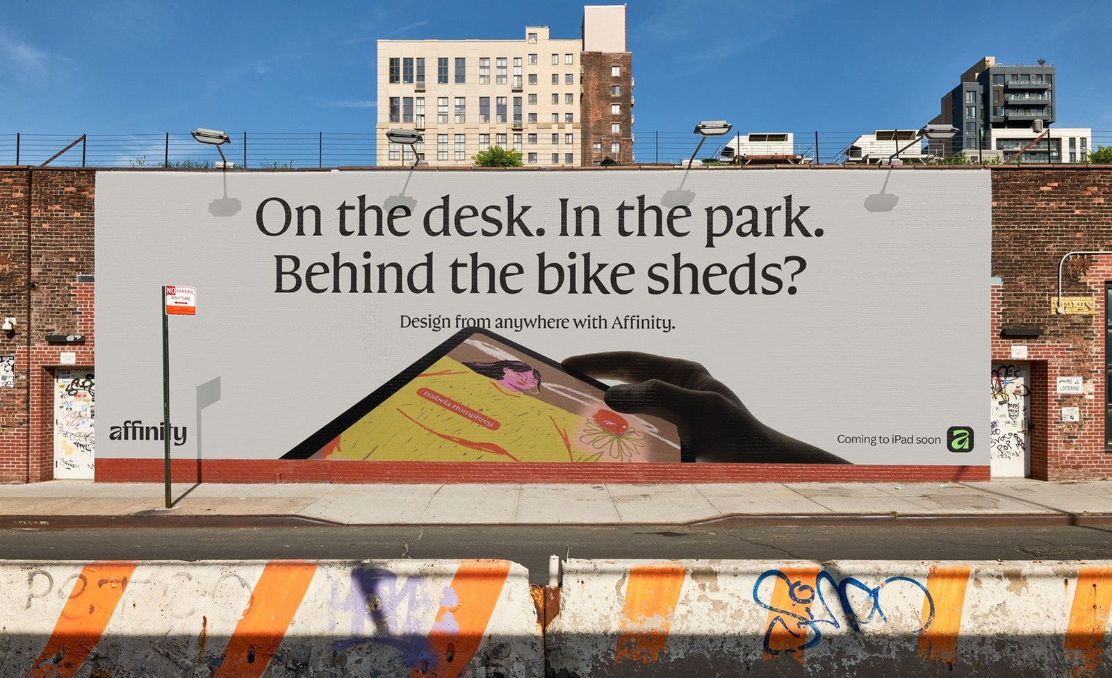
The tone of voice throughout the rebrand is packed with wit and insider humor, including copywriting that plays on version control frustrations (billboard_final_final_final.af).
The Product
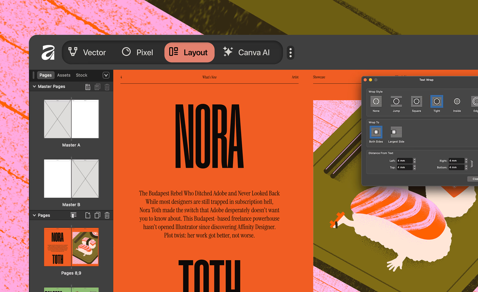
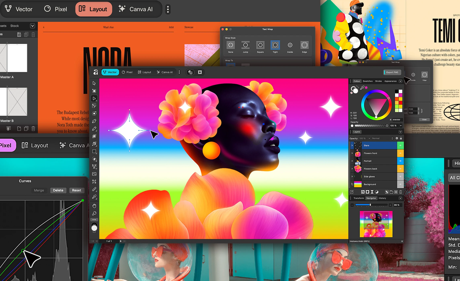
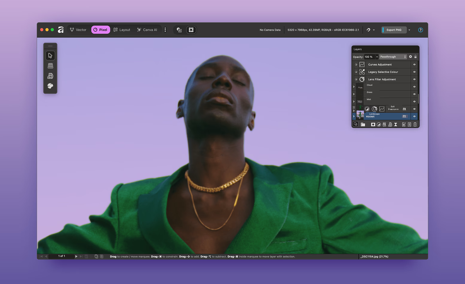
Alongside the visual rebrand, Affinity underwent a complete product transformation. The three separate applications Designer, Photo and Publisher were unified into a single application simply called Affinity. This new version introduces custom workspaces called “studios” (Vector, Pixel, and Layout), allowing users to move easily between different creative modes without switching applications.
Duncan Clark, Canva’s Head of EMEA, explained the significance: “With Affinity Studio, if you move between Vector and Pixel, the tools change, but you’re still in the same canvas. This is a breakthrough in how professional design tools are structured.”
Most significantly, Affinity announced it would be free forever, a dramatic departure from both its previous perpetual license model and the subscription model dominant in the industry (Looking at you, Adobe). This move was made possible by Canva’s profitable business (Canva has been profitable on an operating free cash flow basis for several years, consistently generating cash), which allows the company to offer powerful creative tools for free while monetizing through optional paid features like premium content, collaboration tools and AI features.
The rebrand and relaunch now positions Affinity firmly as a direct challenger to Adobe’s dominance in professional creative software. By making professional-grade tools free and combining them into a unified platform, Affinity addresses long-standing frustrations in the creative community about bloated software, expensive subscriptions and fragmented workflows.
The Launch
The launch campaign was animated by London-based studio ManvsMachine, winners of the Brand Impact Awards 2025. Known for their work on high-profile projects including Film4, BBC, ITV, and brands like Nike and Apple, ManvsMachine created what was described as a rallying cry for creative liberation.
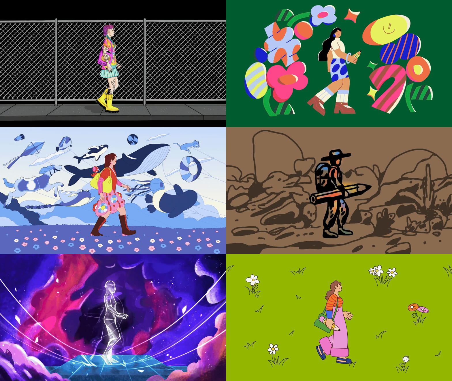
The campaign video combines 3D, 2D motion, kinetic typography and hand-drawn illustration into a fast-paced journey designed to remind designers of creating for fun and love rather than being confined by their tools. The campaign ran globally across YouTube and Meta’s platforms through December 14, 2025.
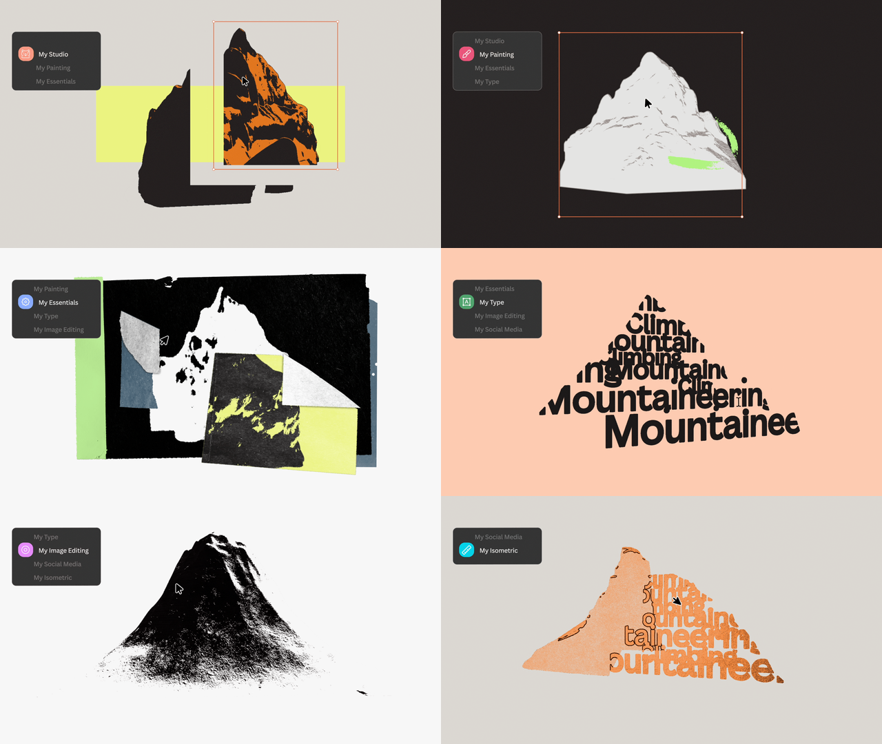
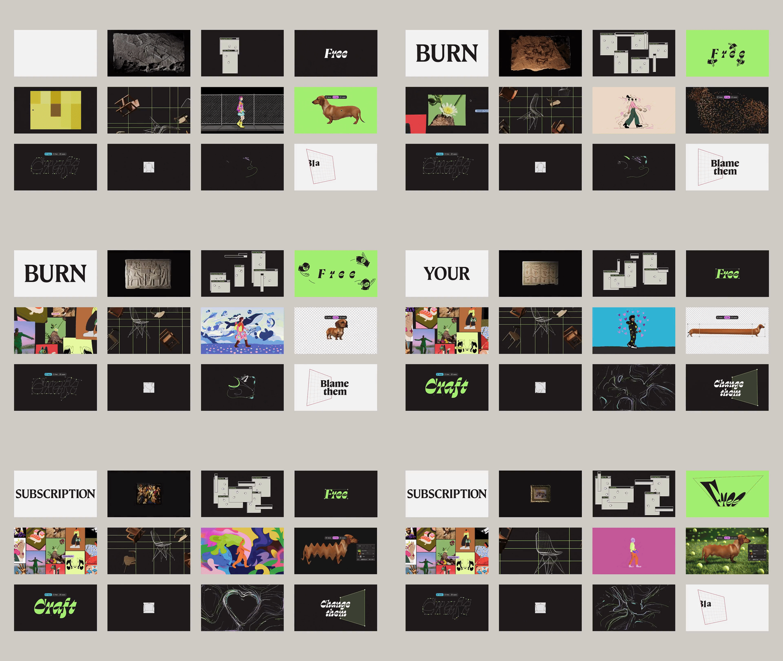
The launch took a distinctly community-focused approach. Beginning in early October 2025, subtle hints and behind-the-scenes moments appeared across social media and design communities. What started as a quiet creative whisper grew into a bubble of excitement through October.
This organic, conversation-driven approach was built anticipation without traditional advertising, ending with the October 30 announcement at Canva’s World Tour keynote.
For Creatives, By Creatives
This rebrand reaffirms Canva’s commitment that Affinity is for creatives, by creatives and this ethos is embedded throughout the work:
• The identity was crafted in Affinity itself, then scaled in Canva
• Every design decision was tested with the Designer Advisory Board
• The launch involved extensive community engagement
• The color palette is deliberately toned down to let creative work shine
The Affinity rebrand is a masterclass in balancing competing demands, 1. maintaining brand independence while acknowledging parent company connections, 2. appealing to professional creatives while remaining approachable, and 3. honoring craft heritage while embracing modern playfulness.
Through careful leadership by Tom Carey, collaboration with Design by Twist, Ohno Type, Made By James and ManvsMachine, guided by an advisory board of industry leaders, Affinity created a visual identity that stands out and stands tall in the crowded software market.
The rebrand’s success was in how completely it embodies the mission, creative freedom for everyone. By making the software free, unifying the platform and creating an identity that genuinely celebrates creativity, Affinity has positioned itself not just as an Adobe competitor, but as a new era for how professional creative tools should work.
Just like Tom Carey’s jazz metaphor, Affinity’s brand identity is designed to be played… it’s adaptable, expressive, and always in service of the creative work it enables. Bold.af indeed.
