Cadillac needed to rethink what it meant to be Cadillac in the first place. A brand that once stood for status, innovation and American optimism had watched the world move past its most iconic cues. Chrome and tailfins weren’t going to carry them into an all-electric future, and their next generation of drivers wasn’t looking for nostalgia.
Developed in-collaboration with independent brand and design company Mother Design and London Based type foundry Colophon Foundry, Cadillac was asked to rethink what it means to be a luxury automotive brand (in 2021 and beyond). The new Cadillac identity had to stretch across a global footprint, support an entirely electric lineup and meet a new class of buyers who view mobility differently.
Mother’s approach started by confronting Cadillac’s layered legacy head-on. Founded in 1902, Cadillac was one of the first to bring precision manufacturing to the auto industry. Their innovations, from the V8 engine to full electrical systems, set the tone for what luxury meant for much of the 20th century. But while the brand carried weight, its identity hadn’t kept pace with the weightless future it was trying to signal.
The Crest
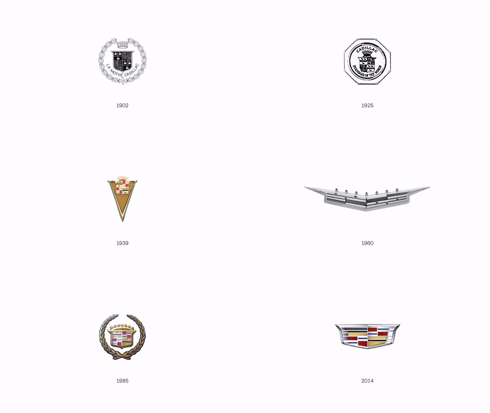
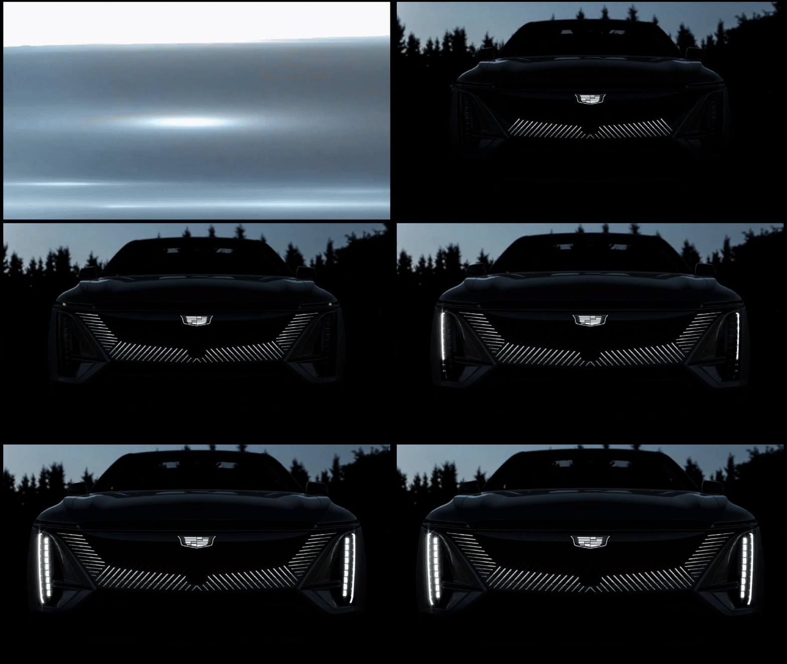
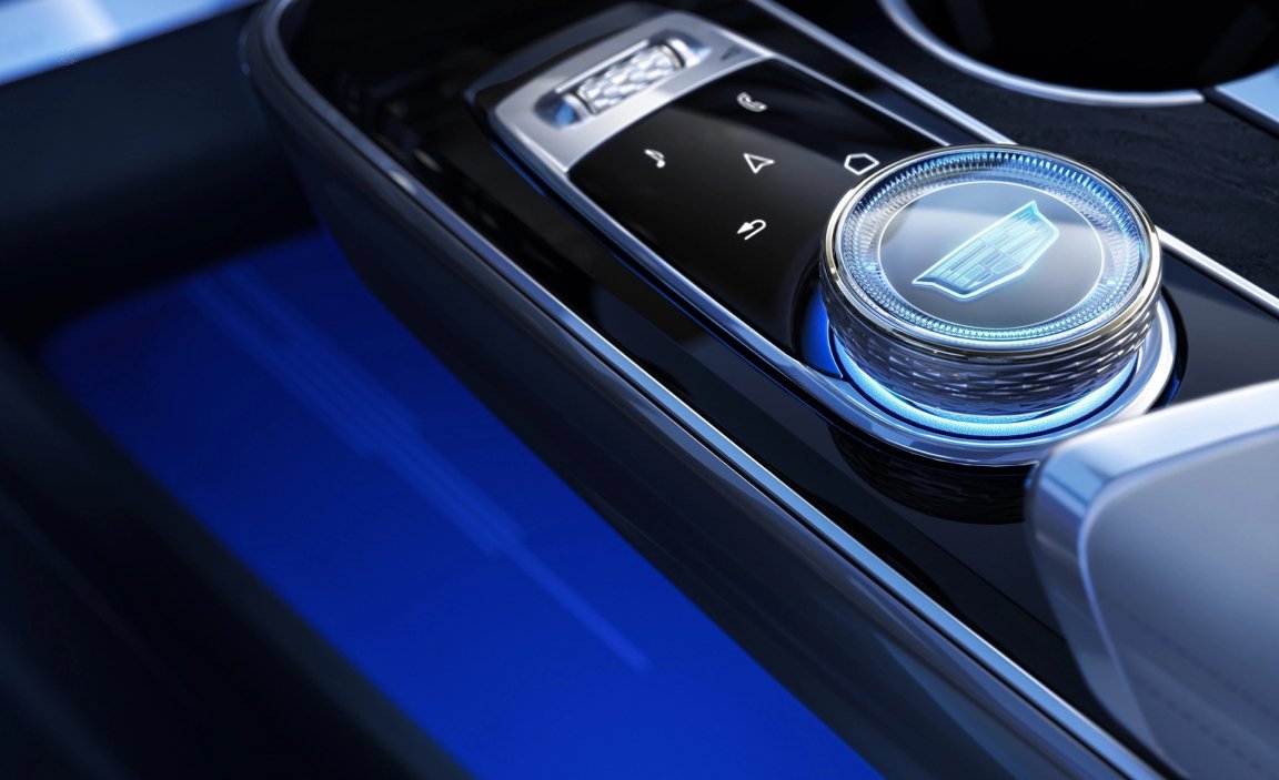
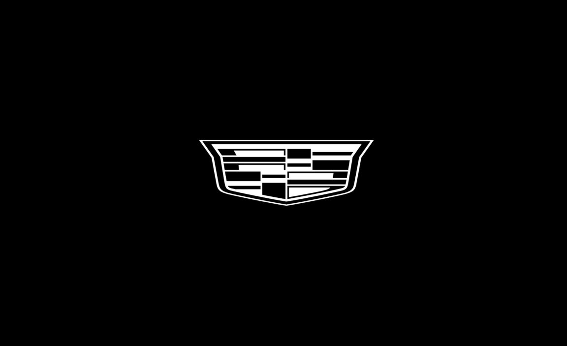
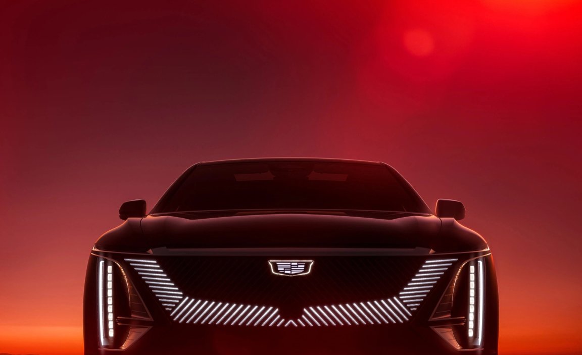
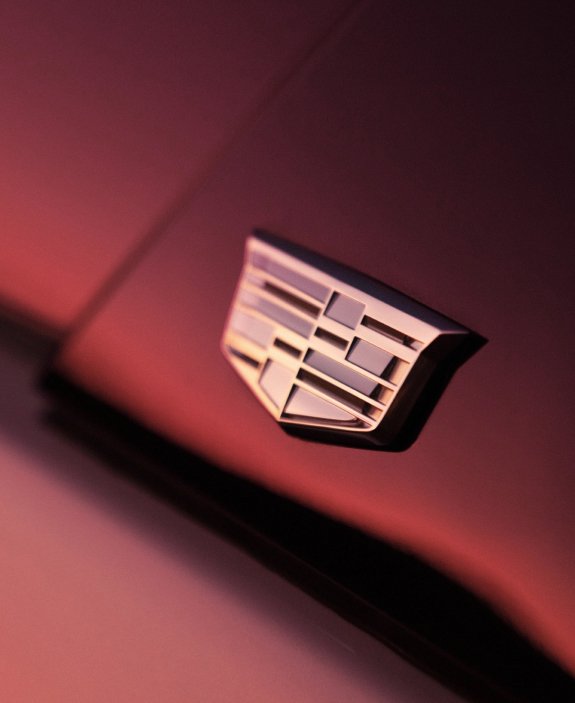
There’s no Cadillac without the crest. But the historical detail that once gave the emblem weight had become a liability. Mother’s updated 2D Crest strips back the embellishment without losing the craftsmanship. It’s flatter, cleaner and built to scale across screens, badges, dashboards and the illuminated grilles of Cadillac’s next-gen EVs.
The redesign preserves the jewel-like design that’s always defined the mark, but it brings it forward. The shape is still inspired by Antoine de la Mothe Cadillac’s family crest, but the new version trades heraldry for versatility. It’s not a museum piece anymore but rather a symbol of renewed motion.


The Typography
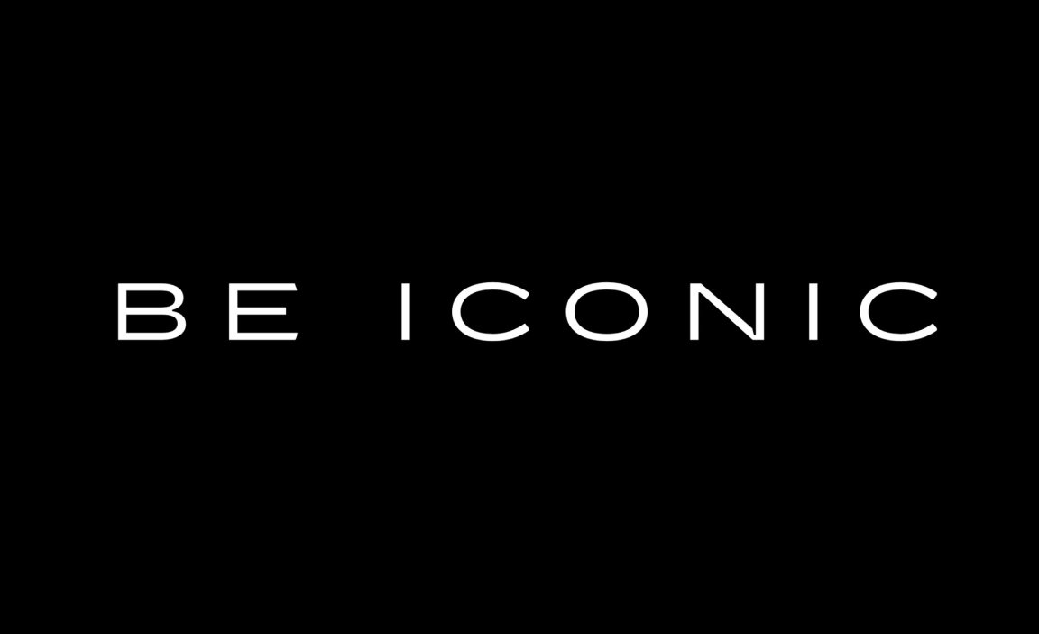
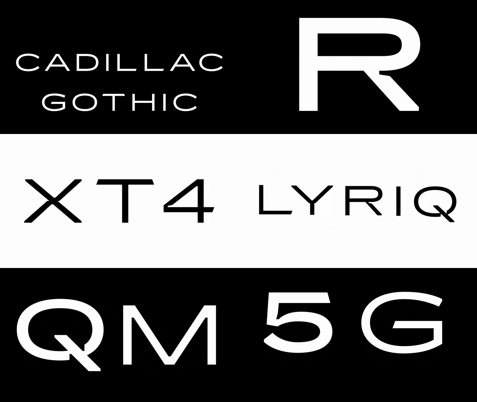
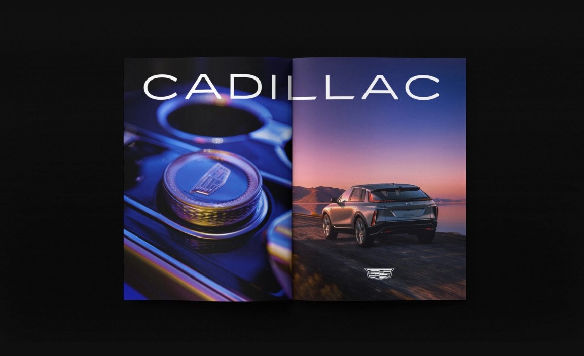
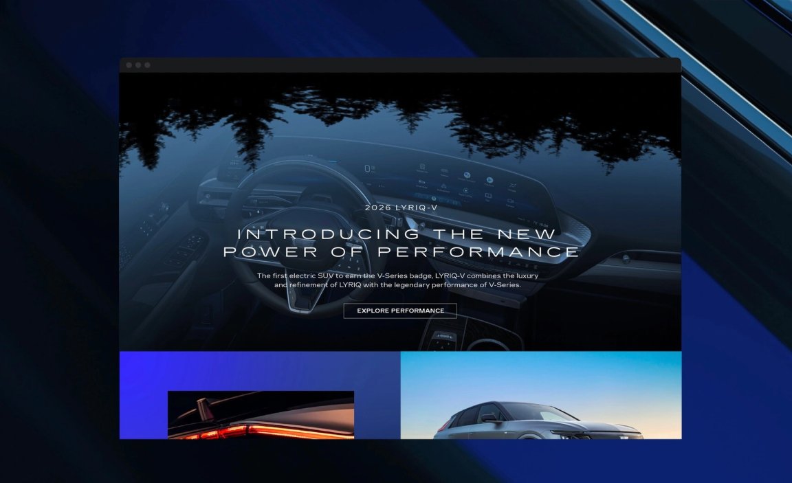
That motion carries into the typography, the challenge here was about making Cadillac feel like Cadillac again without falling into parody. Cadillac partnered with Colophon Foundry to create Cadillac Gothic, a custom type family rooted in the same proportions and confidence as their vehicles. Wide, elegant and heavy with presence.
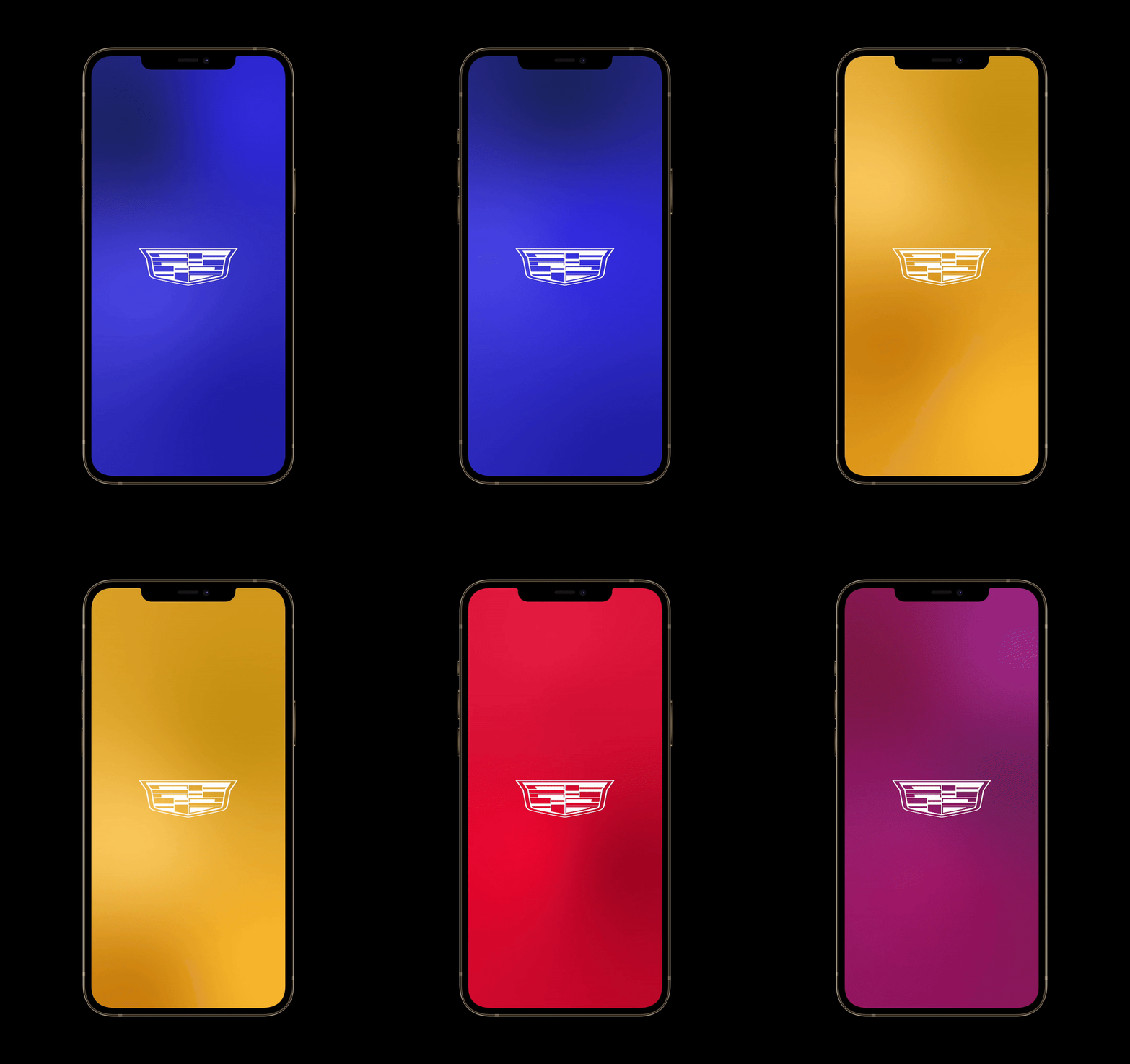
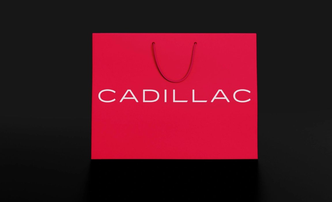
The color palette follows suit, drawn from the crest and evolved into both flat and gradient variations. Blue, red and gold become functional assets in the system and every piece of the identity system knows its job, from patterns to print materials.


The Pattern
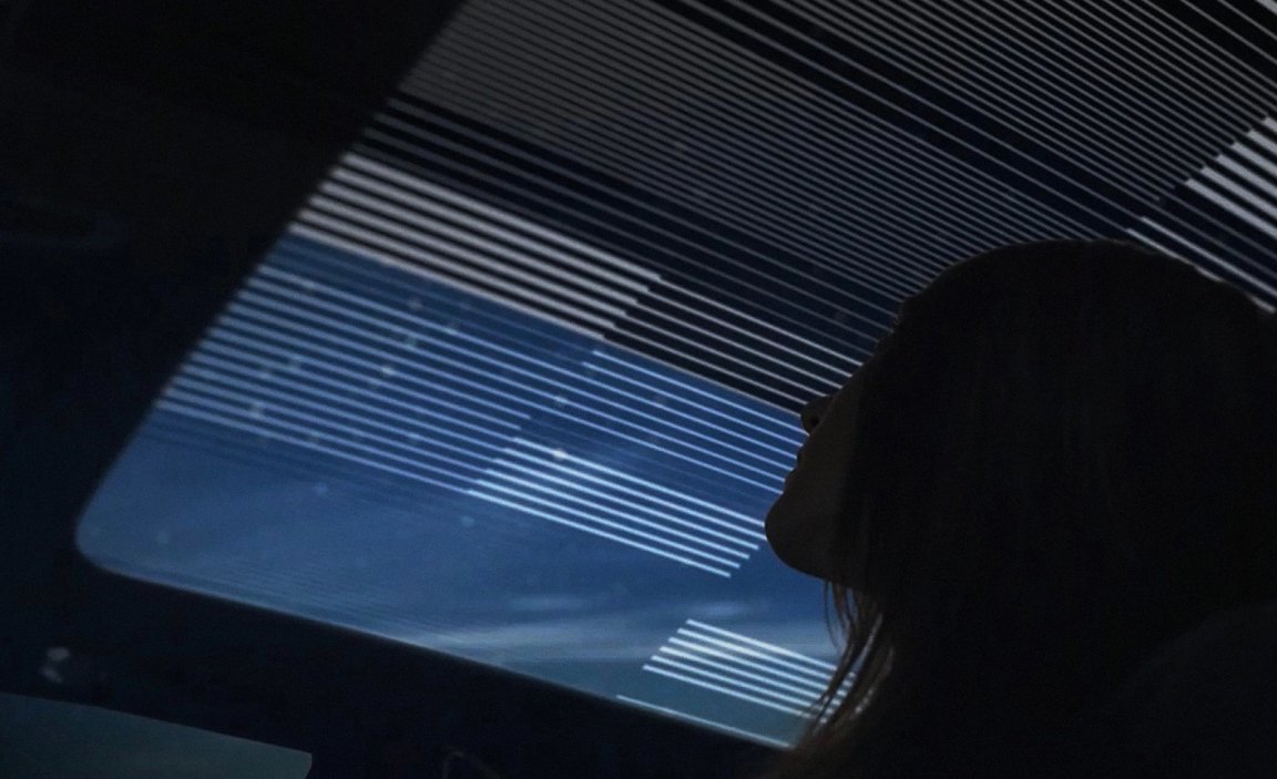
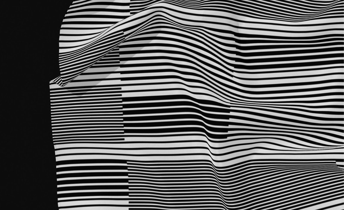
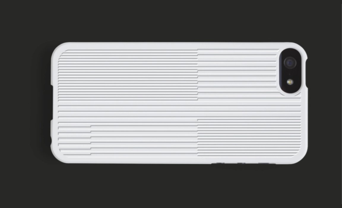
Mother Design built out a full visual system, one that could flex across media, geography and vehicle class. This system includes the Precision Pattern, a graphic language pulled from Cadillac’s own design details, echoing both automotive engineering and architectural elegance.
The system is modular by design. On a Celestiq roof, the pattern reads as a material experience. On a business card or phone case, it adds quiet complexity. There’s a thread running through everything.
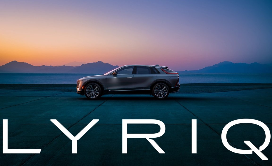
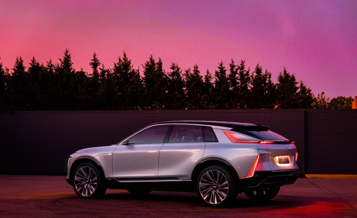
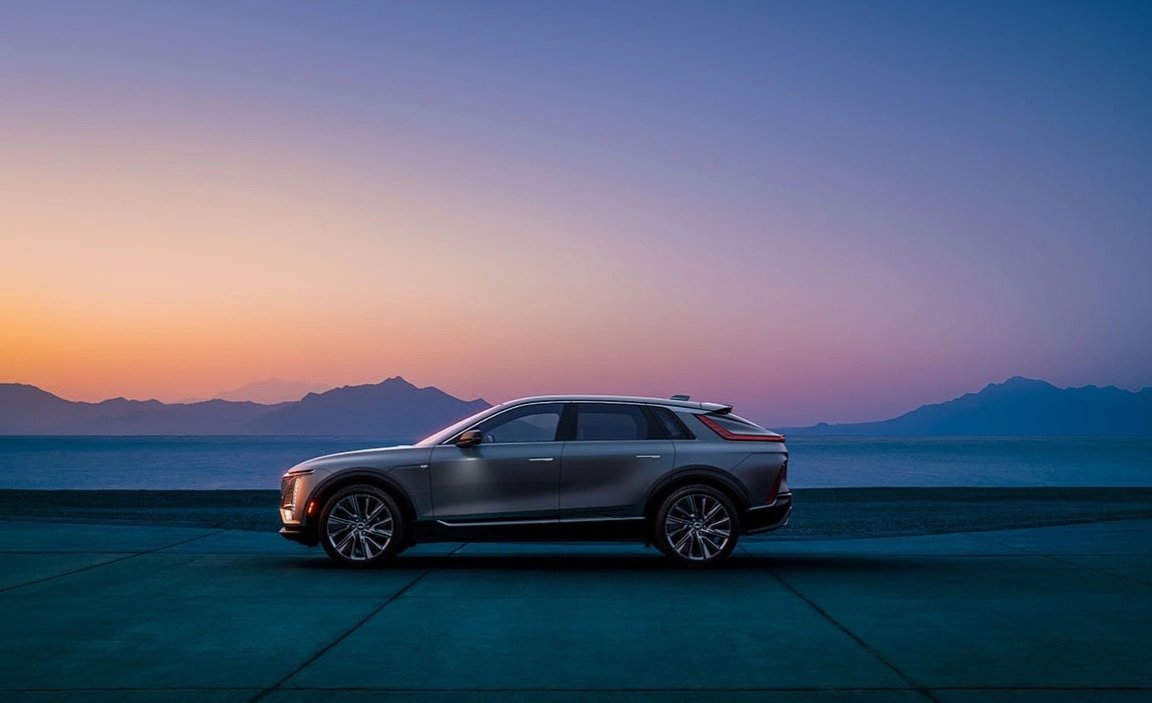
The photo direction also got an overhaul. Gone are the grey studio backdrops. Instead, Cadillac’s vehicles are shot in ethereal landscapes with surreal tones that echo the new brand palette. That same balance between precision and dream shows up in the way details are captured. Sharp reflections, soft backgrounds, tonal washes, it all reinforces the idea that Cadillac isn’t just about the machine but also about what the machine makes possible.
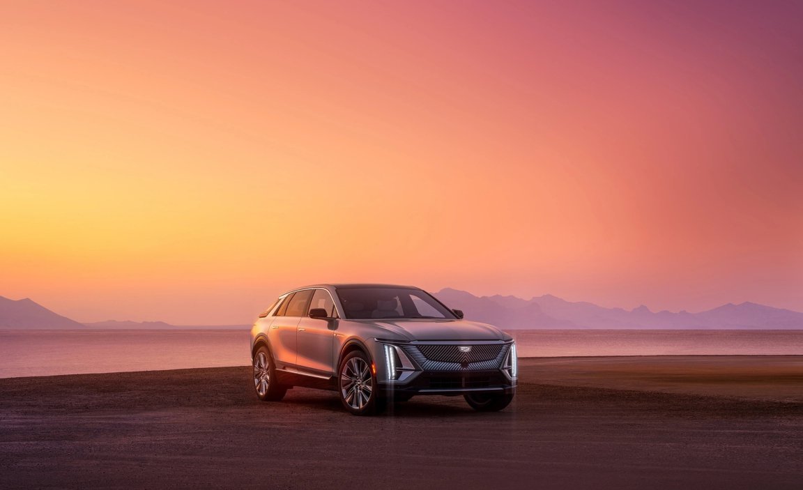
Everything from logo, type, photography, color and motion is built to serve the same idea, Cadillac is a confident, modern, American luxury brand.
It’s not trying to win the EV aesthetic war with gimmicks. Instead, it reclaims space Cadillac always had a right to, with a system that moves, adapts and still knows where it came from, and that’s the real win. Not the new crest, not the gradients, not the photography but the fact that for the first time in a long time, Cadillac’s identity was finally moving at the same pace as their ambition.
