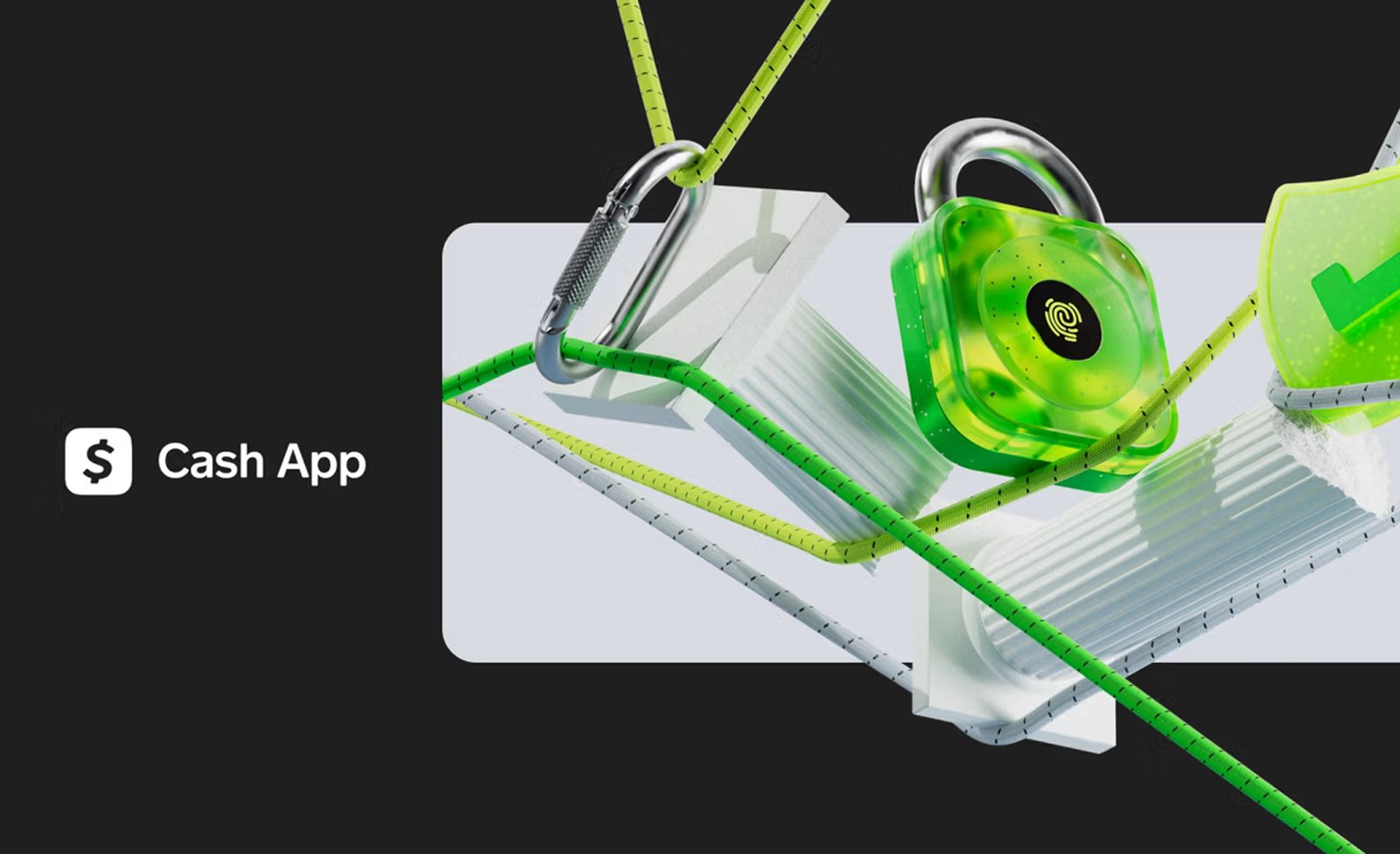
CashApp is pushing the boundaries of what a fintech brand can look and feel like, but the brand also needed a bold push that would preserve its upbeat spirit while evolving it for new frontiers. Together with global creative foundry Buck, Cash App embarked on a creative journey that demanded strategic precision, innovative thinking and more than a little rebellious energy. The result is a reimagined spatial illustration system that’s bold, tactile and utterly distinct from the wave of minimalist designs flooding the industry today.


Cash App’s voice has always lived at the edge… smart, sharp, never sterile. But when you start expanding into new product territories, that edge becomes harder to hold. It’s easy to fall into the pattern of flattening things out. Playing it safe. Becoming one more grayscale fintech brand trying to look premium.
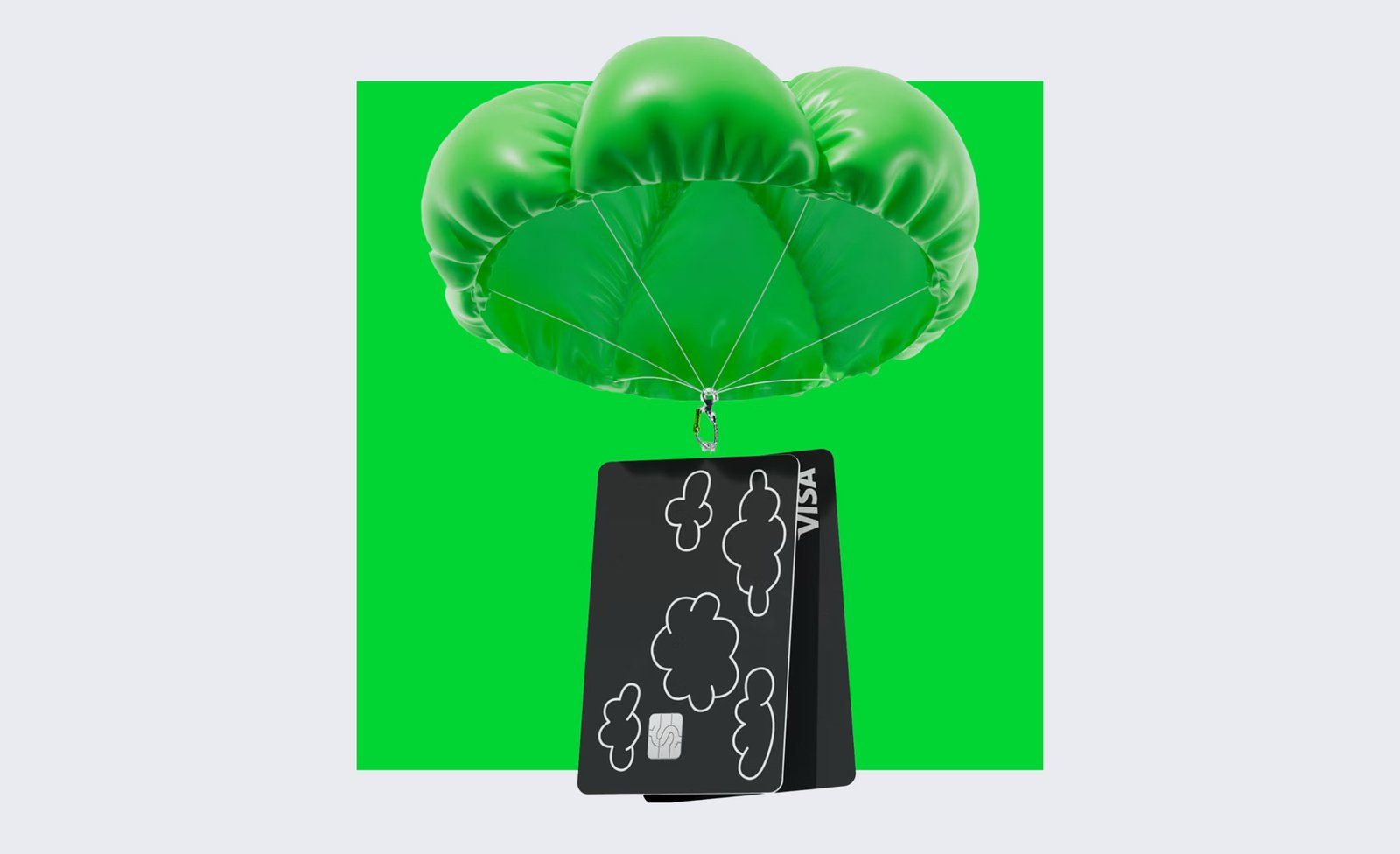
One reason this new system feels so authentic is the time Buck invested in ideation, composition and conceptual thinking. Rather than chasing short-lived trends, they explored every visual cue (from paracords to parachutes) to see how each piece could tell a story. It’s an approach grounded in the belief that good design doesn’t just look cool, it resonates over the long haul.
They didn’t try to blend in or flatten out. They developed a design strategy and purpose materials that would serve as the backbone of the project and one built on confidence, color and a kind of curated chaos that makes you look twice. Together with Buck, Cash App developed a design system that didn’t mute the brand’s voice, but gave it more room to speak. Across 3D illustration, iconography, motion and social expression.
Buck helped Cash App mature without losing the edge that made people care in the first place.


Design Strategy
Cash App didn’t need new personality traits, they needed more alignment withiin existing elements. The brand was already speaking clearly on social, in-app and out in the world. But the system under the hood hadn’t caught up yet. So Buck’s goal wasn’t to overhaul the language, but instead to define the grammar.
They created a flexible set of principles that could scale across product and marketing without feeling forced. The structure was rooted in three brand values: Clarity, Brilliance and Security. They translated into visual logic: how objects were composed, how light and material were treated, how space and form supported storytelling across every asset. What makes the system work is that it’s not purely stylistic. Every visual choice down to the treatment of a single icon was designed to support an idea. Is this moment about confidence? Precision? Play? That level of rigor required time. And Buck took it. They invested in concept development and composition before touching production.
For those who follow my posts, you know I’m a big believer in Virgil Abloh’s 3% rule: sometimes all it takes is a subtle shift to spark a massive transformation. Buck operated by that same principle. Instead of tearing down Cash App’s identity, they honored its vibrant personality, making only the moves necessary to elevate the brand.
Where many brands cave to minimalism, Cash App held onto its playful, rebellious DNA. So even when it came to territories like Banking, Commerce, Security and Scam Protection, preserving that unique identity was paramount. Finance doesn’t have to be cold or boring; it can feel tactile, relatable, even fun. Rather than stripping away color and character, they leaned into them, ensuring the brand would remain instantly recognizable in a sea of sameness.


Tactile as Language
Visual storytelling in fintech usually swings one of two ways: flat and safe, or flashy and generic. Buck found another lane. The world they built with Cash App was tactile, dimensional, and emotionally legible, even when the subject matter got dense.
There’s a tactility to the imagery that feels almost analog. Paracords, locks, parachutes, coins each object is physically grounded but slightly surreal, sitting in its own sculpted space. Narrative tools used to translate abstract themes like scam protection, commerce or security into something you could feel. The way they handled abstraction? Controlled. Balanced. Structured enough to land a point, loose enough to leave room for interpretation. In a world of overused gradients and floating blobs, these visuals actually told stories.
If you’re someone who can read tone through lighting or sense personality in object scale, this system lands immediately. The tactile choices were aesthetic pleasing and strategically oplaces. They make the brand feel secure without being cold. Bright without being loud. Playful without losing credibility.
Virgil Abloh’s 3% Rule teaches us that tiny, well-chosen tweaks can radically transform the familiar. Buck embraced this principle for Cash App, leaning into a series of small but significant changes that kept the brand’s offbeat DNA intact. Instead of stripping away color, humor and character, often the first casualties of a rebrand, Buck honed in on what made Cash App stand out.


Real-World Testing
While the system was taking shape, Buck was also running creative tests in-market. Real assets, on real channels, in real time. TikTok, YouTube, Instagram, Google. Each one with different tempos, tones and visual demands.
Which concepts carried? Which fell flat? What kind of movement made people pause? That feedback loop informed how motion was used across campaigns, how compositions were cropped and paced, even how light interacted with materials in different digital environments. Out of this came a secondary expression of the system, a bespoke marketing layer built specifically for fast-moving, high-volume content. The energy of the work shifts without breaking form.
This is where a lot of systems fail. They’re built for decks, not deployment. What Buck delivered was a system that survived contact with reality. And looked better because of it.


Rethinking Digital Money
Brands like Coinbase, Wealthsimple and Venmo have already shown that money doesn’t have to be boring. Buck and Cash App push that even further, reminding us that finance can be colorful, quirky and loaded with attitude.
The secret? Start with a strong brand spirit, apply small but meaningful tweaks and invest in a creative process that values experimentation over chasing the next fad. The result is a system that looks forward without leaving its soul behind. That’s the kind of design evolution we need more of.


