In 2020 we all felt it, too many screens, too much swiping and not enough presence. While tech helped us survive lockdown, it couldn’t replace the feeling of being there. Eventbrite recognized this faster than most brands. As the world slipped deeper into digital dependence, they doubled down on the thing their platform was always built for… helping people gather.
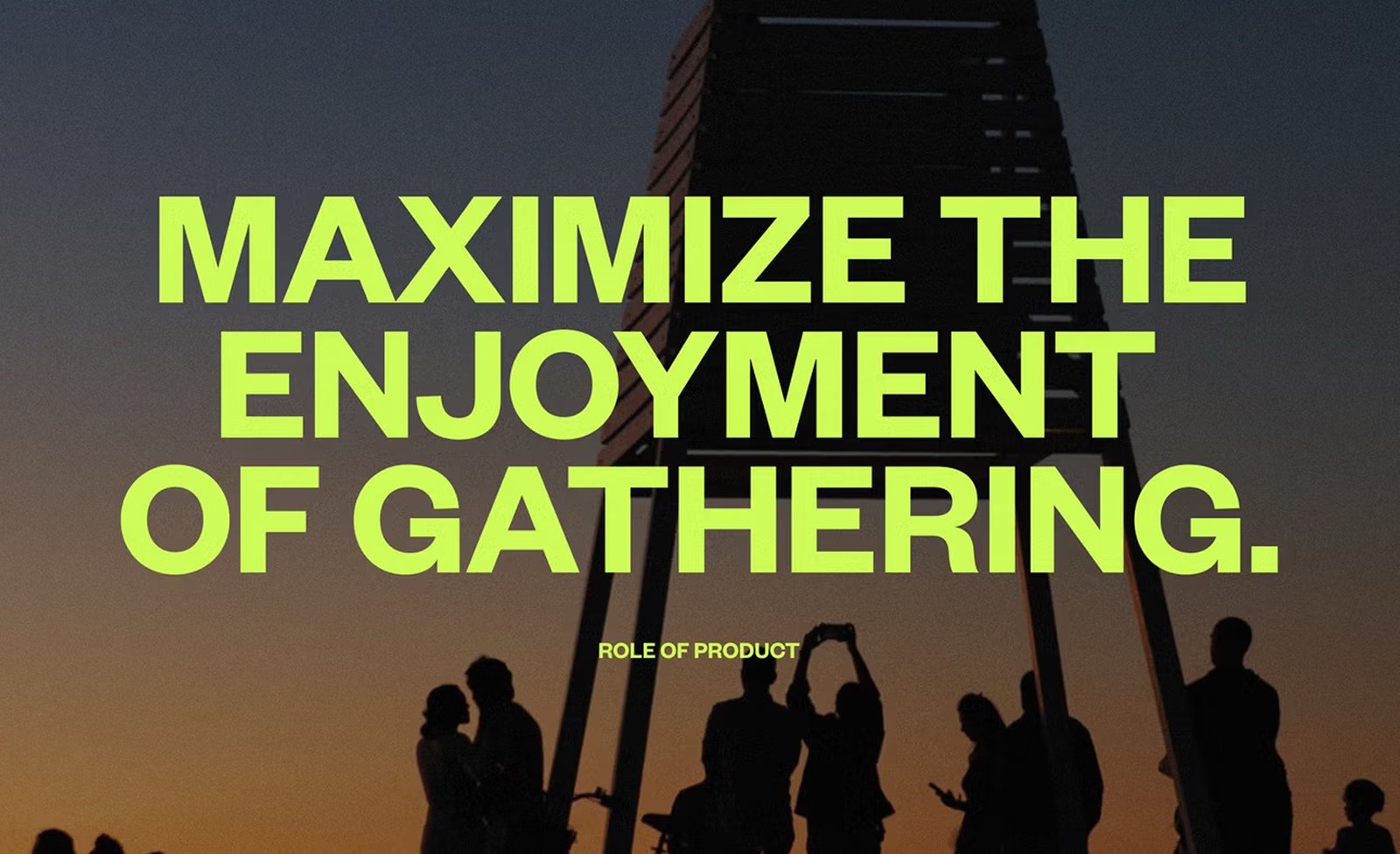
In collaboration with global creative foundry Buck, the mission was simple, bring people together through live experiences. A shift that required Eventbrite to become a brand that could not only scale visually and emotionally, but also help people maximize the enjoyment of gathering.
Eventbrite needed to move beyond being just a place where you buy tickets but transform to become the spark that gets people out of the house, into the moment and face-to-face with their communities. This meant designing a system that could reflect the full emotional range of real-life events, from forest forages to dance battles to niche workshops you didn’t know you needed until you showed up.

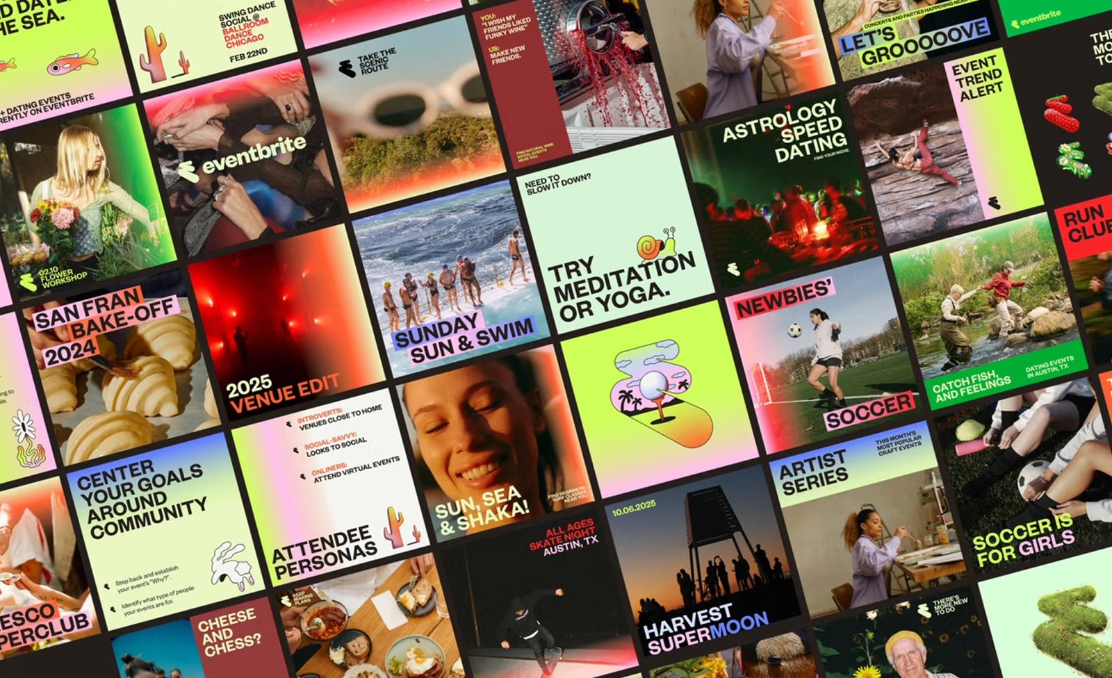
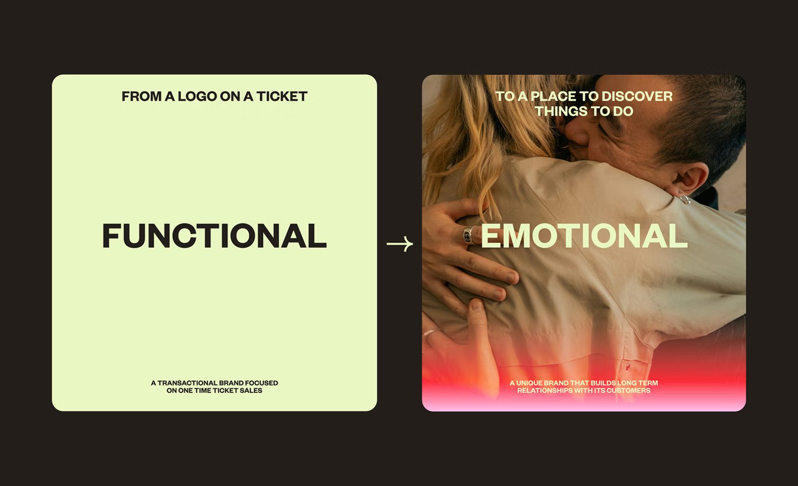
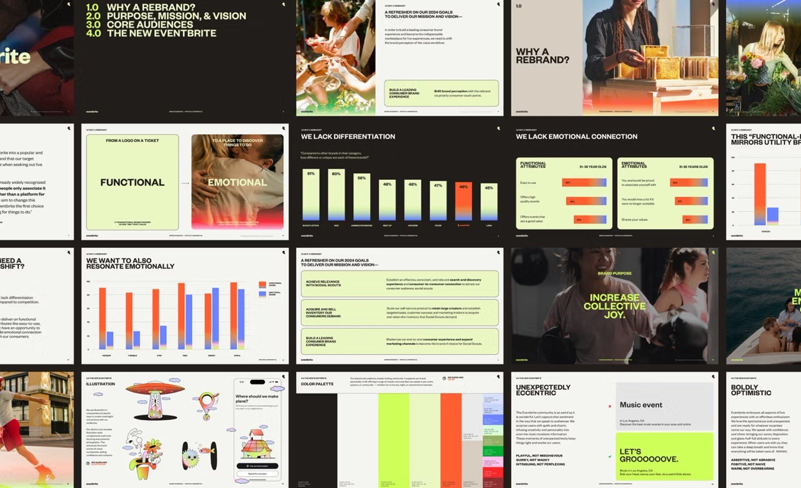
Before the redesign, Eventbrite’s identity felt like a receipt. You’d use it, then forget it. But the team understood that the world had changed since 2020 and so had expectations around in-person events. People were craving moments that felt spontaneous, local, joyful. The brand needed to stop looking like a ticket stub and start acting like a doorway. Their new mission Bring people together through live experiences is a system-wide shift that includes, the product (more joyful), the platform (more empowering) and now the brand. The outcome is a complete identity overhaul built for speed, flexibility and emotion.
The core problem was perception. Eventbrite wanted to show up as more than just a backend tool for organizers. They wanted to be a catalyst for gathering. From forest forages to karaoke raves to dog costume parades, Eventbrite powers the spaces where culture actually happens. Now their brand finally reflects that. The goal wasn’t to reinvent the brand, it was about aligning Eventbrite’s outer layer with the same internal clarity. It was translating energy, movement and presence into a new system that had to work at every level, from app icons to sidewalk posters. And it had to make people feel something.
Giving Eventbrite a voice
The first step was voice. Not the kind you workshop in a deck but the kind that lives across interfaces, notifications and copy. The new Eventbrite tone is alive. Boldly optimistic, weird in the right places and always human. It’s not afraid to sound excited. It’s not afraid to sound like someone you’d actually want to hang out with. It also scales. You can hear it in a push notification reminding you about a comedy show and again in the footer of a landing page for a plant-care meetup. It flexes based on where it lands… sometimes direct, sometimes eccentric but always anchored in a sense of shared experience.
This shift also gave organizers a clearer model. If the platform speaks like this, your event can too. That ripple effect where users model their communication after the platform’s voice is a quiet but powerful brand move. You’ve seen it before, people don’t just post on LinkedIn, they sound like LinkedIn. The voice is so distinct it’s become its own genre, with terms like LinkedIn lunatics used to describe the tone that’s now part of the platform’s culture.
This only works if the voice is consistent and clear. In a way, Eventbrite’s tone is now doing the same job the product does, guiding people into new experiences, removing friction and making things feel simple. The difference is, this layer works in both visual language and in code.
A logo that moves like people do
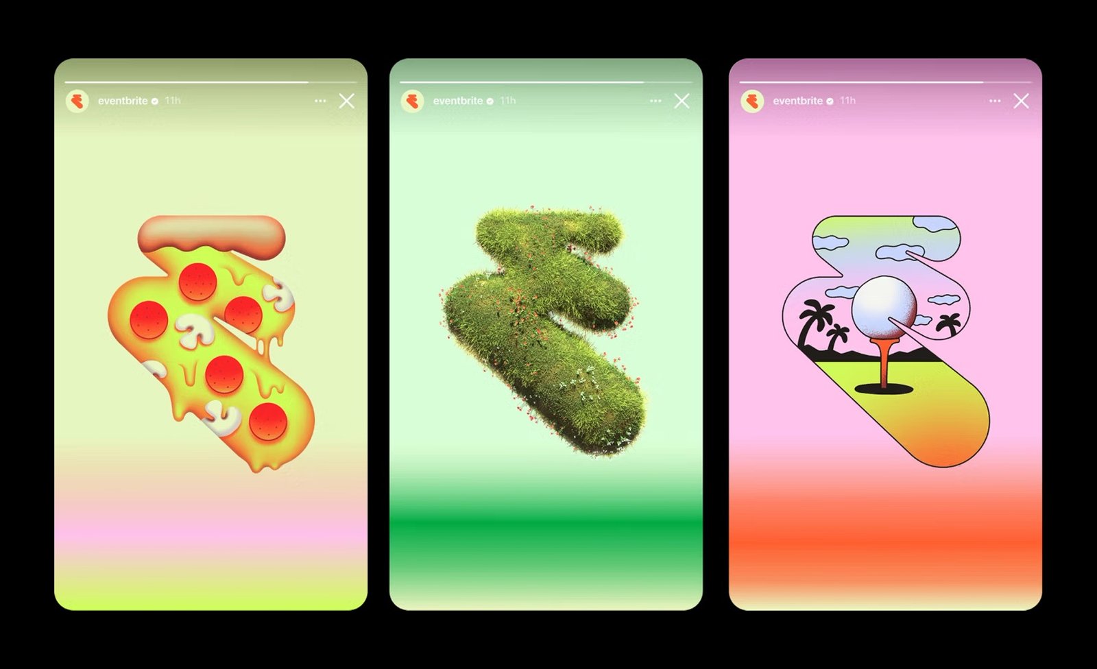
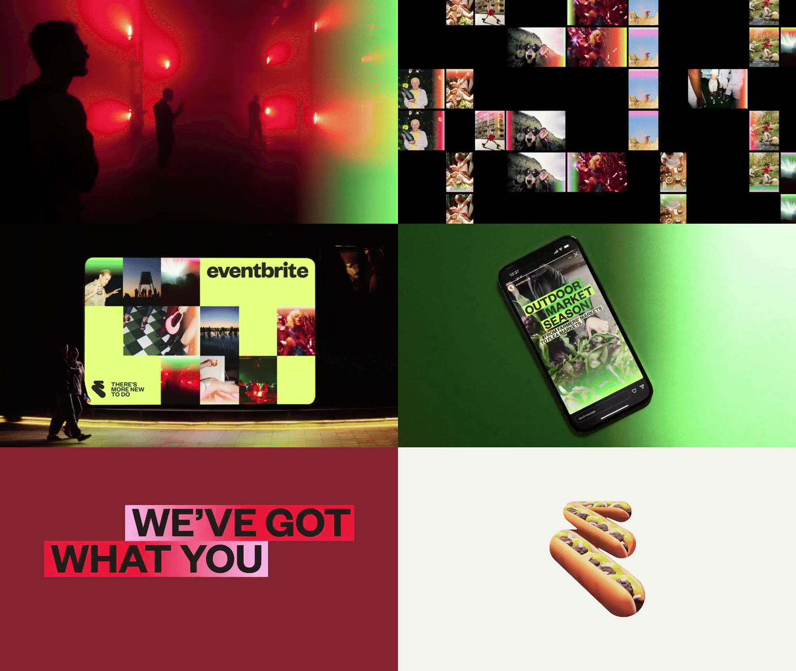
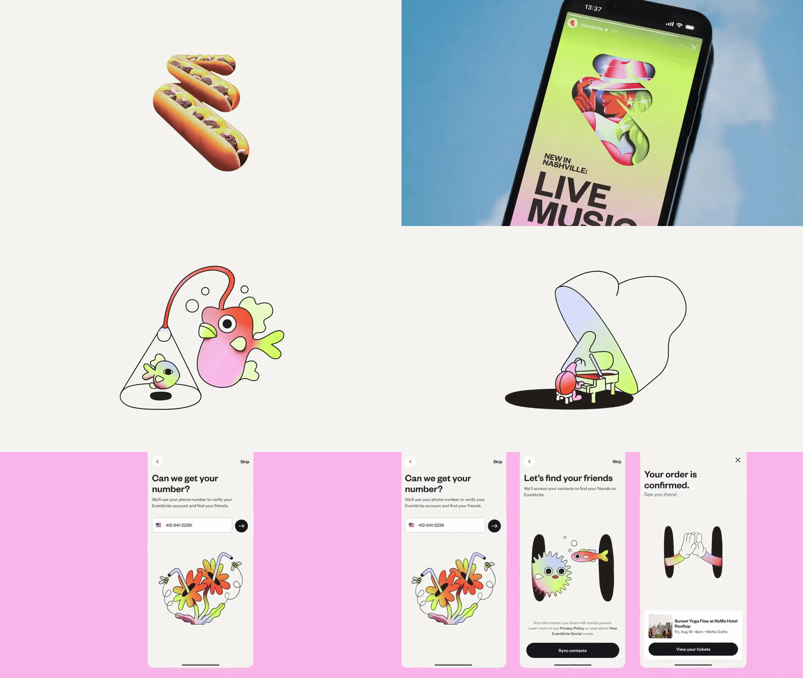
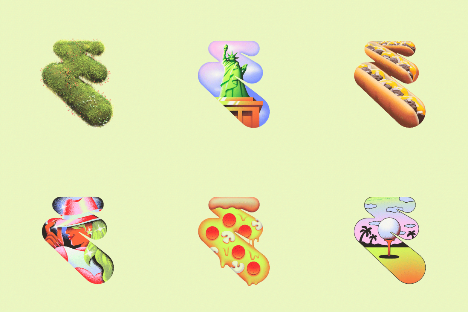
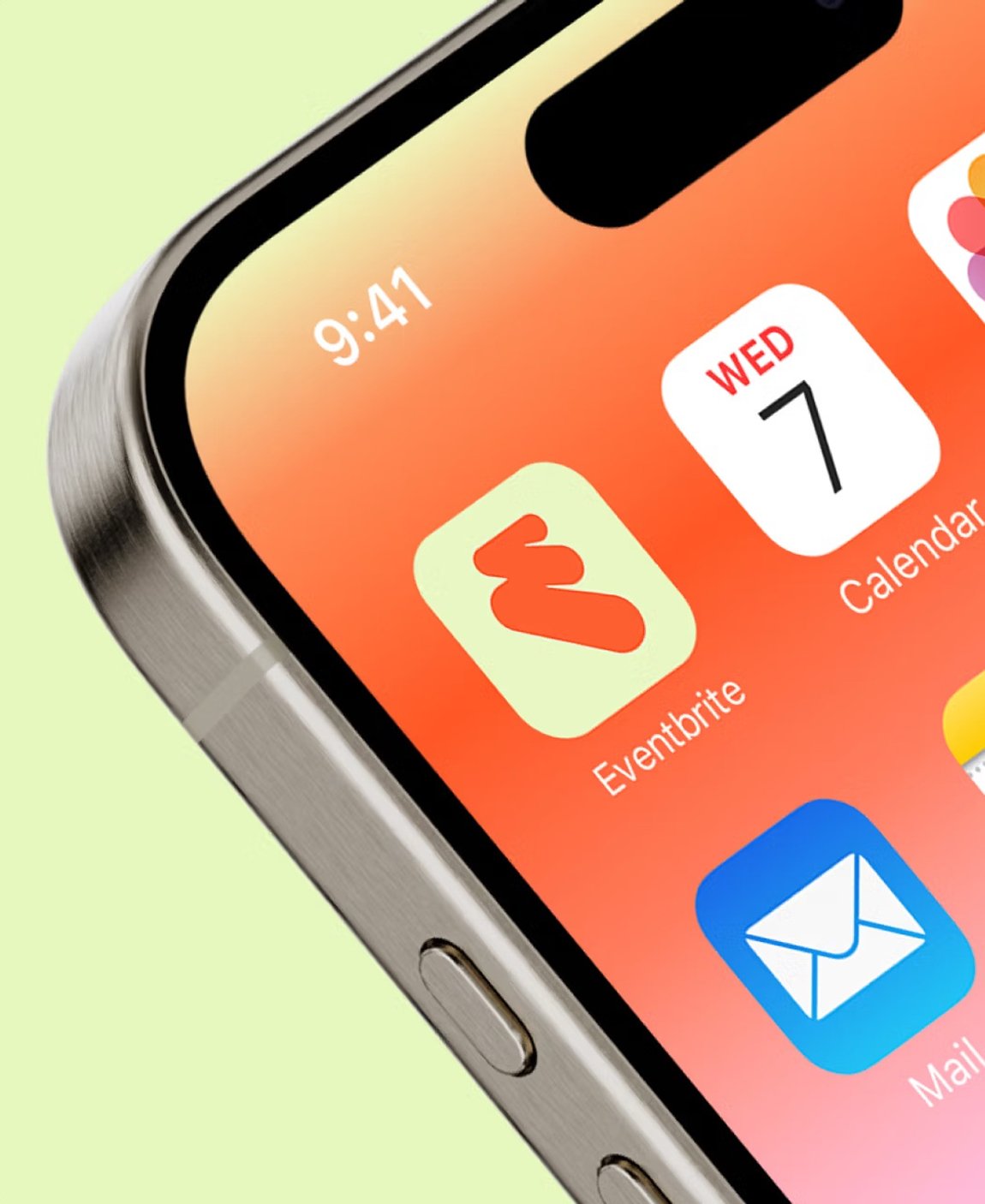
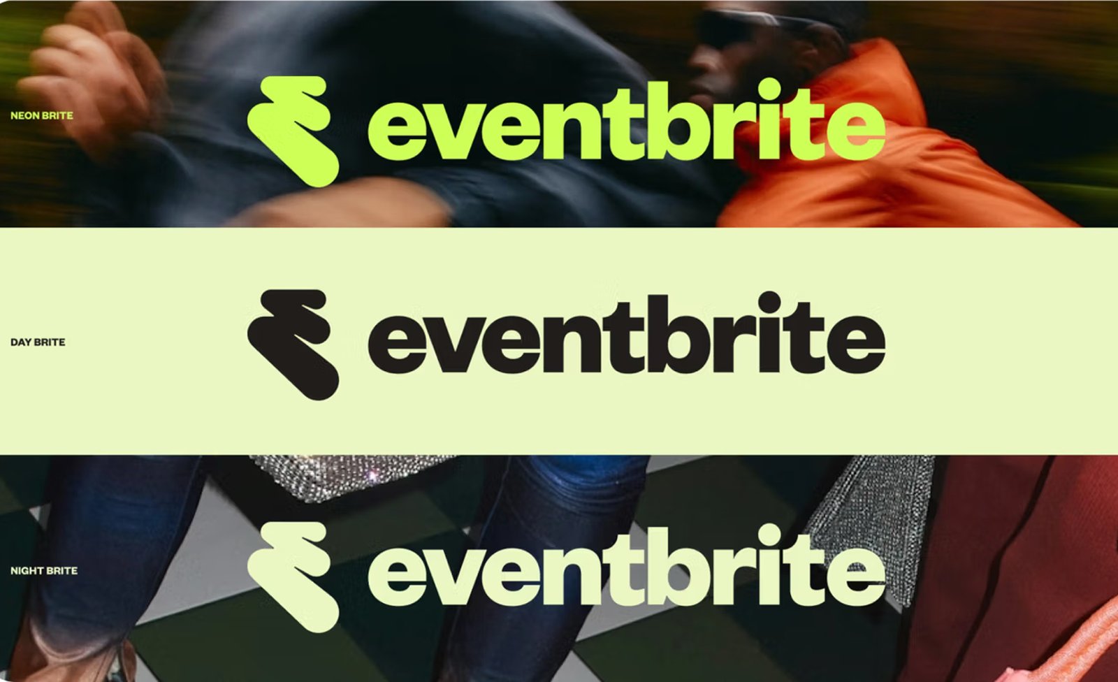
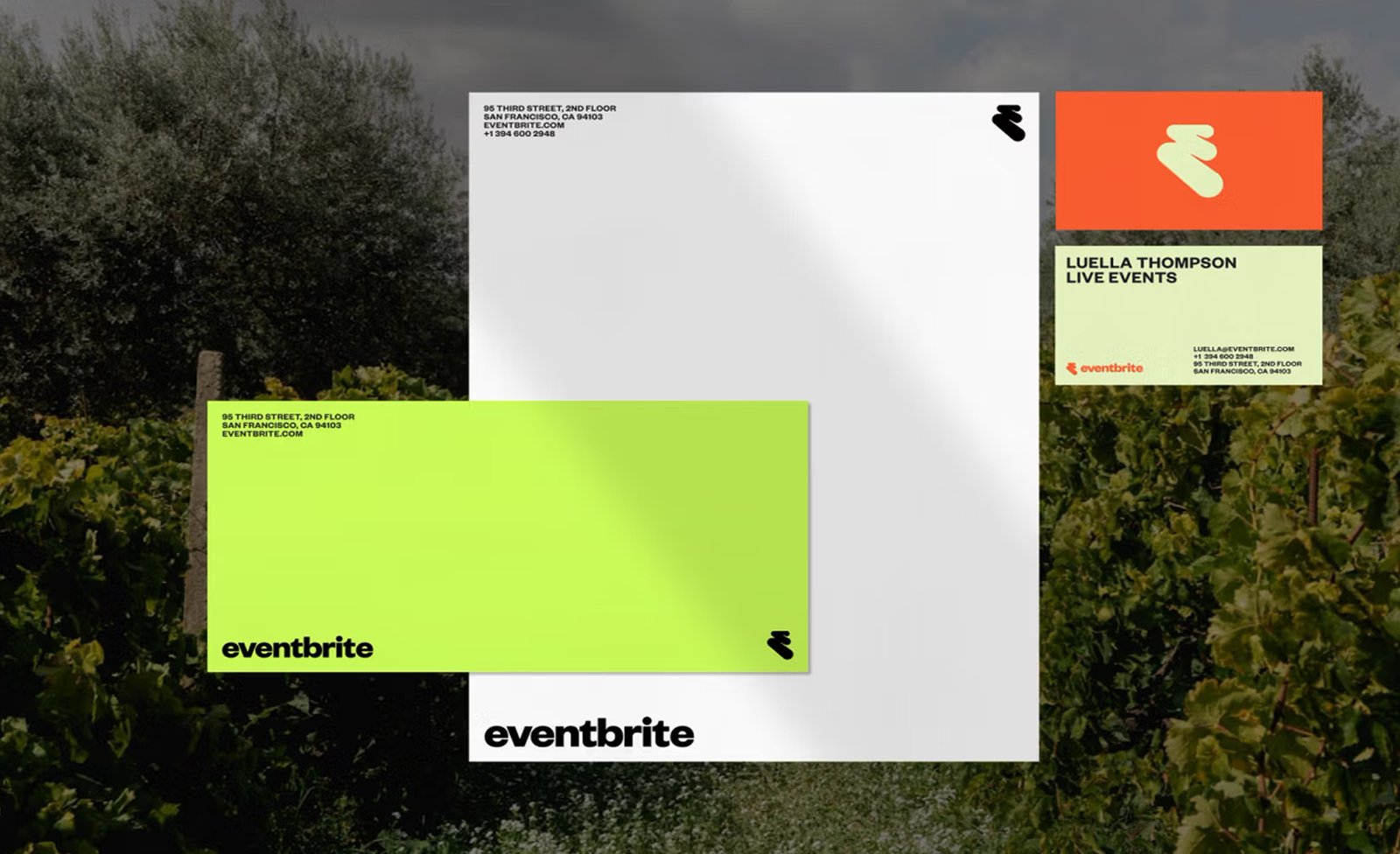
The new logo starts where most logos stop. It doesn’t just sit there it shifts, it thickens, it pulses. Designed as three interconnected forms that move in rhythm, the updated Eventbrite mark captures what live events actually feel like… kinetic, layered, electric.
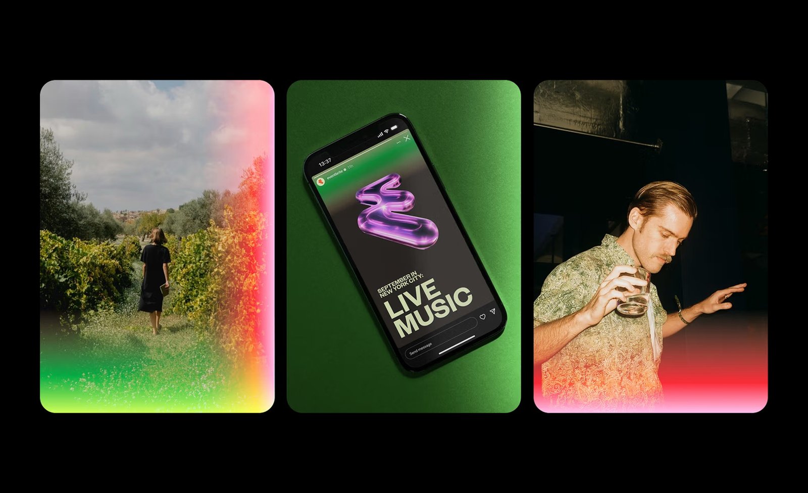
It’s not abstract for the sake of it. The motion represents the feeling of energy building in a room. The decision to visualize that tension was smart, where most platforms in this space flatten out, Eventbrite leaned into physicality. What anchors the system is how the logo interacts with other elements. It works with photography, glows against dark gradients and holds its own in motion. That versatility lets it appear everywhere without losing shape or energy. It’s recognizably Eventbrite, but never static.
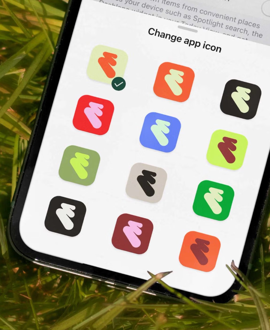
The logo also works symbolically. You don’t need to be told what the shapes mean. But if you feel like decoding it, you’ll find the same themes that guide the rest of the system… connection, rhythm, joy. It’s not about hitting you over the head with meaning but about making sure the feeling lands. And it does land. Especially alongside the expanded color system, which adds highlighter tones to Eventbrite’s already recognizable orange. It’s a brand that glows literally, and sets the stage for everything else to follow.
Building the amplified brand
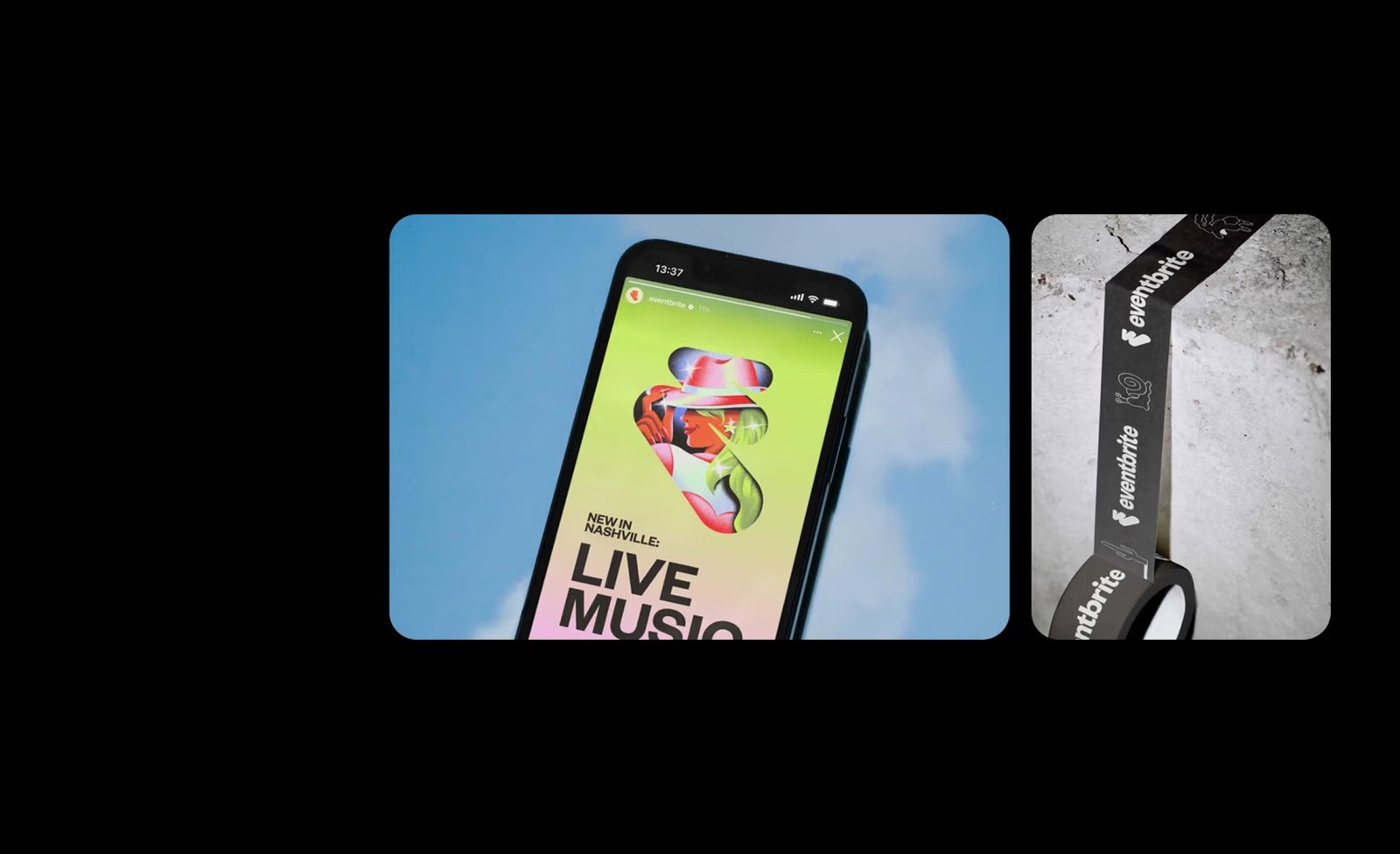
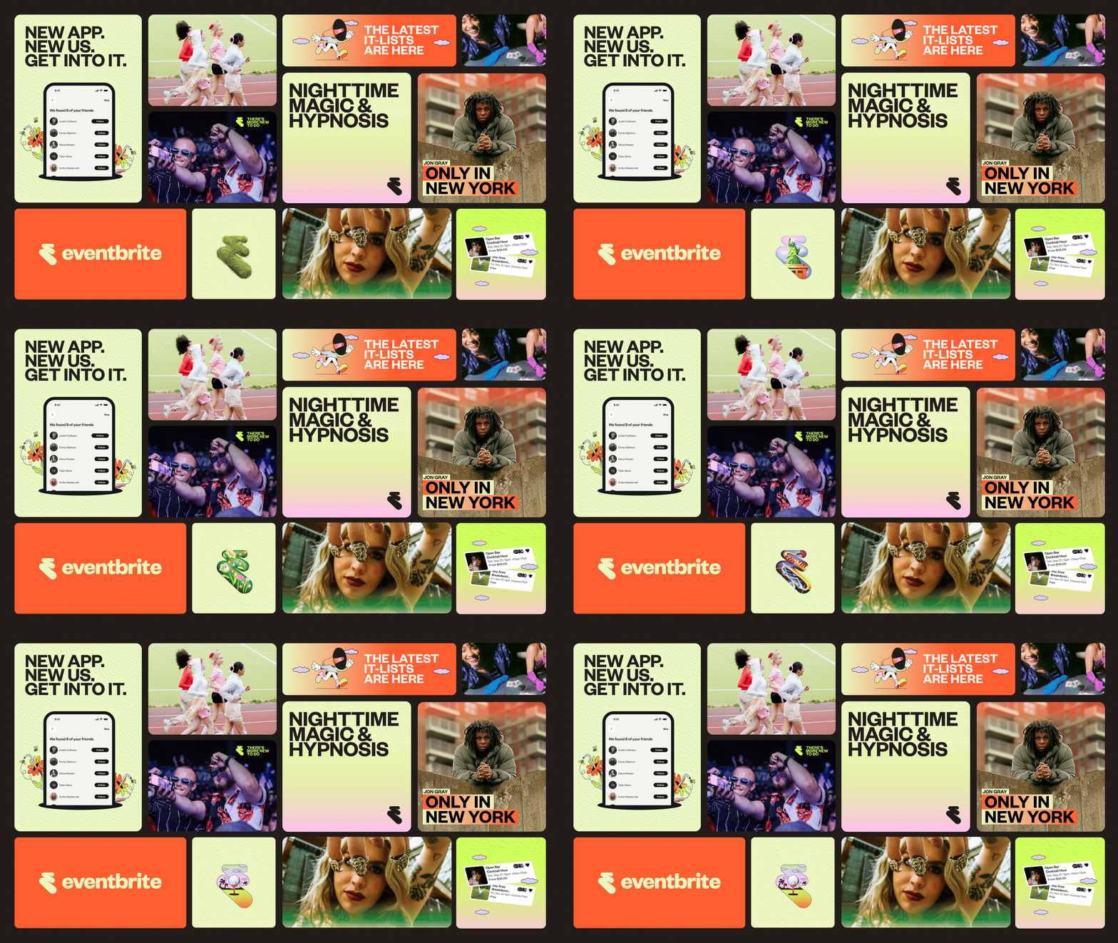
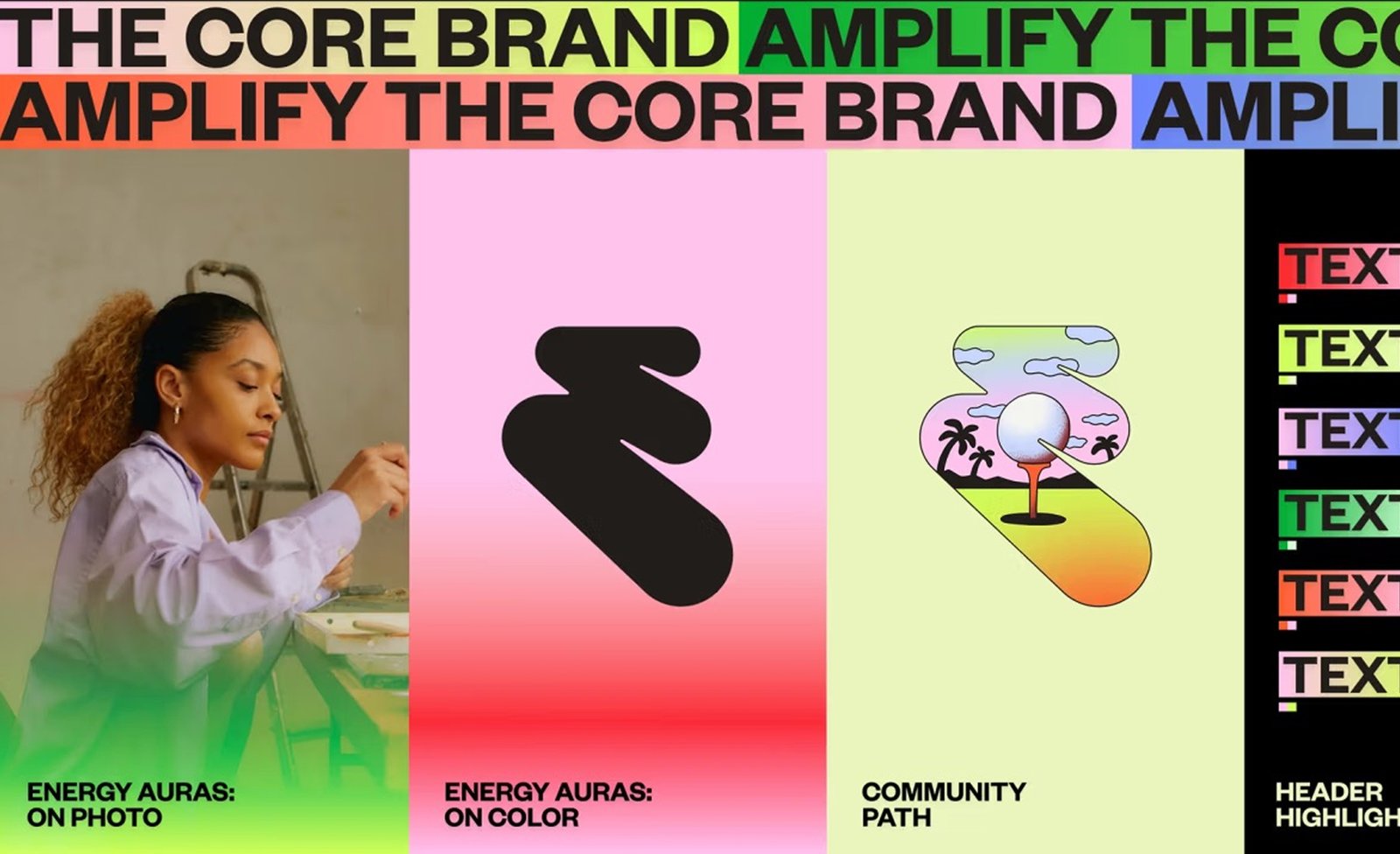
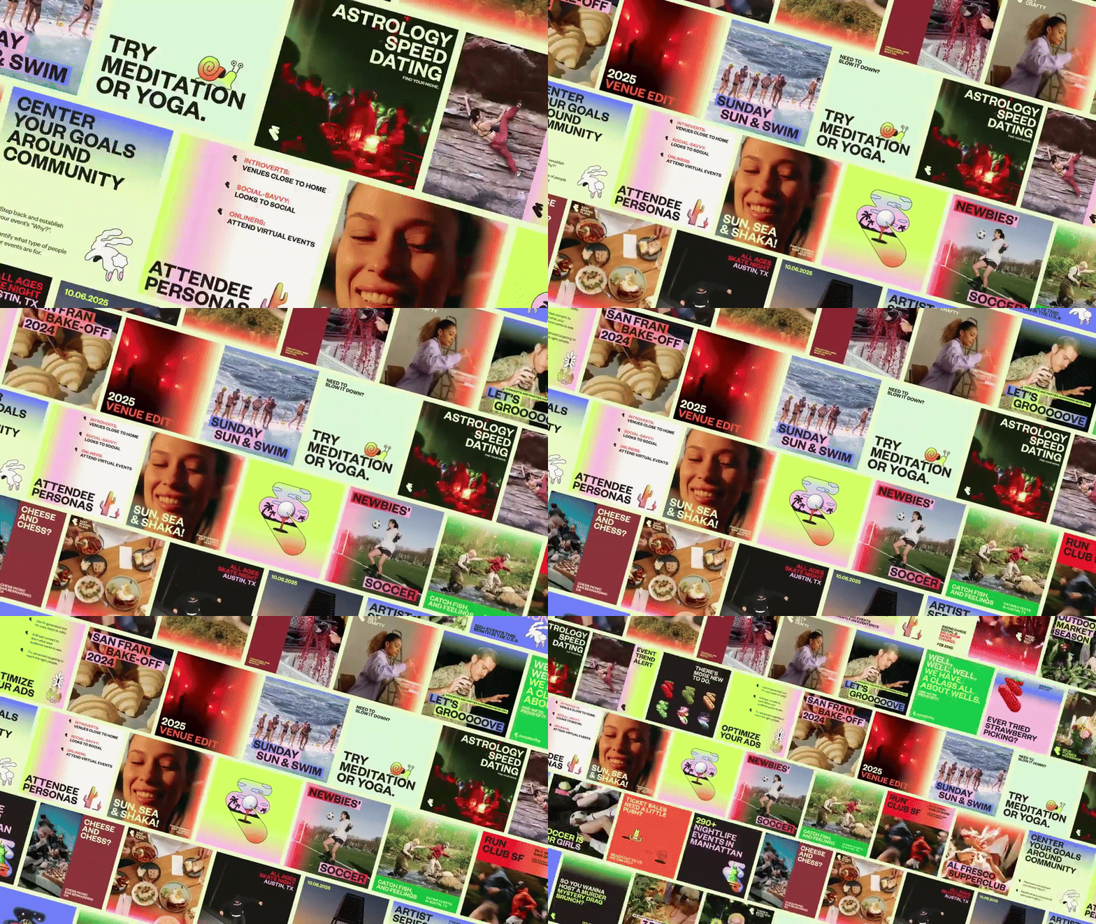
If you’ve seen how Eventbrite shows up across different surfaces e.g subway takeovers, email headers, Instagram Stories—you’ve probably already met The Amplified Brand. That’s what Buck calls the more expressive layer of the system, built for marketing, motion and storytelling. This version of the brand introduces techniques like the Header Highlighter (bold type overlays that hold up against noise), Expressive Paths (where the logo turns liquid) and Energy Auras (neon glows that hover and pulse).
They’re tools that serve to scale Eventbrite’s energy across more chaotic, attention-poor environments. Whether you’re scrolling a playlist of events or walking past a poster for one, you should feel the same buzz. And that’s what this part of the system enables: expressive consistency.
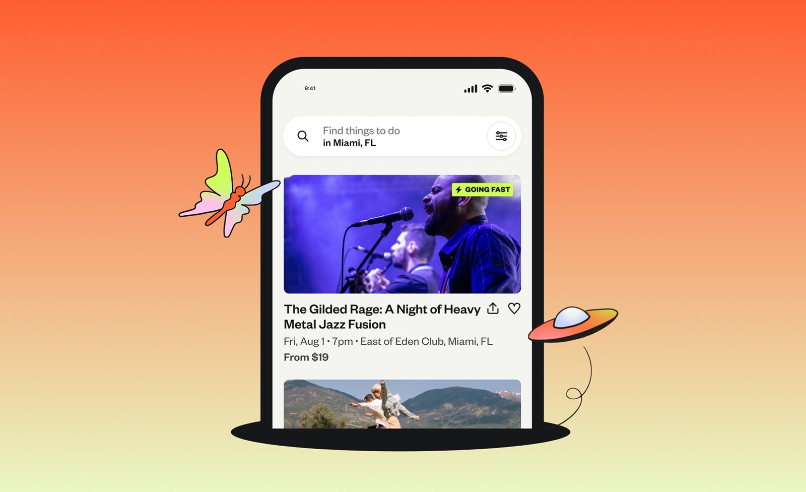
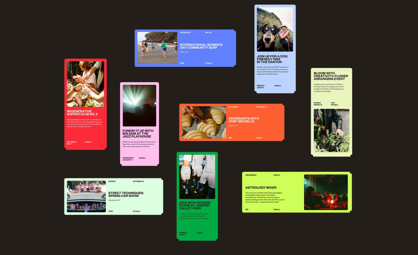
The challenge here was building something flexible enough to stretch across countless use cases while still holding together visually. That’s why the system allows for interchangeable media across gradients, photo, illustration and text. It’s built to be mixed. This flexibility is a quiet win because the real test of any identity isn’t how it looks in a brand book but how it looks when your intern uses Canva and this new system is strong enough to hold up under that pressure.

A platform for every kind of person
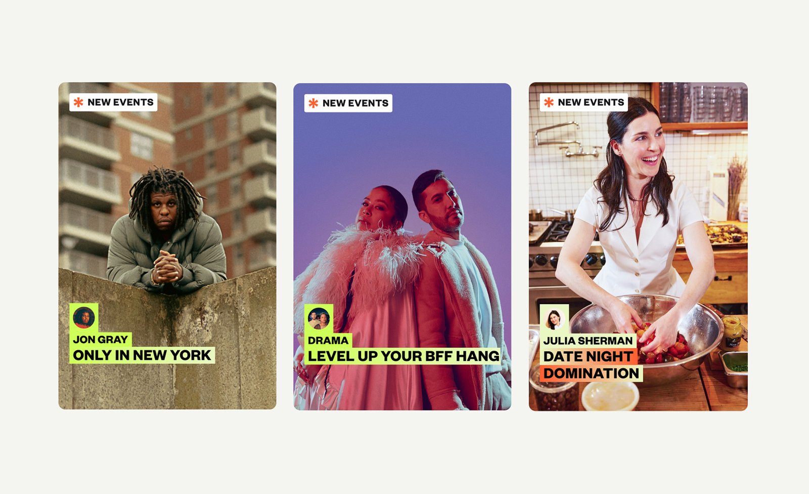
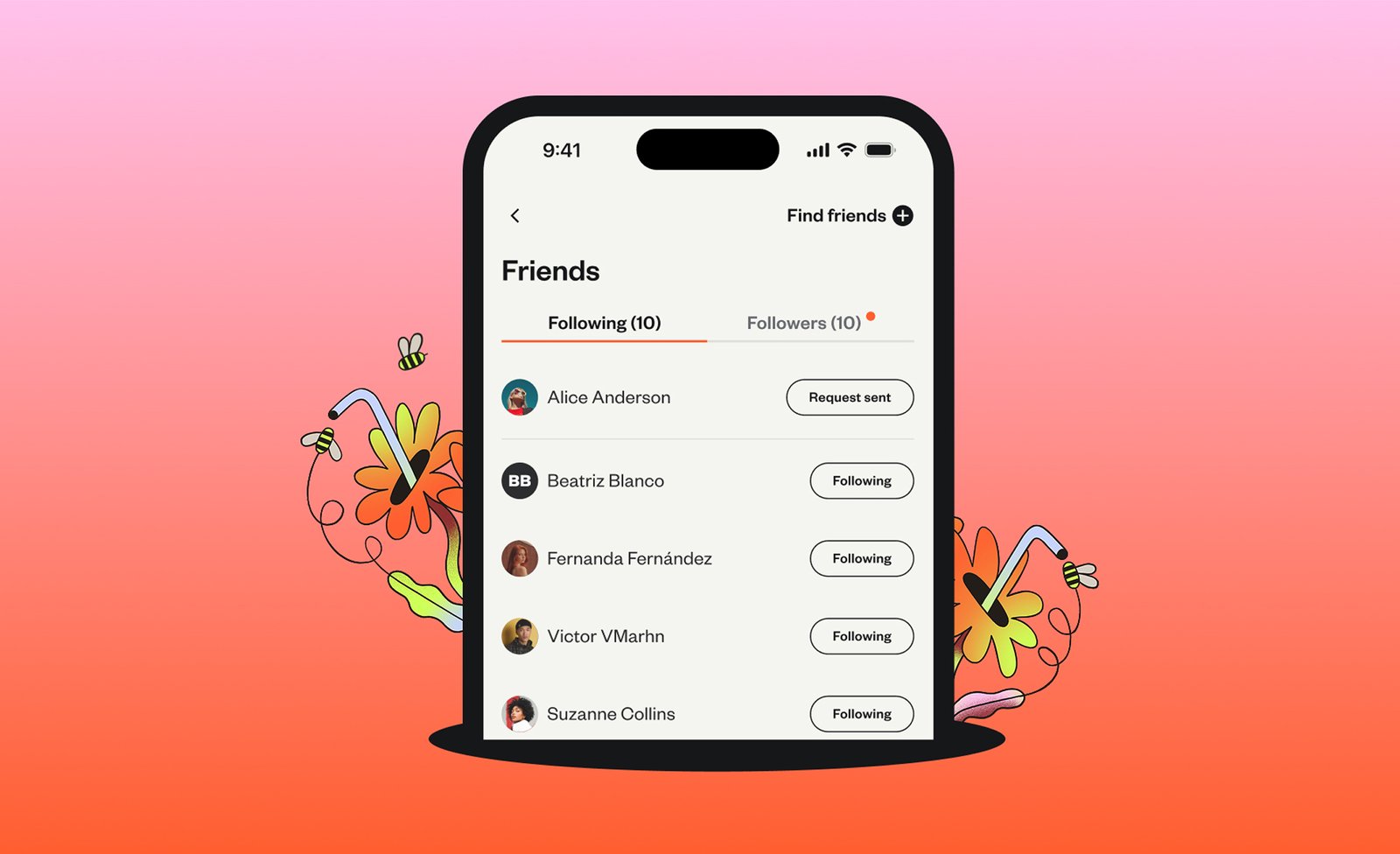
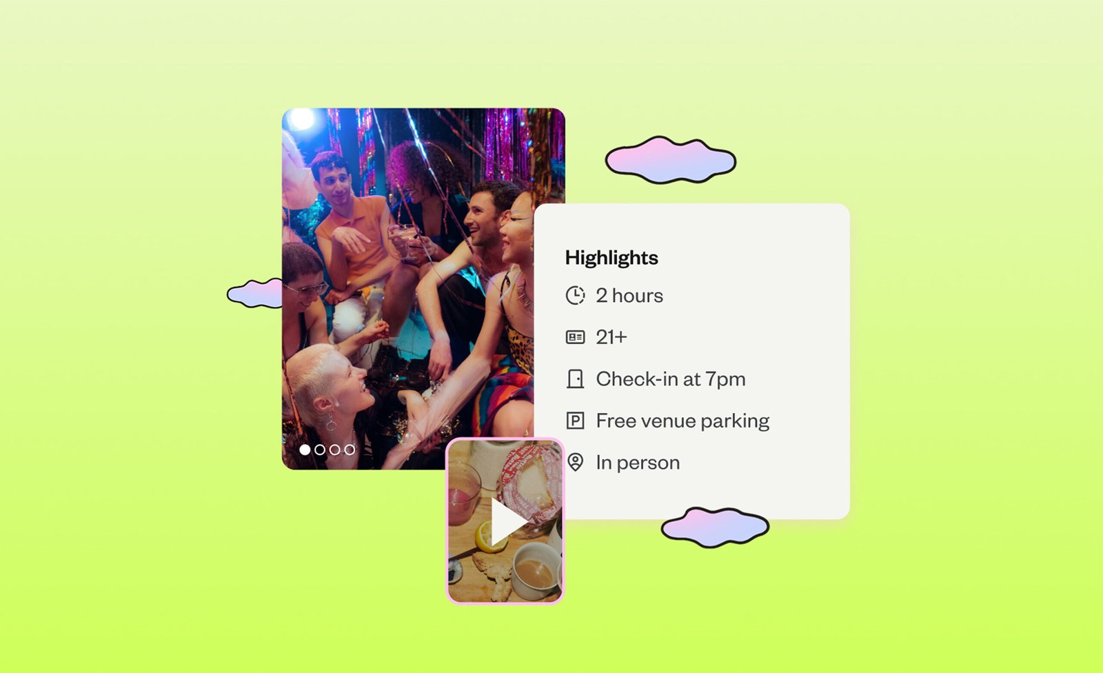
Photography, illustration, type, UI across every layer of this brand is a collection of elements working to tell the same story. Not about the platform. About the people who use it. The photography guidelines embrace mess, motion, and moment. The illustrations are surreal but grounded, metaphorical but warm. The visual voice is coherent without being sterile. Even the smallest brand moves reinforce the idea that this is a platform for every kind of person.
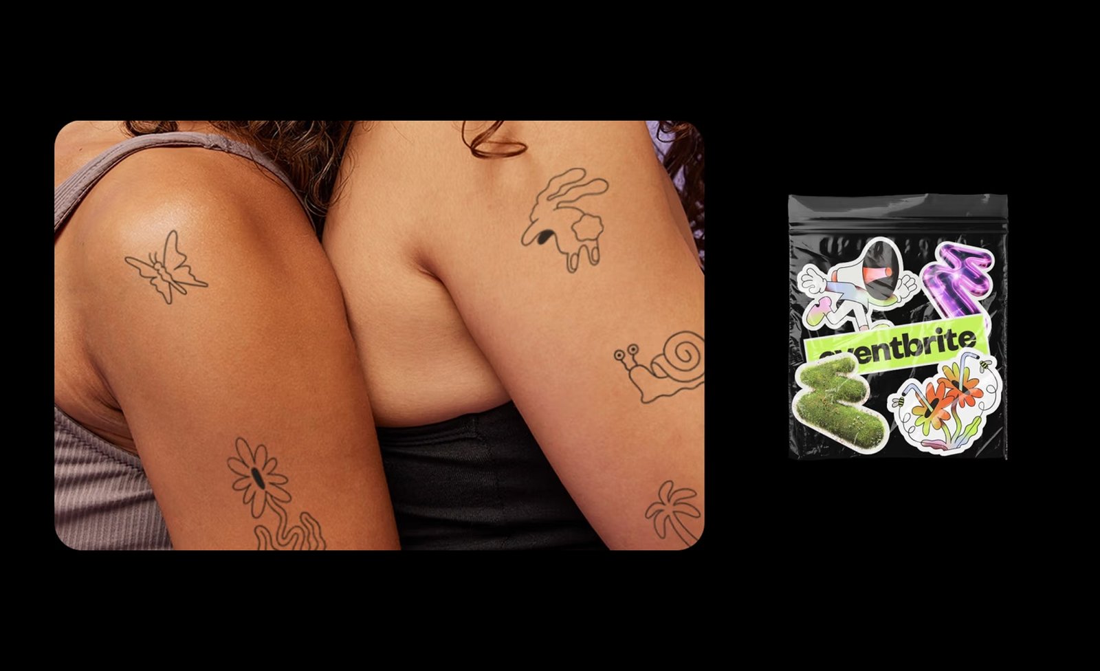
You see it in the way photo subjects are framed. You see it in the tattoos, the props, the facial expressions. No one looks like they’re modeling. They look like they’re having a good time. Illustration also plays a key role here. Rather than building a mascot, the team created a language of motifs. Hands, portals and accessories that can plug into different places without becoming overbearing. The vibe is light and the intent is sharp.
What holds it together is clarity. The system knows what it wants to say and doesn’t try to say everything at once. That’s surprisingly rare in event branding, where the temptation is to match the energy of the crowd with chaotic design. Eventbrite found a different lane. The result is a brand that reflects real life without trying to perform it. It doesn’t flatten identities or over-curate experience. It invites. It amplifies. And most importantly, it gets out of the way once the event starts. Because that’s where the magic really happens.
