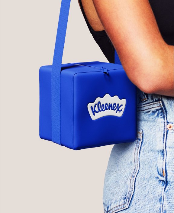
To celebrate their 100th anniversary, Kleenex introduced a refreshed brand identity in collaboration with Turner Duckworth. Developed with their parent company, Kimberly-Clark, the new global visual identity draws inspiration from a mean case of the sniffles. This redesign brings a modern touch to the century-old brand known for its tissues, whose name has become synonymous with the product itself.
Over the years, Kleenex realized they had lost visual consistency, with varying logos and color schemes across different markets. The wordmark itself had undergone many changes since 1924, most notably Saul Bass’s iconic 1961 version. Turner Duckworth‘s challenge was to unify Kleenex’s branding globally while infusing it with a renewed sense of personality and service.


Visual Identity
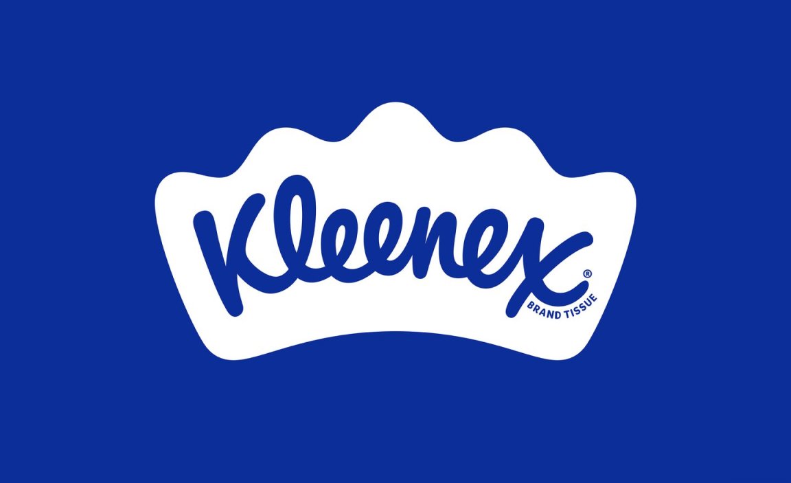
While Saul Bass’s famous 1961 rendering of the Kleenex script remains largely unchanged, the refreshed visual identity centers around the tissue-inspired crown that contains it. The crown, which subtly resembles a folded tissue, has evolved from a minor detail to a central design element. Metaphorically, it reinforces both Kleenex’s leadership in the category and their core brand idea of delivering strength in everyday moments. Before Turner Duckworth’s involvement, there were multiple versions of the logo, each housed within different shapes. The new logo is designed as a unified, singular piece to be used globally.
The soft curves of Turner Duckworth’s reimagined script and the distinctive crown have influenced the brand’s broader look and feel — particularly in its typography and illustrations.
“While many competitors far and wide claim to make facial tissues, there is only one Kleenex,” says Andy Baron, Executive Creative Director at Turner Duckworth. “Every square inch of the new visual identity is designed to reinforce the brand’s category leadership (and invention, for that matter) through a suite of carefully designed distinctive assets, and a system that brings them together.”

Design System
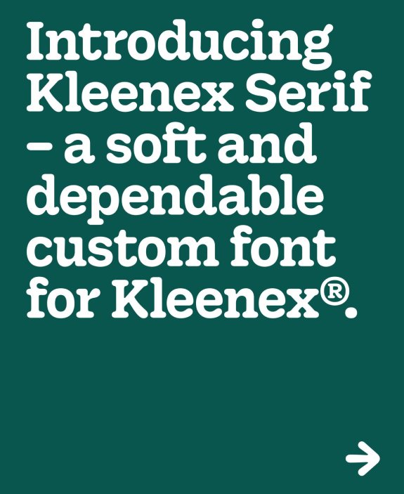
Previously, different colors were used for different markets, leading to inconsistencies. To create cohesion, the rebrand standardizes the signature Kleenex Blue as the primary color across all touchpoints. A secondary palette of warm tones adds depth and flexibility to the visual system, allowing the brand to balance its heritage with a modern appeal. A custom typeface, Kleenex Serif, was developed in collaboration with type designers Alec Tear and Lewis Macdonald, drawing inspiration from the nuances of Saul Bass’s original script.
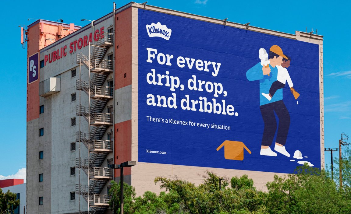
Balancing Kleenex’s heritage with a modern aesthetic was a key challenge. The updated logo and color palette are complemented by illustrations depicting moments in daily life where Kleenex plays a role — from joyful tears to soothing cold symptoms. Created by Turner Duckworth’s in-house team, these illustrations incorporate the soft curves of the crown, adding warmth and personality to the overall identity.
Jennifer Kasmarick, from Kimberly-Clark, explains, “This rebrand represents a pivotal moment for Kleenex. It’s not just about celebrating the past; it’s about deepening the emotional connection with consumers as we look to the future.”





Campaigns
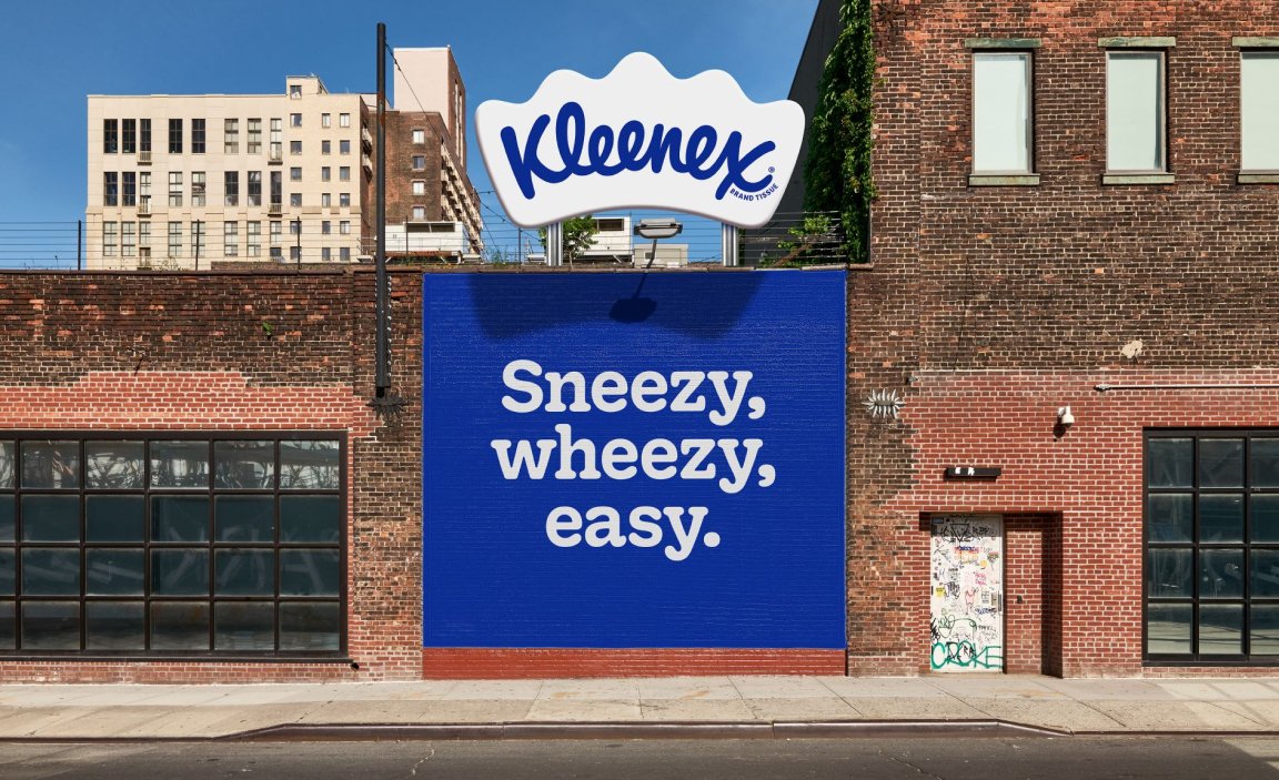
The new visual elements are brought to life through gentle animations, while broader campaigns feature taglines such as For every drip, drop and dribble. and Sneezy. wheezy. easy. The tone embraces life’s pivotal moments, giving the brand an approachable and memorable feel.
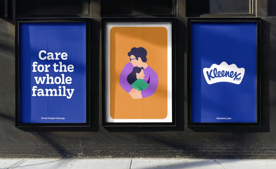
The campaign further reinforces Kleenex’s role in everyday life, showcasing relatable, heartwarming scenarios. From a comforting hug to a proud parent’s tears at a child’s achievement, the visuals capture how Kleenex supports people during both small and significant moments. The tagline ‘Care for the whole family’ emphasizes the brand’s universality and dedication to being there for everyone, regardless of the situation.
By featuring a wide range of emotional moments, the campaign seeks to remind audiences of the diverse ways Kleenex can be a part of their lives. Bright, playful illustrations and bold typography convey a sense of warmth and reliability, while large outdoor installations, such as murals, bring the new identity into public spaces. These elements collectively reinforce the message that Kleenex is not just a product but a trusted companion in all of life’s ups and downs.
Credits
Branding is a team sport and this refreshed identity was made possible thanks to the collaborative efforts of Turner Duckworth and the Kleenex/Kimberly-Clark team. Special credit goes to Erin Dameron, Gerard Vasco, Mona Monahan, Kasi Turpin and Beverly Wright for all their contributions.
