AI is an extremely powerful tool that must be created with safety and human needs at its core, OpenAI is dedicated to putting that alignment of interests first, to achieve this mission the company has to encompass and value the many different perspectives, voices and experiences that form the full spectrum of humanity.
When OpenAI first burst onto the scene as a non-profit research lab, their identity felt almost incidental, a collection of scattered fonts, mismatched icons and a logo that hinted at promise without fully articulating it. As the team behind ChatGPT watched usage surge from a modest experiment to nearly 800M WAU (122.6M DAU), it became clear that their visual language needed to evolve in step with their ambitions.
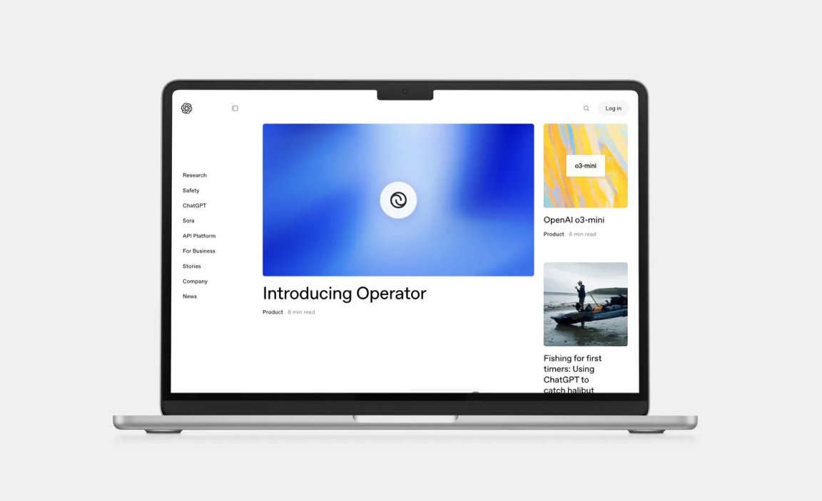
Developed in-house by a team led by Head of Design Veit Moeller and Design Director Shannon Jager in-collaboration with type foundry ABC Dinamo and motion partner Studio Dumbar, OpenAI introduced a refreshed identity that marks the brand’s transformation from an agile research outfit into a global force committed to building general-purpose artificial intelligence that serves every corner of humanity.
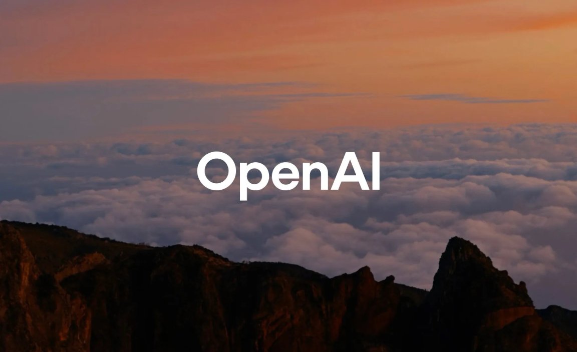
The charge to redefine their identity came directly from Sam Altman, who asked design leads Veit Moeller and Shannon Jager to craft something more organic, more human, while preserving the seriousness of rigorous research. Moeller, whose résumé spans creative directorships at Mercedes-Benz, WhatsApp and Instagram, with Jager, who had never envisioned ChatGPT as a product until it exploded onto the scene, dove into the process with the same curiosity that fuels their own work. Rather than outsourcing to an external agency, they leaned on data and user insights, mirroring the company’s research ethos to drive each decision.
Speaking from their San Francisco headquarters, Moeller and Jager admit that until now, OpenAI’s identity felt like a loose jumble of fonts, marks, and colours, and was missing the unified strategy that would bring their brand into focus.
“OpenAI doesn’t promise to have all the answers, and the rebrand reflects that. We are a research and deployment company and our studio has embraced that and reacted to it. Here, we’re really trying to be curious and use research to influence the design process. ChatGPT was never meant to be a product” says Moeller.
“When it was initially released as a research experiment in 2022 it gained a million users in five days.” – Jager adds.
As for the perennial question as to how AI will impact human creativity, the designers have an answer.
“At OpenAI, we believe technology should amplify, not replace, the depth of human creativity. Our brand language is built on the nuances of human experience – the way an image evokes memory, how typography carries tone and how motion breathes life into ideas.”

Design Strategy
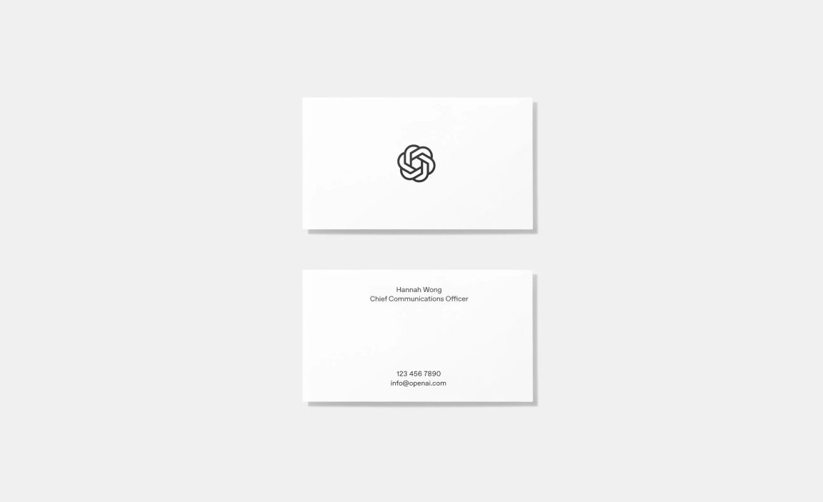
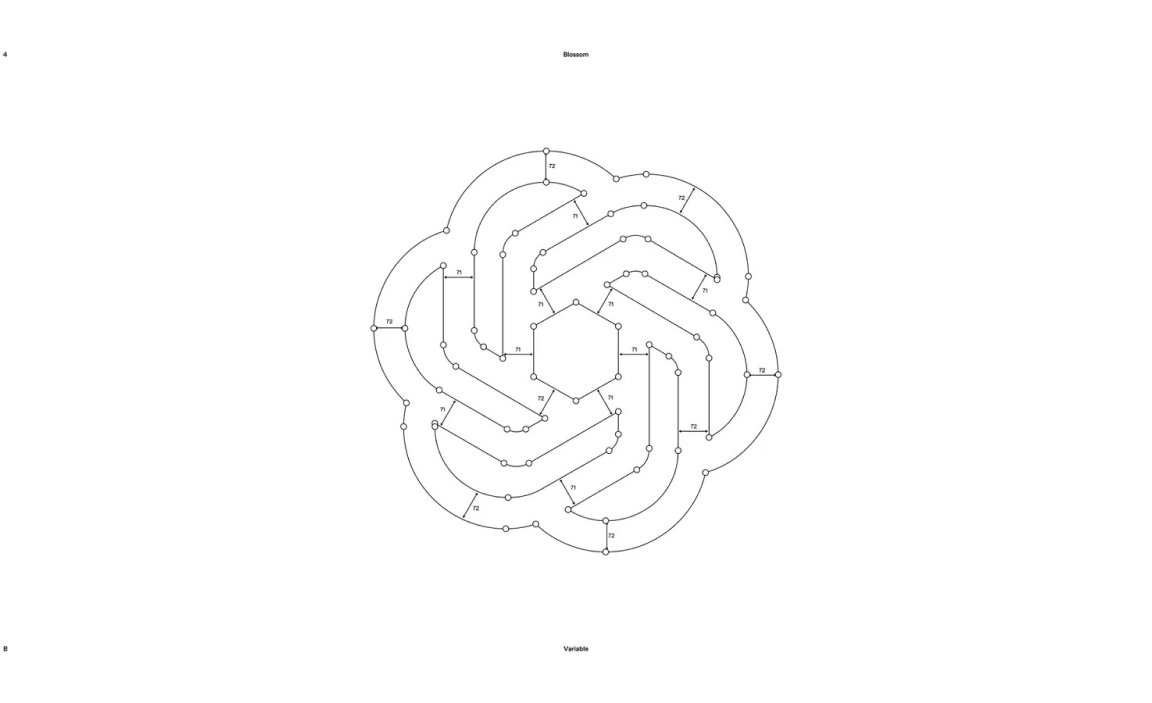
At the heart of the new identity is their familiar logo, affectionately codenamed Blossom. First sketched in 2016 by then designer Ludwig Pettersson, designer Ben Barry (who also worked on the cursor logo and facebook like icon) and OpenAI Co-founder Greg Brockman, the three intertwined triangles have been gently refined to balance precision with warmth. The updated geometry pays homage to the underlying seed of life grid, evoking growth and interconnection, while new weight variations ensure the mark reads clearly across screens, print and even stationery.
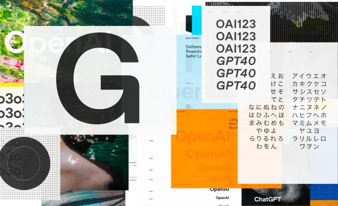
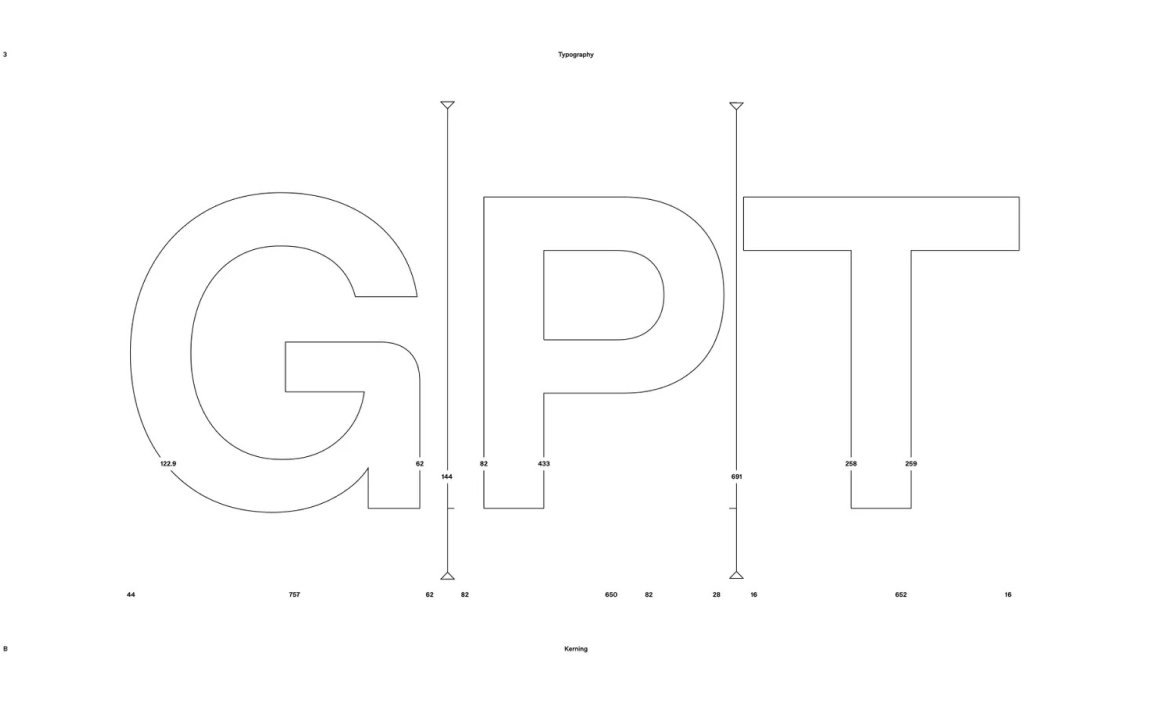
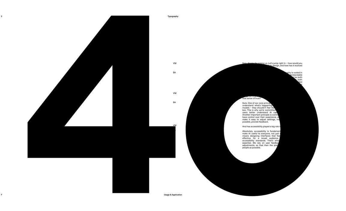
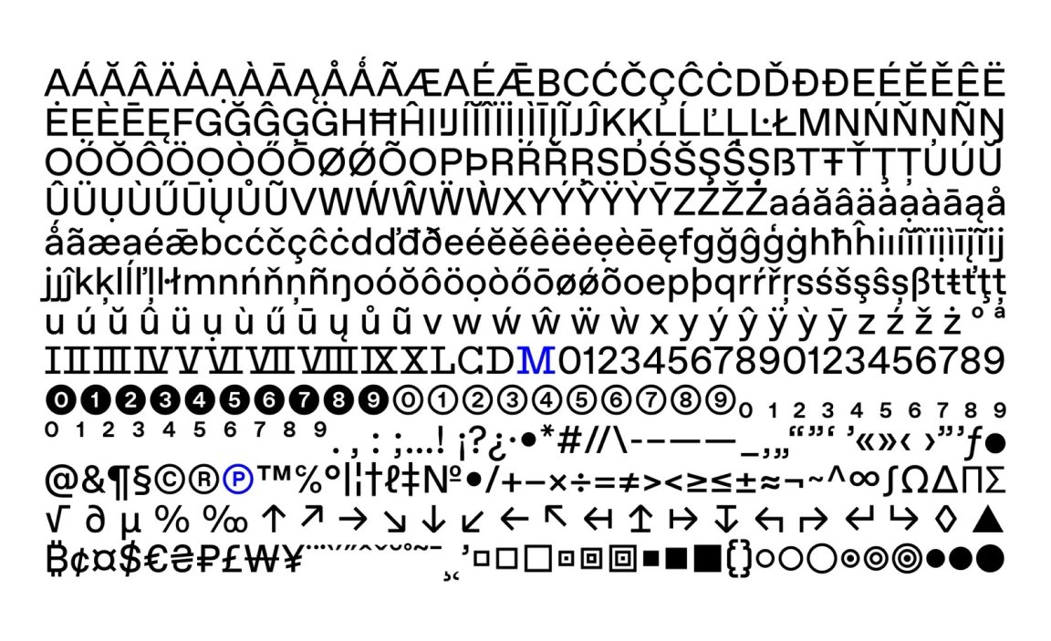
Surrounding the blossom is the newly commissioned OpenAI Sans, born from a collaboration between OpenAI’s in-house studio and Dinamo. Every letterform emerged from a single circular motif: the point.
This dot, inspired by the cursor that heralds ChatGPT’s next reply, became the foundation for letter shapes, spacing, and grid structures. Perfectly circular exteriors mask subtle interior irregularities, a deliberate nod to imperfection that keeps the brand feeling approachable, counterbalancing the cold precision often associated with artificial intelligence (and technology in general).

The point has become a bridge across different products and departments says Moeller, explaining that the four core values of the new identity are simplify, space, imperfection and vivid. Space is underrated, we want to find the beauty in nothing. There’s also a certain level of imperfection, to counter any robotic precision and make things feel more human. For example, while the ‘O’ is perfectly circular on the outside, the interior form is not.
“OpenAI Sans is a love letter to typography, we approached ABC Dinamo with a clear vision of integrating the point into letterforms, and through close collaboration, we brought OpenAI Sans to life.”Jagger adds.
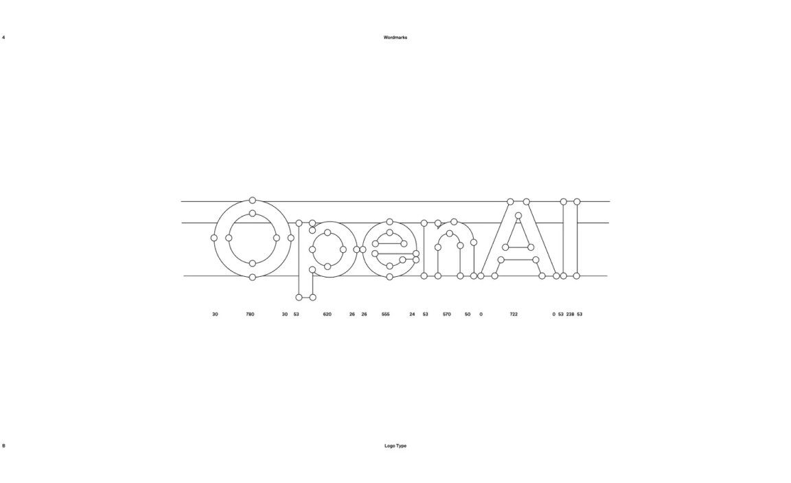
They’re continuing to collaborate as they roll out global scripts and a mono version of the font, ultimately consolidating the six or seven typefaces that were in use across the company’s various products.
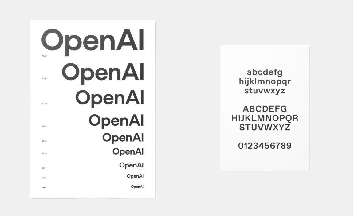
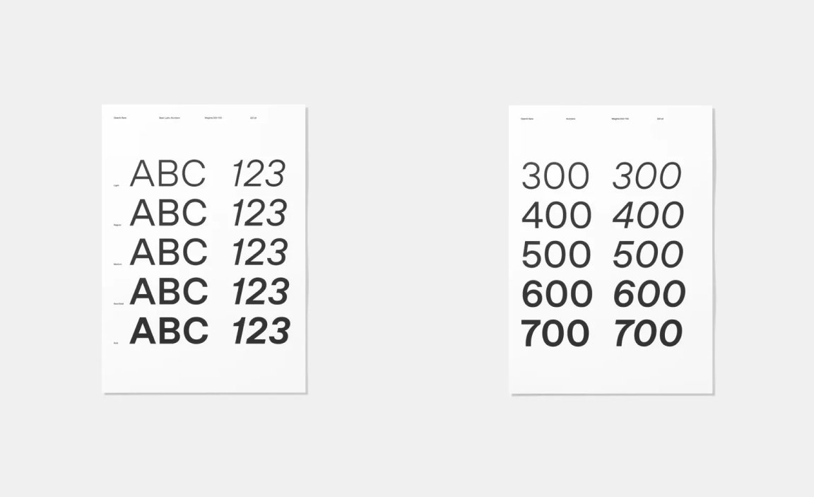
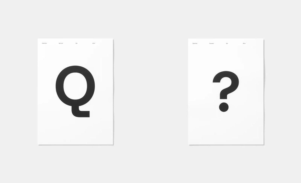
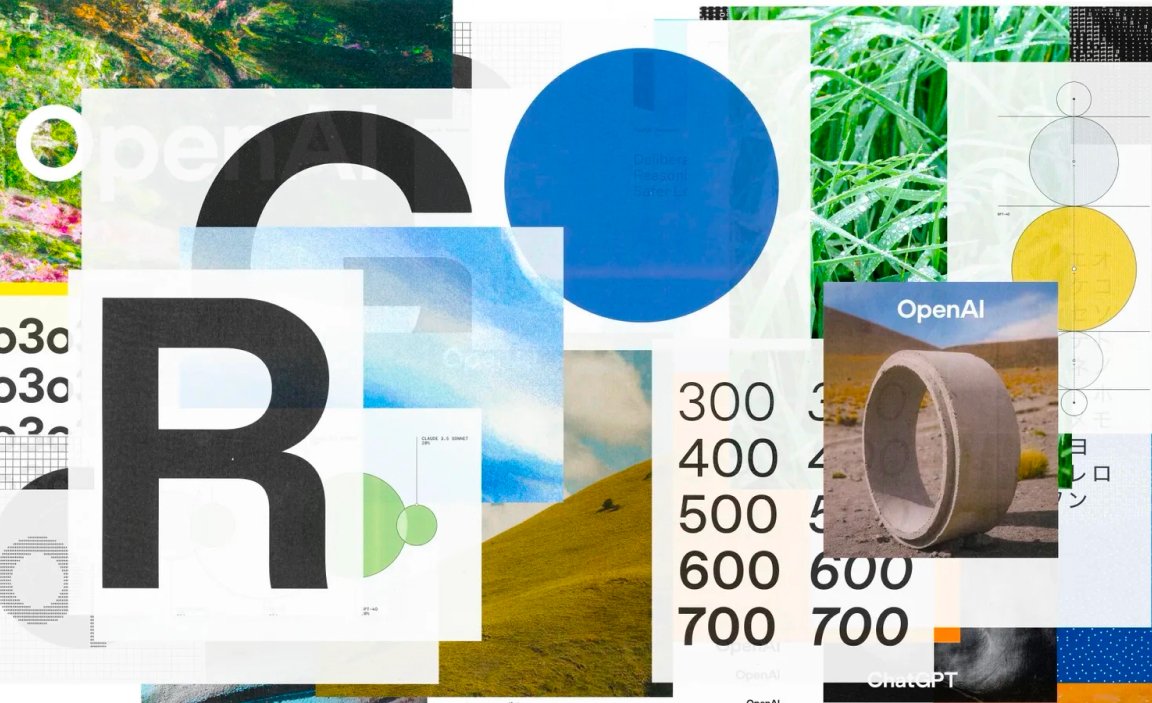
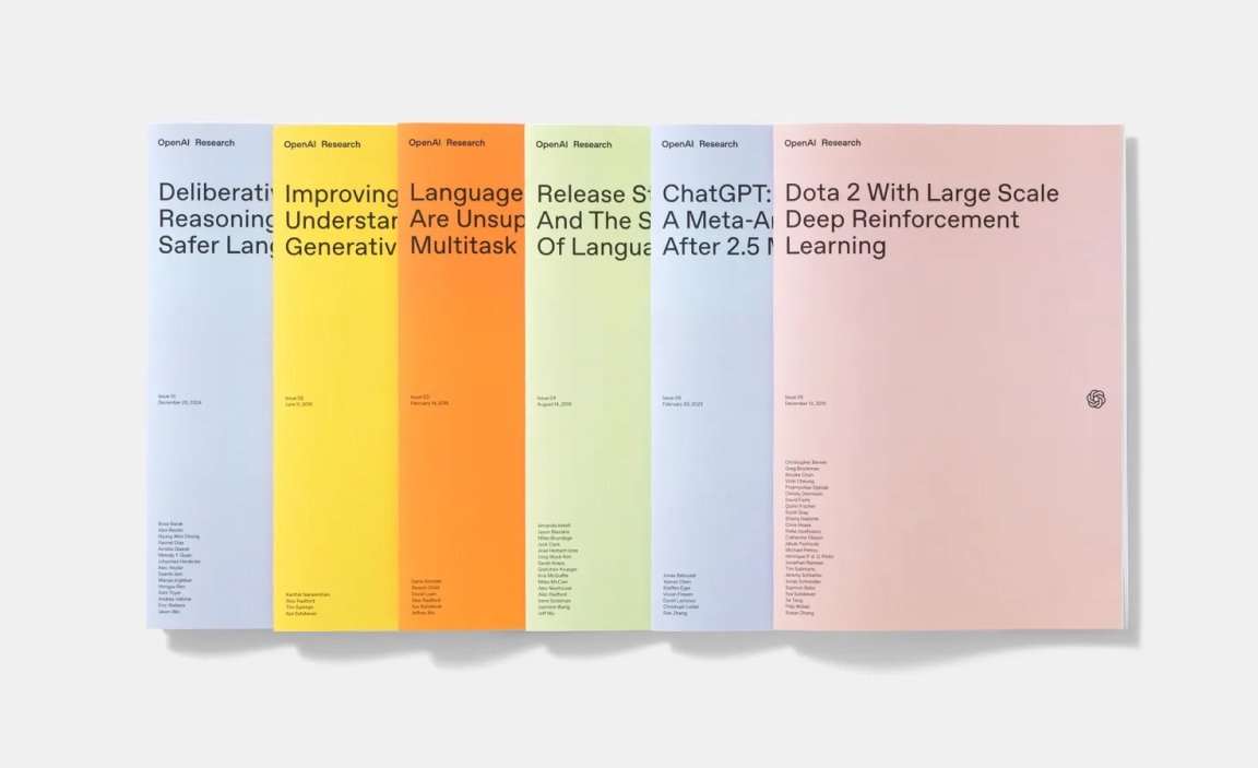
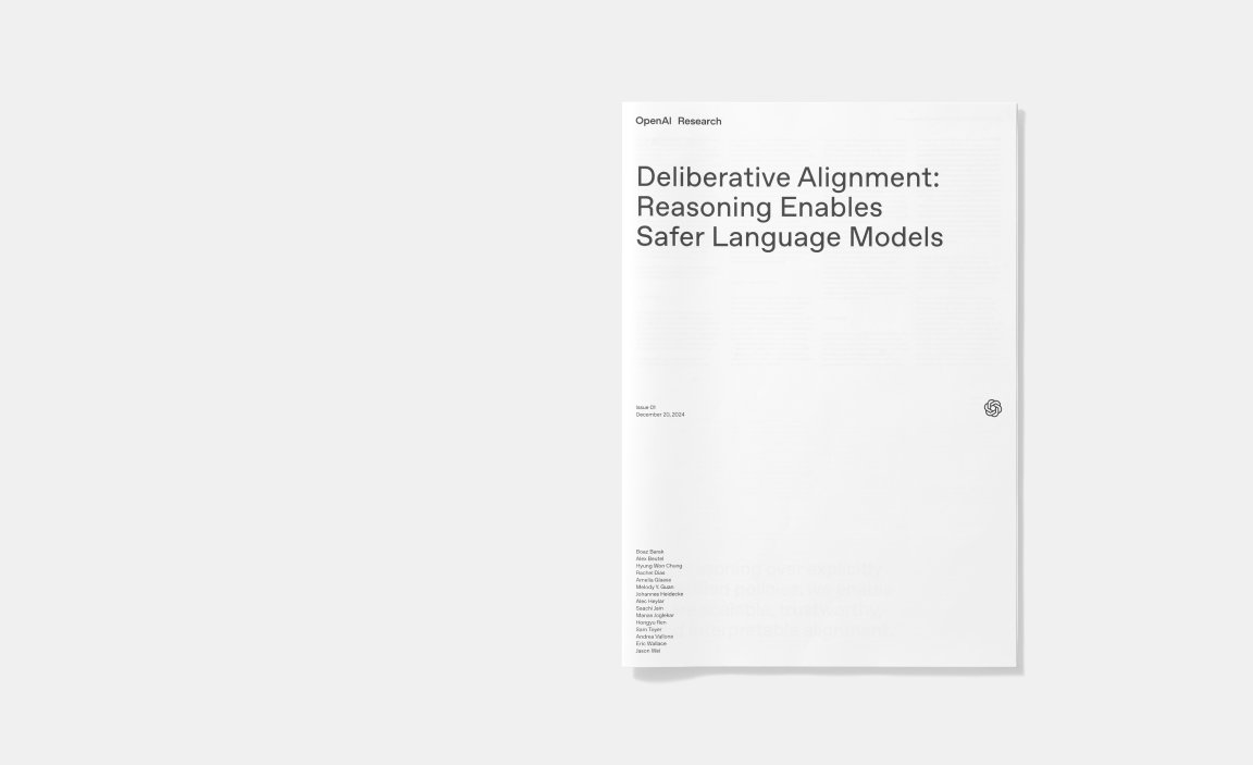
OpenAI didn’t stop at logos and fonts. Their research papers, once typographically dense and visually uniform, have been overhauled with fresh grid layouts, playful data-visualization elements, and the new typeface palette, giving weight to the notion that design can carry insights as powerfully as data itself.

Giving ChatGPT a voice
Color palettes and motion language further ground OpenAI’s new visual system. Soft greys and blues conjure boundless horizons and open skies, while vibrant accent hues supply contrast and energy. In motion, there is the Emotive Point, a pulsing disc with a watercolour-inspired background of swirling blue abstract forms. “It’s a design device that people will use when interacting with AI” says Moeller, pointing out that the emotive point is deliberately non-human, with no discernible character or emotions.
Rather than a simple motion file, the Emotive Point is coded, so the patterns and movement can respond to your inputs. Capable of being deployed across OpenAI’s products at a variety of scales, this pulsing crystal ball-like device is a visual representation of ChatGPT’s voice.
However, text will continue to be a primary output.
“At its base, typography is how you interact with everything, it’s the anchor point for ChatGPT. Every interaction, every visual, and every detail is designed to feel alive, resonant and deeply connected to the people who experience it.” says Moeller.

AI as a tool and a partner
Photography and imagery straddle the line between the real and the abstract: commissioned work from contemporary photographers sits alongside textures dreamt up by Sora AI, all curated by human editors to preserve spontaneity and surprise.
For OpenAI the human curation of imagery remains essential.
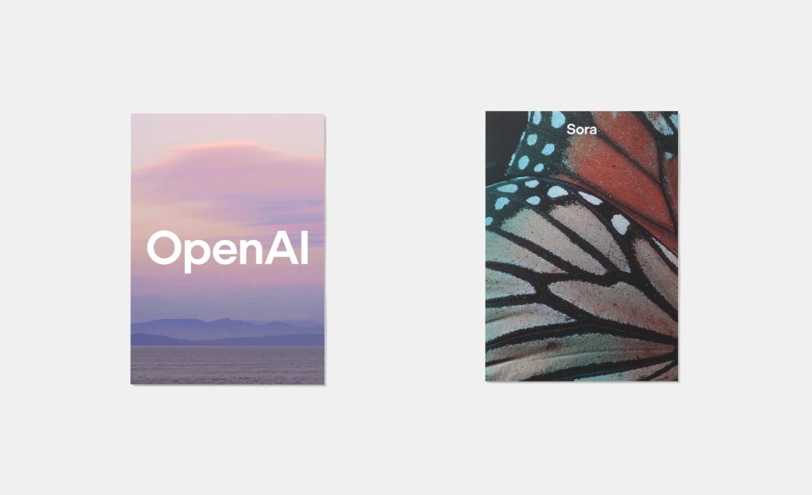
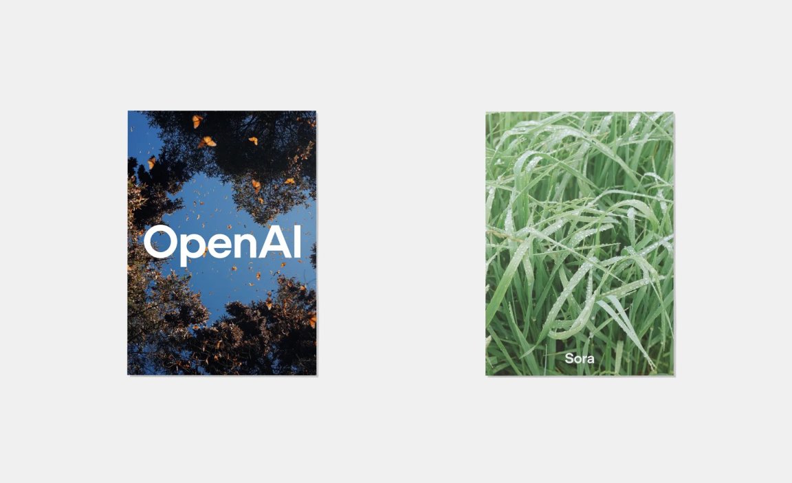
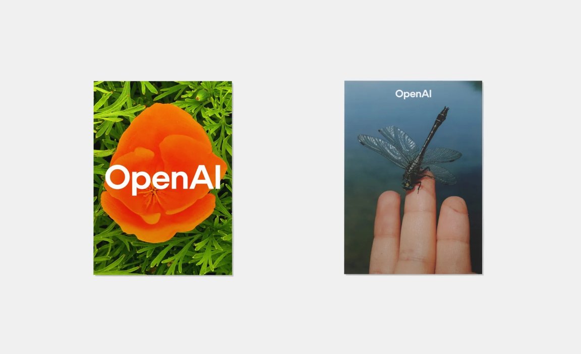
“We’re trying to find a way to research the world and find things that are both human and surprising, although we don’t have a rule that AI can’t produce this element of levity, imperfection and introspection – we’re trying not make up too many rules. Using AI as a tool and a partner is something that’s interesting.” says Moeller.
“We’re using AI as a thought partner,’ Jager adds, ‘what’s great about this balance is how it creates different perspectives.” Jager adds.
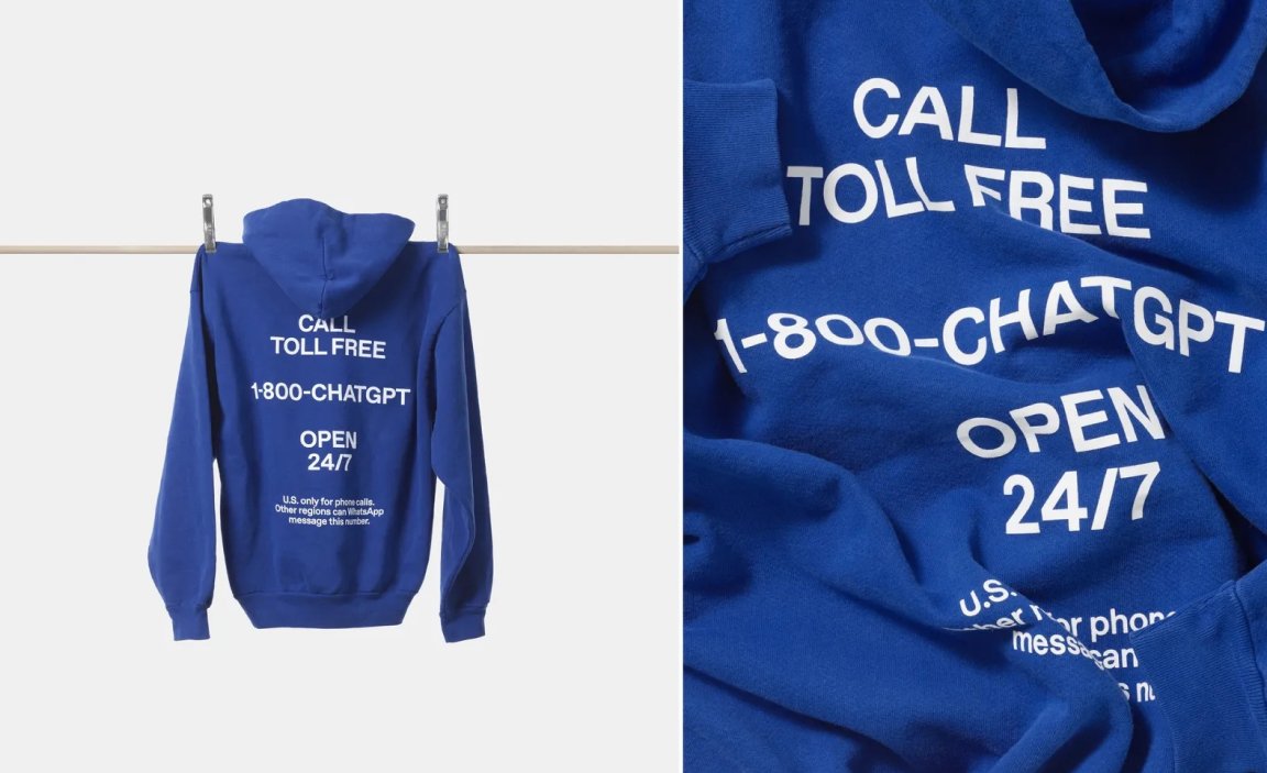
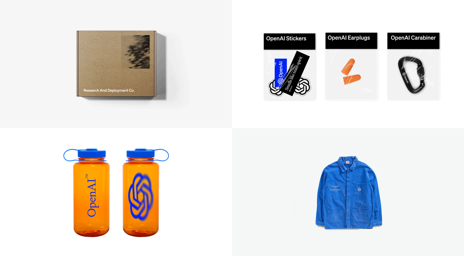
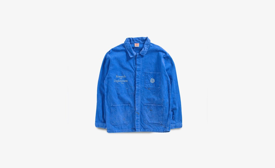
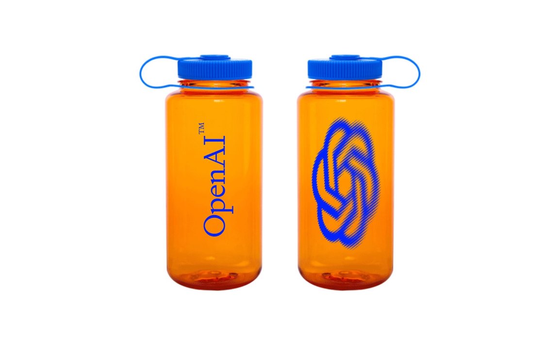
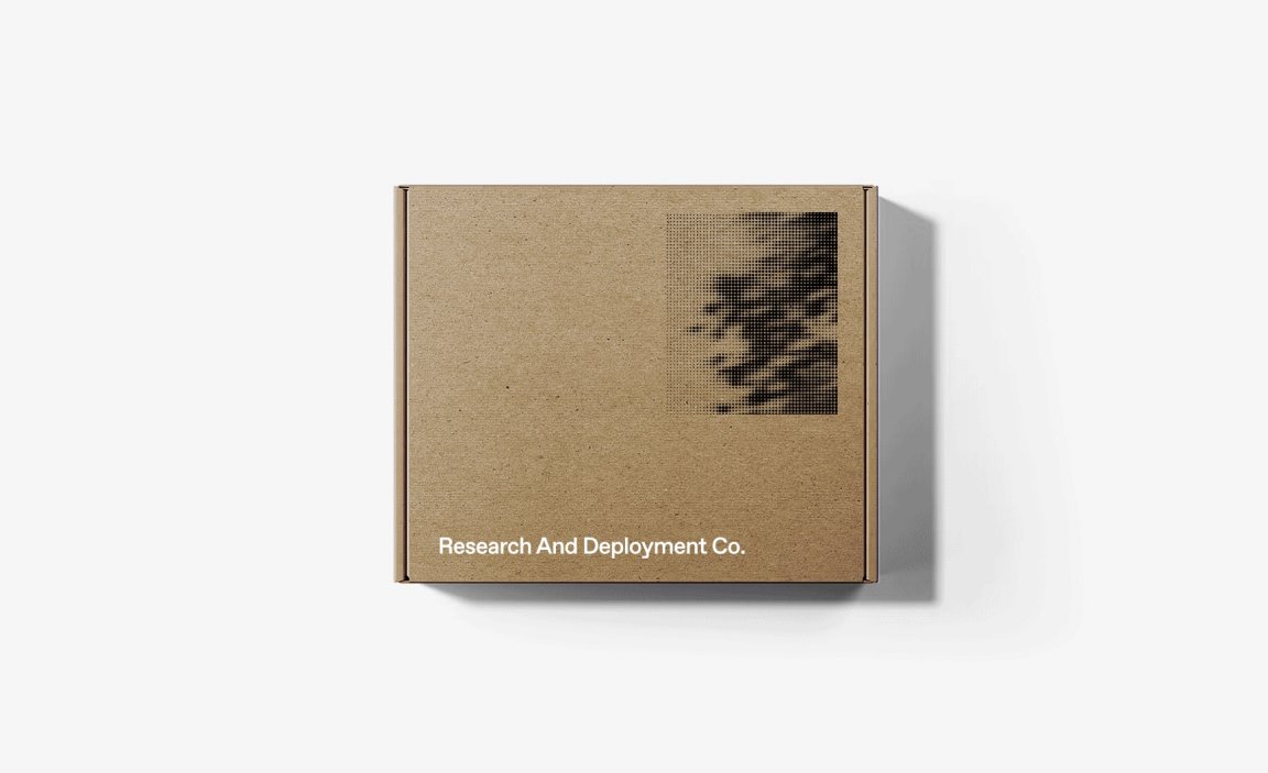
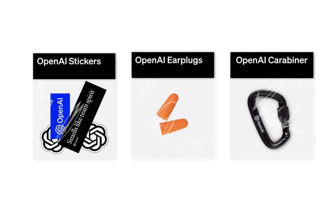
The rebrand also extends into physical touchpoints. Merch, once an afterthought for in-house swag now speaks the same brand language, from lanyards embossed with the blossom mark to notebooks where the point motif patterns the edges of each page. Early drops had internal enthusiasm so intense that employees hacked the site to get extra gear, a playful reminder that brand culture lives as vibrantly within as it does outside.
Serving every corner of humanity
Through every stage, OpenAI has confronted the tension between authority and empathy, between precision and organic imperfection. They’ve traded a jumble of disjointed assets for a coherent system that breathes, pulses and listens. Yet questions linger, how will this identity scale across emerging AI applications beyond ChatGPT? Can the balance between human nuance and machine logic hold when general-purpose AI marches into healthcare, education and governance? Measuring the impact of design on trust, safety and adoption remains a frontier as challenging as any technical breakthrough.
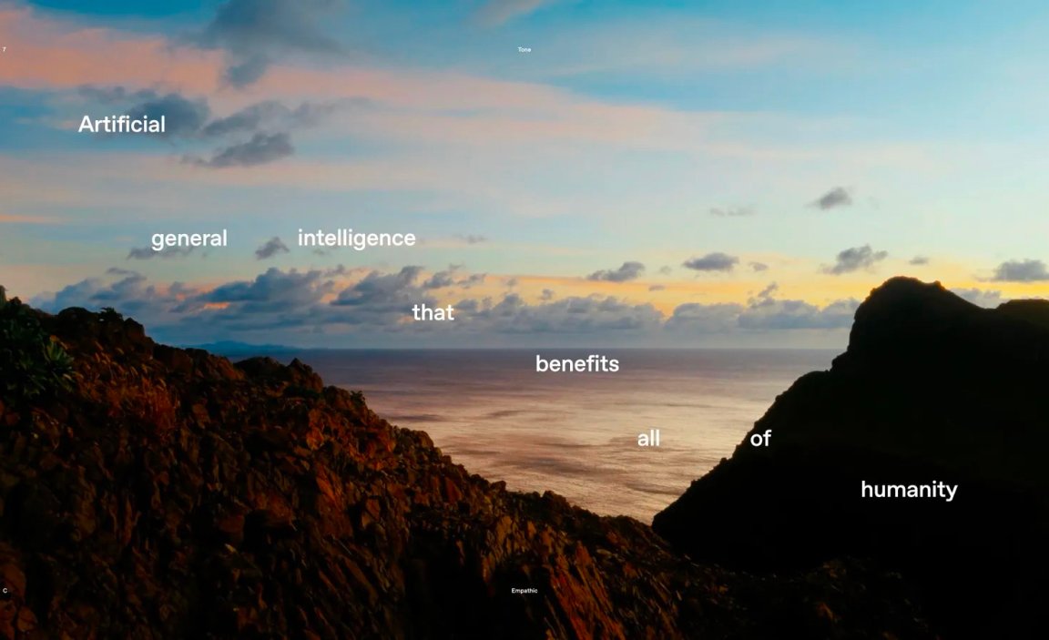
Ultimately, OpenAI’s rebrand is a statement of purpose. One that believes that powerful technology must be built with safety, human needs and broad inclusion at its core. By embedding research methodologies into each design decision, they’ve crafted an identity that acknowledges uncertainty, invites collaboration and above all, keeps the mission front and center: Creating AGI that benefits all of humanity. In a field racing toward the unknown, their new brand offers a compass forged from the very principles they seek to uphold.
The Intelligence Age | ChatGPT 2025 Super Bowl Commercial
Credits
Sound design
Studio Dunbar
Photography
Footage
