Earlier this year, Verizon one of the most recognizable telecom companies in the world introduced a comprehensive rebrand that included a fresh visual identity and a new ad campaign. This move signifies a major shift for one of the most recognizable brands in the industry, aiming to align more closely with the company’s evolving mission and customer expectations, aka the younger more digitally-savvy generation.
Verizon’s Chairman and CEO, Hans Vestberg, emphasized the significance of this rebrand: “Verizon is one of the most recognizable brands. By listening to our customers, we continue to significantly evolve our offerings and brand promise to connect people when it matters most on our reliable network. We never stop pushing the industry forward and delivering more value to all of our customers. This next chapter is a continuation of our journey of service and innovation.”
Visual Identity
At the heart of Verizon’s rebrand is a redesigned logo and visual identity that reflect the company’s forward-thinking approach. The new logo features a lighter red “V” wordmark in Neue Haas Grotesk. This newer more modern design replaces the previous tick mark logo—a creation by Michael Bierut at Pentagram in 2015, which was itself an iteration of Landor’s original design from the year 2000.
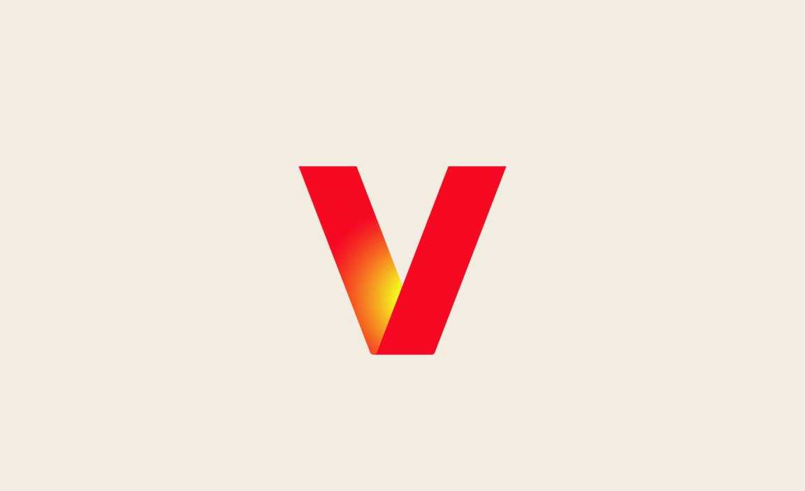

The updated emblem, a red ‘V’ with a striking yellow glow, symbolizes both Veritas (truth) and Horizon (the future of possibility). This new logo encapsulates Verizon’s commitment to connecting people with reliability and innovation. The glowing ‘V’ serves as a visual anchor, reinforcing the brand’s core values and its vision for the future.


Design System
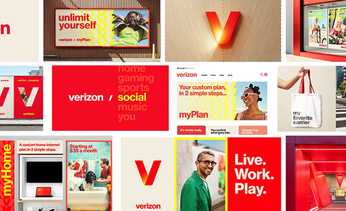
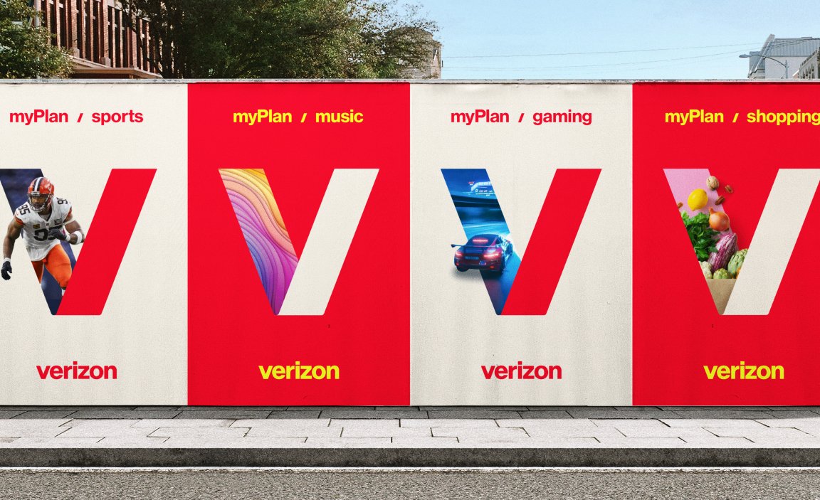
Verizon has also refreshed its entire design system to match the energetic, modern look of the new logo. This includes updated color palettes, photography styles, and new formats for TV and digital advertising. The new visual identity is designed to reflect the dynamic way people live, work, and play, and will be rolled out across Verizon’s marketing materials, digital properties—including its website and apps—and retail stores over the coming years.



Campaign
To cap off the new brand presence, Verizon has released a new TV spot that pays homage to its iconic “Can You Hear Me Now?” campaign. The ad features a real Verizon network engineer as the “test man,” bridging the gap from the company’s roots to its current role in people’s lives. This nostalgic reference helps anchor the rebrand in the company’s rich history while showcasing its push into a digital first era.


Website
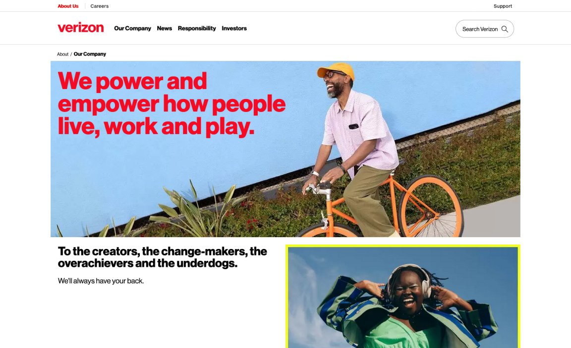
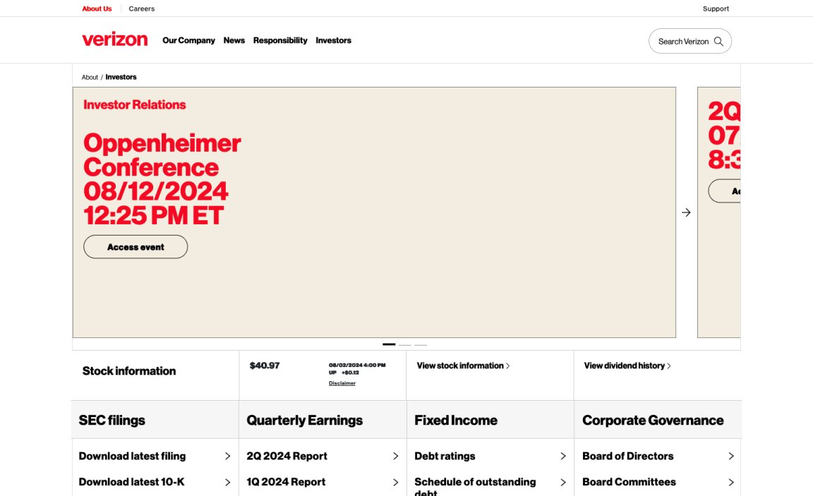
In addition to the TV spot, Verizon is rolling out new advertising campaigns to promote various aspects of its offerings. This includes the myHome initiative, a compelling phone trade-in offer, and Spanish-language content through a partnership with ViX.


My Thoughts
Verizon’s rebrand isn’t purely aesthetic; it represents a strategic move towards deeper engagement with its customers and a stronger alignment with the expectations of that tech savvy consumer. By introducing a new logo and design system, the company is positioning itself to continue leading the telecom industry with innovation and customer-centric design.
As the rebrand unfolds across various platforms and touchpoints, it will be exciting to see how these changes impact Verizon’s market presence and customer interactions. The refreshed identity drew tons of criticism and comparisons to the Netflix logo released back in 2015, but to me the new look is just Verizon paving the way for a new future for the brand and moving away from the “legacy brand” look.
