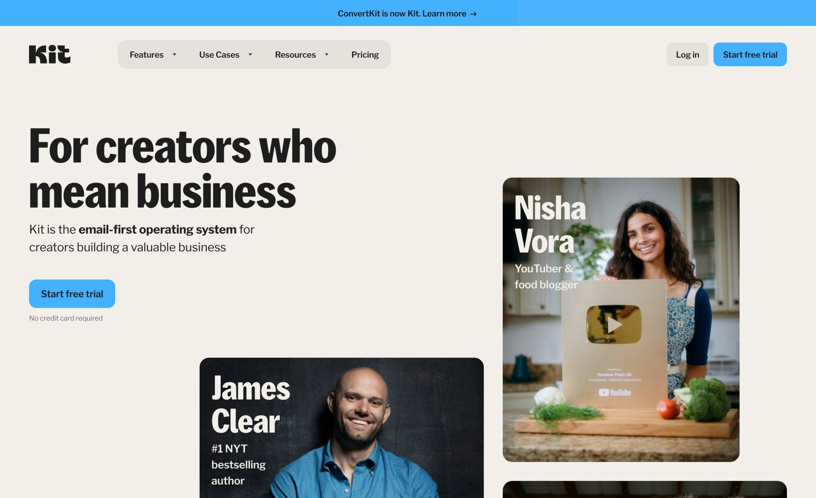
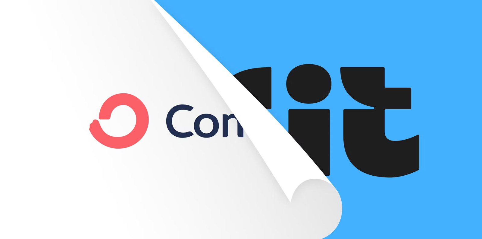
Kit, the email-first operating system for creators, introduced a major brand update that includes a new logo, brand name, fresh visual identity, and renewed purpose. This move is a major shift for one of the most recognized platforms in the creator economy, aiming to better reflect their evolving mission to empower creators in building valuable businesses. By redefining who they are and what they stand for, Kit seeks to foster confidence and creativity, helping creators transform their passion into a thriving profession.
“Through conversations with creators, we learned that while earning a living is important, what creators value even more is the purpose behind their work—the “why” that keeps them going.” says Kit’s Creative Director, Charli Prangley. “That’s why our brand strategy for Kit is centered on the idea that being a creator is about more than earning money. It’s the value you create in the world and the connection you build with the people who support you. Kit is here to help you tap into that deeper level of meaning, giving you the tools and support you need to make your business not only profitable but truly purposeful.”
Visual Identity
At the heart of Kit’s rebrand is a redesigned logo and visual identity that reflect the company’s dedication to empowering creators. Inspired by the simplicity and versatility of a toolkit, the new logo captures both the essence of Kit and the passion of its community. Before embarking on the redesign, Kit sought to define what they stood for as a brand, aiming to reflect their bold yet approachable energy and commitment to the community, while capturing the moment inspiration strikes—that exhilarating buzz of bringing a creative idea to life.
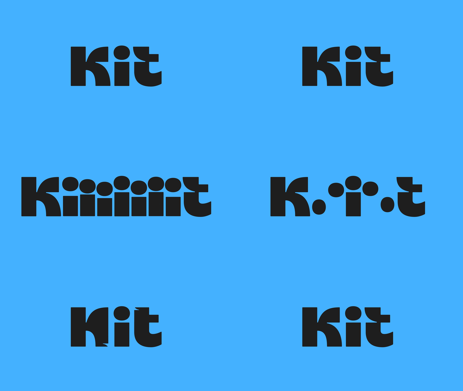
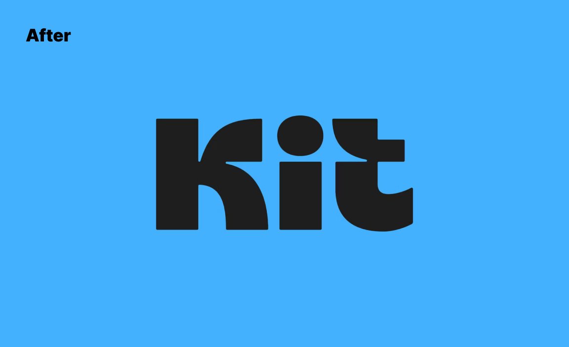
After countless iterations and refinements, Kit landed on their new logo, which represents two core ideas:
- Creators at the Heart: The lowercase “i” in the middle of the logo symbolizes the creator, reminding us that Kit is here to serve you—the creator—putting your needs and vision at the center of everything we do.
- A Value Exchange: The small arrows hidden in the negative space between the K and T represent the exchange of value between creators and their audience—creativity and engagement flowing both ways.
When developing the new Kit brand, Kit needed clear principles to guide its decisions and keep the brand identity consistent. With so many choices to make, it was crucial to establish a set of constraints to shape how Kit communicates and presents itself. To bring the brand strategy to life, Kit defined three key tonal principles that serve as guardrails, ensuring that every touchpoint reflects Kit’s core values:
- Bold: Kit is confident in its expertise and unafraid to stand out. Kit communicates with authority, while also embracing creativity and taking risks. Kit’s boldness reflects its commitment to helping creators thrive in a competitive landscape.
- Sincere: Kit genuinely believes in creators and the incredible work they do. Creators are the heroes of the brand, and Kit’s sincerity shows through in every interaction, whether it’s through messaging or support.
- Expert: With over a decade of experience in the creator economy, Kit is built on deep expertise. Kit leverages its knowledge to help creators succeed, ensuring that the platform is not only valuable but also designed to empower creators at every stage of their journey.
“As we transition from ConvertKit to Kit, we’re not just changing our name—we’re evolving to better support you as a creator. This rebrand is about making sure Kit gives you the tools and confidence you need to build a business that reflects your passion and purpose.
We know that creator businesses are serious businesses. The outside world might look at what you do and think it’s “just” making videos or “just” recording podcasts—but we know better. Your work is valuable and deserves a platform that takes you seriously. With Kit, we’re building an operating system that grows with you, helping you build the business of your dreams.”
Design System
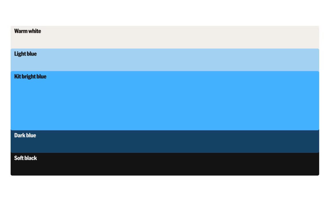
Kit has also refreshed its entire design system to align with the bold, modern look of the new logo. This includes a reimagined color palette featuring Kit Blue—a bold yet energizing shade that conveys trust and expertise. Kit Blue is complemented by a set of secondary colors that keep the brand assets looking fresh and dynamic.
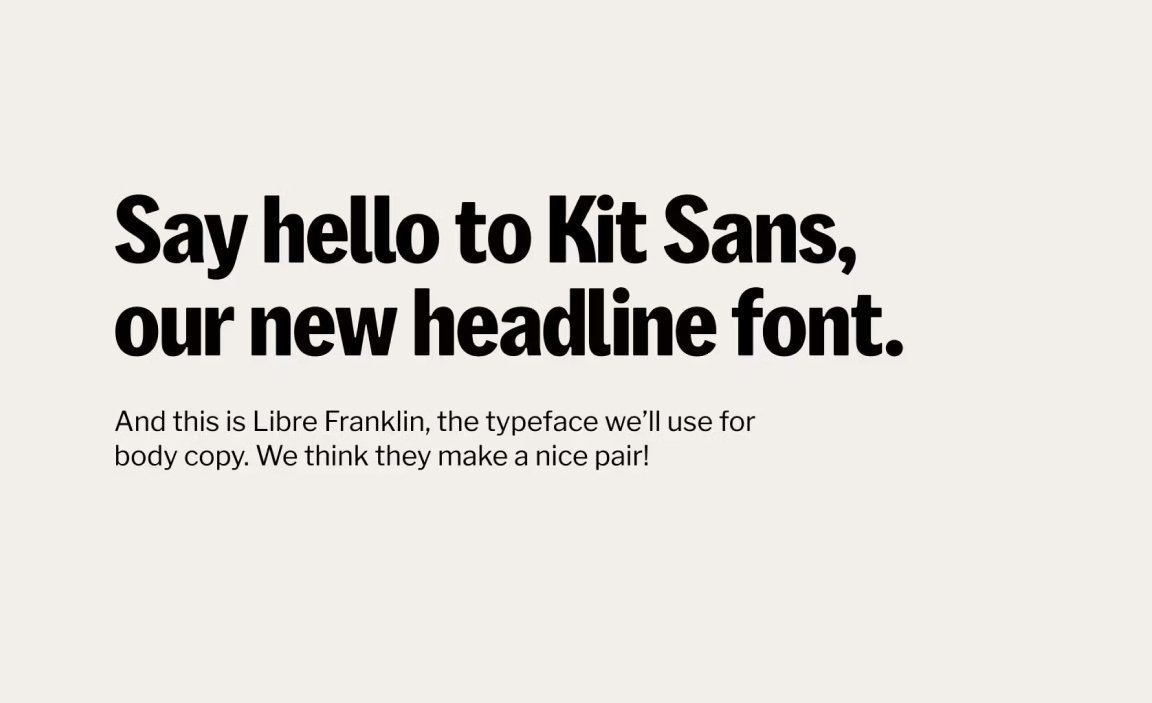
To further enhance the brand’s visual presence, Kit introduced a custom font—Kit Sans. Designed specifically for Kit, this font captures everything the brand stands for—boldness, sincerity, and expertise. Sleek and professional, with a touch of warmth and personality in its curves, Kit Sans is meant to stand out in headlines and make a statement. Paired with Libre Franklin for body text, Kit Sans brings a cohesive, polished look to the brand.
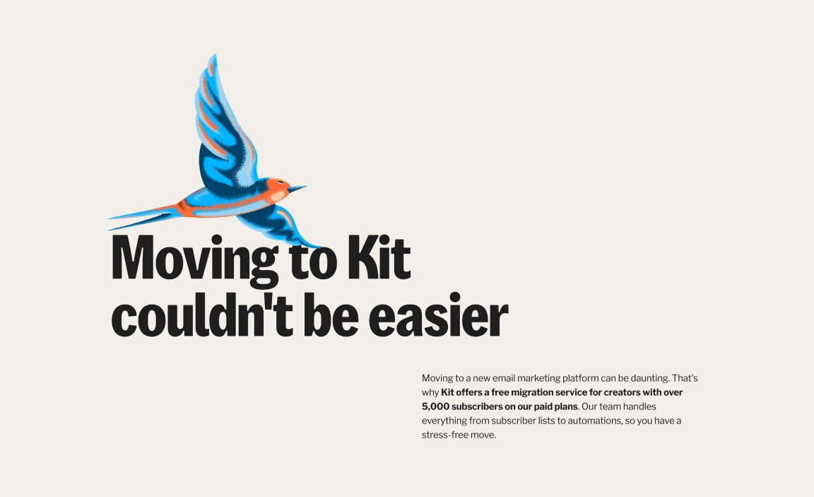
The refreshed visual identity will be rolled out across Kit’s marketing materials and digital platforms—including their website and user accounts—to ensure a consistent and inspiring experience for all creators.
“This is just the beginning. As we begin rolling out Kit’s new identity, you’ll start seeing these changes come to life across our platform. Everything from the app’s UI to our site and branding is designed to help you feel more confident, more connected, and ready to build a business that truly matters.”

Convert Kit
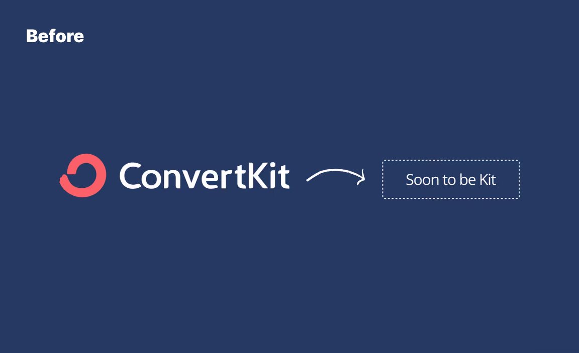
To cap off its new brand presence, Kit introduced a name change that represents the evolution of its role in the creator economy. Kit, formerly known as ConvertKit, has rolled out the new name kit.com across its website and social media platforms. The high-value domain name, kit.com, was secured to anchor the new identity, and the brand now uses @kit on Instagram and Twitter. However, on Facebook and YouTube, the brand still lives at @convertkit and @kit-hq, respectively.
This name change symbolizes a bold step into a new era for the company—one that is focused on serving creators with an even more expansive set of tools. It embodies Kit’s mission to empower creators to turn their passion into a thriving business, while staying true to the values of authenticity, creativity, and community. Just like Envato’s sonic identity brought a new energy to their brand, Kit’s new name and digital presence aim to infuse confidence and inspiration into every creator’s journey.
Kit also introduced a docuseries to explain the rebrand, offering a deeper look into the process that led to all these decisions. As part of their ‘rebranding in public’ ethos, the docuseries demonstrates Kit’s commitment to transparency and sharing every step of their journey with their community. This docuseries takes viewers behind the scenes, showcasing the challenges, inspirations, and key milestones that shaped the transformation from ConvertKit to Kit. Through candid interviews with the leadership team and creators themselves, the series highlights the thought process behind the new visual identity, the name change, and how Kit plans to continue supporting creators. It’s a transparent and engaging way to share Kit’s journey and reinforce their commitment to the creator community.
Website
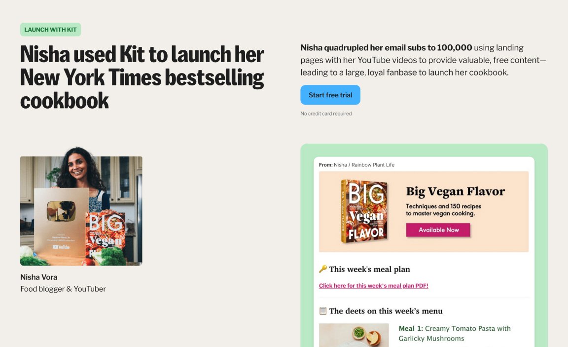
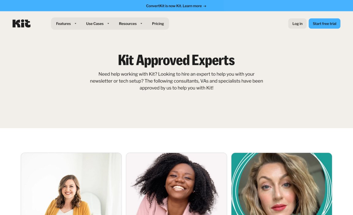
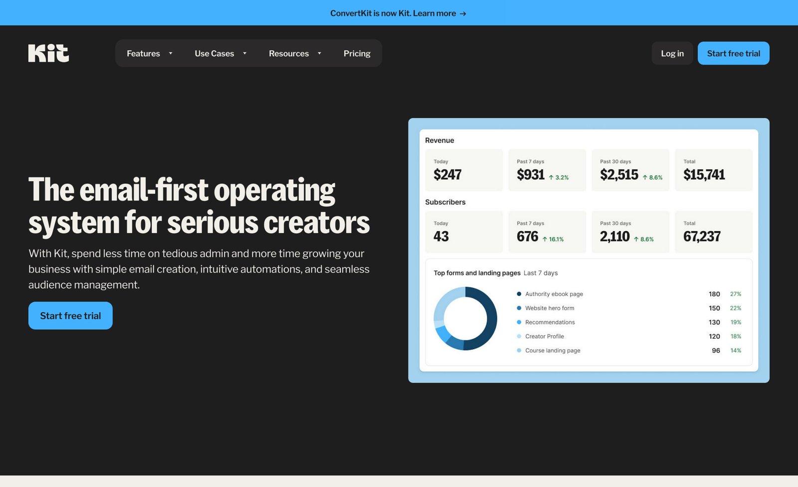
In addition to the new logo and refreshed design system, Kit rolled out a revamped website to enhance various aspects of its platform. The new site not only looks better but also functions better, featuring a modernized UI and enhanced UX to create a cohesive and inspiring journey for creators.
