Last month, PayPal one of the most recognized names in digital payments, unveiled a refreshed brand identity developed in collaboration with Pentagram partner Andrea Trabucco-Campos, aimed at boldening the simplicity that defines PayPal’s user experience.
PayPal has been revolutionizing commerce globally for more than 25 years with payment infrastructure that make moving money simple, seamless, and secure. One year into the top job at PayPal , Alex Chriss is emerging from a period of heads-down rebuilding with two simple messages to investors: PayPal’s next decade won’t solely be focused on payments and the 26-year-old tech firm will move with more laser-like precision to bring that vision to life.
“When I got here it was obviously a great team and an incredible company with incredible opportunity ahead. But to be honest, it was just moving too slowly,” Chriss told Yahoo Finance’s Opening Bid podcast. “And the world that we play in — this fintech world — is so dynamic, so interesting with so much competition out there that if you’re not moving quickly, if you’re not innovating fast, then you’re just going to get left behind.” This rebrand marks a significant shift for PayPal, as it ushers in a new era for customers, making it easier and more rewarding to shop and pay with PayPal anywhere, anytime.
Visual Identity
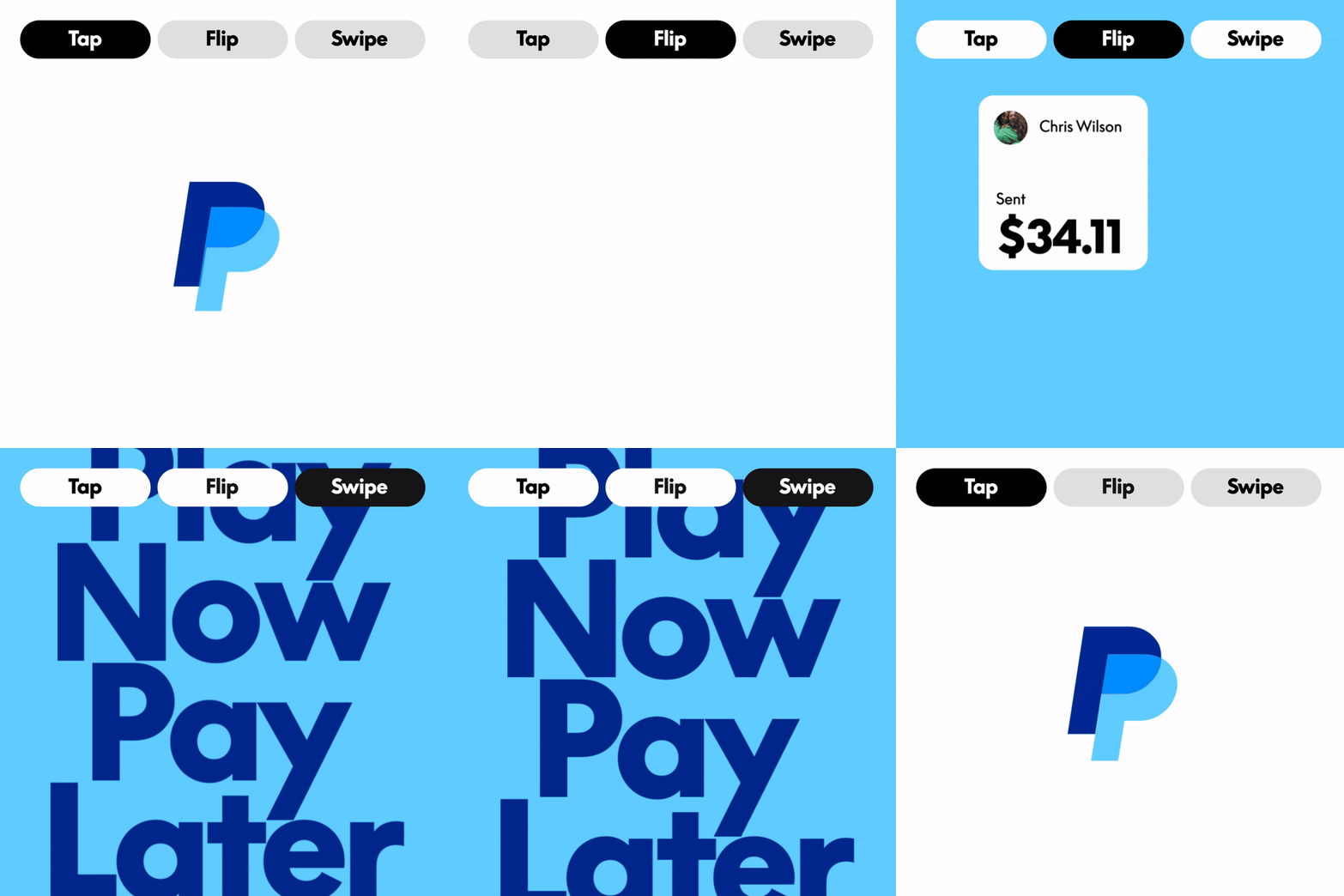
As part of this evolution, Andrea Trabucco-Campos and his team at Pentagram developed a visual identity that unifies the PayPal brand and conveys its mission to revolutionize commerce on a global scale. The design system includes a new bespoke brand typeface, PayPal Pro, a streamlined color palette, and a motion language based on everyday payment behaviours like tapping, flipping and swiping.
The Pentagram team collaborated closely on the rebrand with Diego Scotti, Executive Vice President and General Manager of PayPal’s Consumer Group and Global Marketing & Communications, and Geoff Seeley, Chief Marketing Officer at PayPal, along with the company’s internal communications, marketing and advertising teams. Pentagram worked with PayPal to oversee all aspects of the implementation of the new system, including an advertising campaign by BBH Global featuring Will Ferrell.
Pentagram first helped PayPal clarify a strategic foundation for the brand identity that would enable and amplify the transformation of the business into a more universal offering. These principles include simplicity, optimism and trust, with the goal of making PayPal more accessible for Everyone, everywhere.
The New PayPal Wordmark
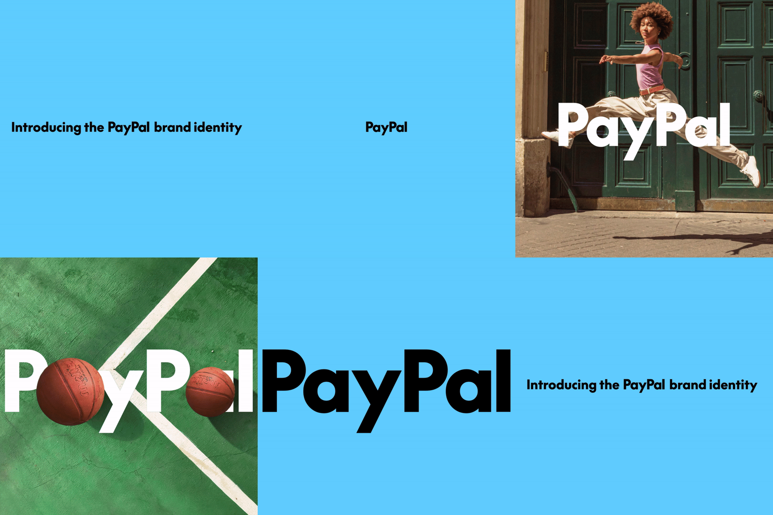
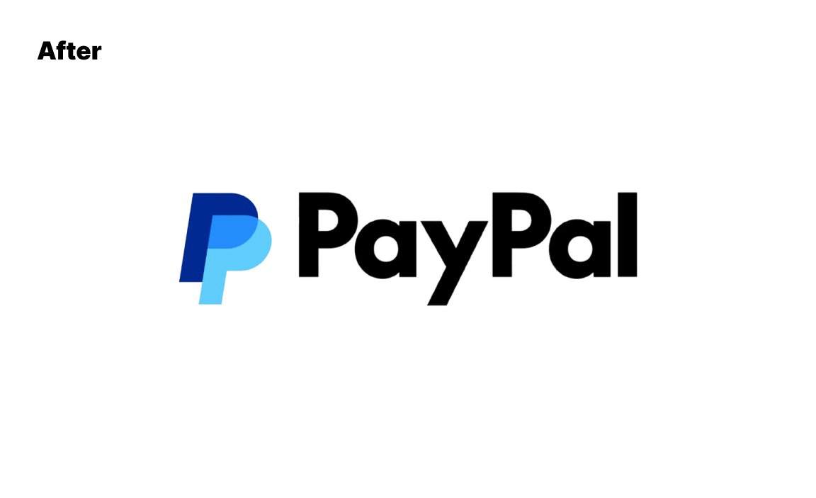
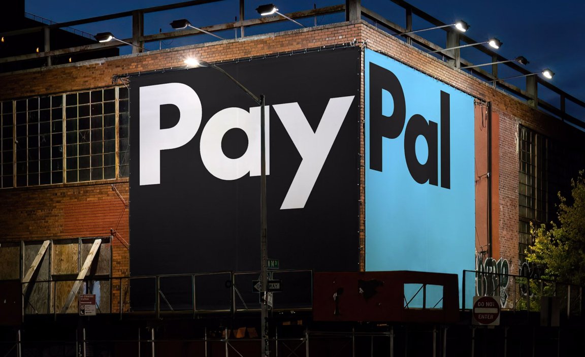
The new PayPal wordmark is a foundational element of the updated identity, reflecting the company’s commitment to innovation and accessibility. Set in a new custom typeface, PayPal Pro, the wordmark embodies the brand attributes of boldness, confidence, and clarity. Much like Verizon’s redesigned emblem, which symbolizes both Veritas (truth) and Horizon (future possibility), PayPal’s updated wordmark strives to encapsulate its values and vision for the future.
PayPal Pro, the new bespoke typeface, is a customized version of LL Supreme, a contemporary redrawing of Futura by Lineto Type Foundry. Originally designed by Paul Renner in 1927, Futura’s geometric sans serif was inspired by proportions of ancient lettering. PayPal Pro inherits these timeless characteristics, utilizing straight lines and circular curves to create a modern yet familiar visual style.
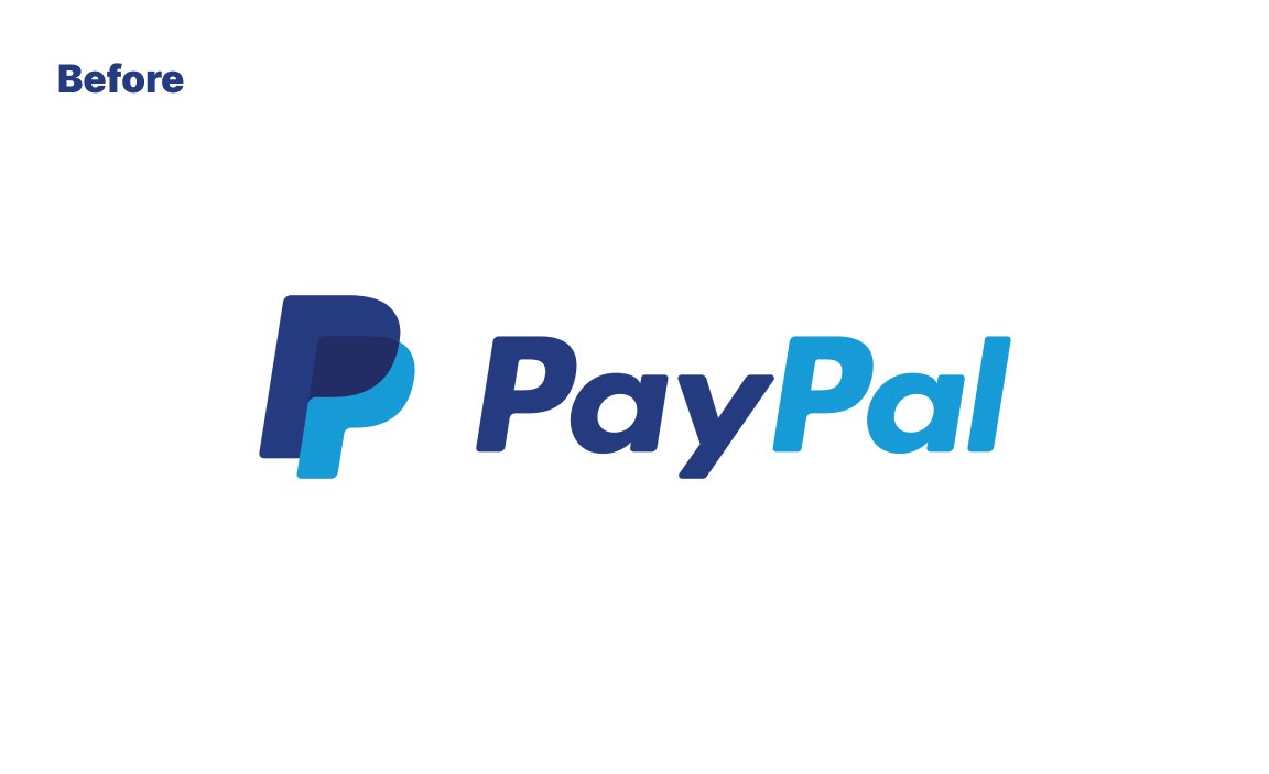
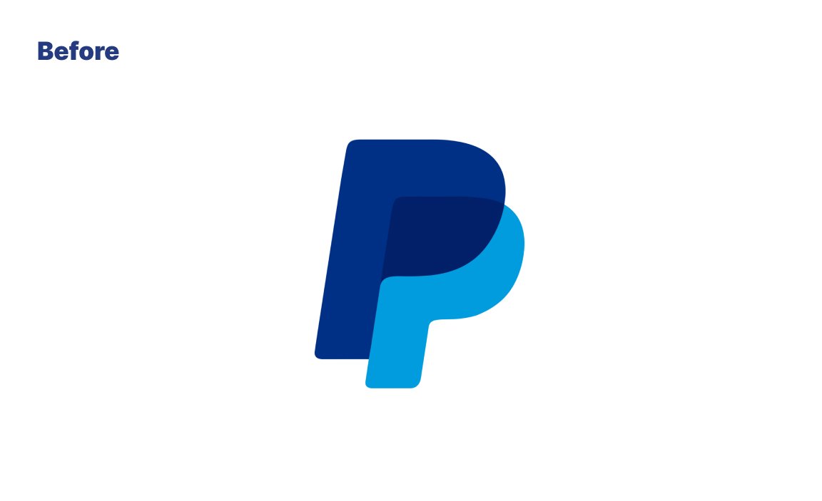
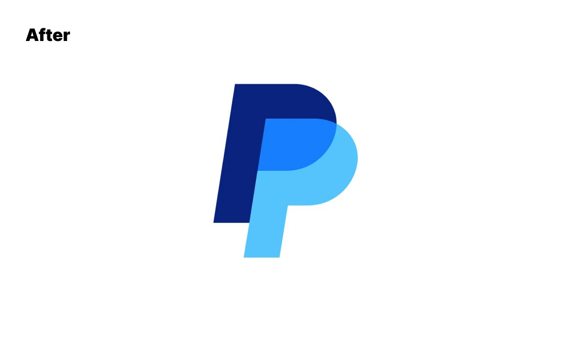
The updated emblem symbolizes PayPal’s evolution, with colors carefully calibrated for continuous contrast, enhancing visibility and creating depth. Bright blue and deep blue overlap to reveal Venmo blue — a nod to PayPal’s growing mobile app and its focus on mobile experiences (check our my How to build a brand episode on Venmo). The wordmark and monogram now exist independently, enabling greater flexibility and simplicity across different mediums.
The Pentagram team is also developing a secondary typeface, PayPal Pro Text, optimized for smaller sizes to ensure clarity and legibility. This is part of PayPal’s broader mission to make its services more accessible, emphasizing innovation and reliability for everyone, everywhere.
Design System
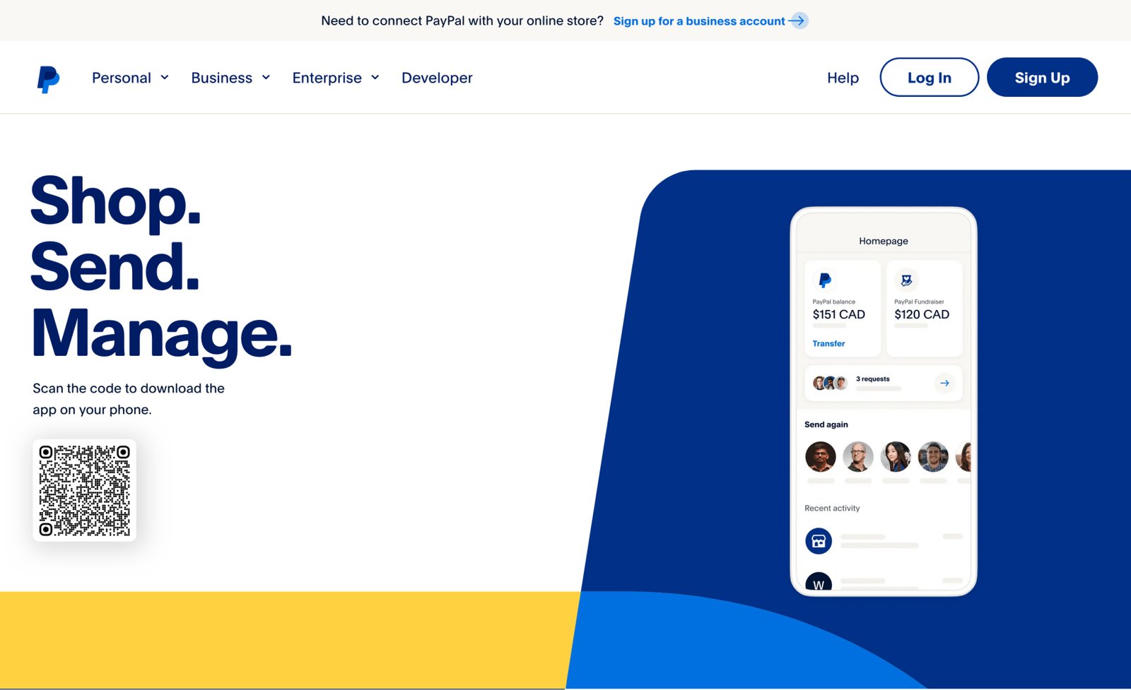
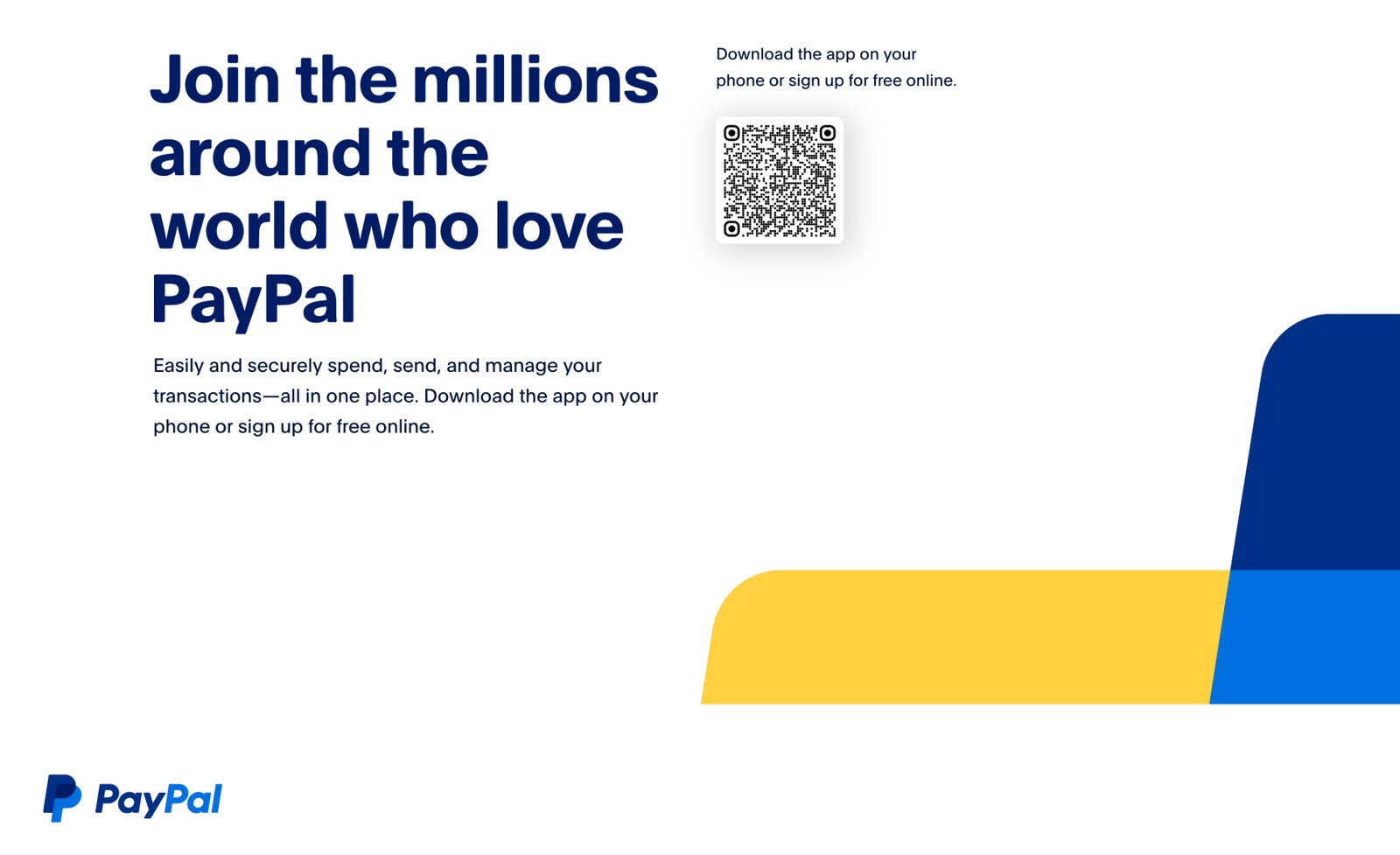
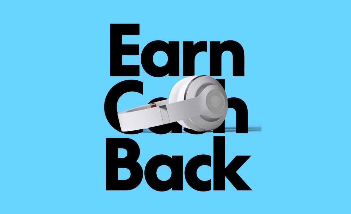
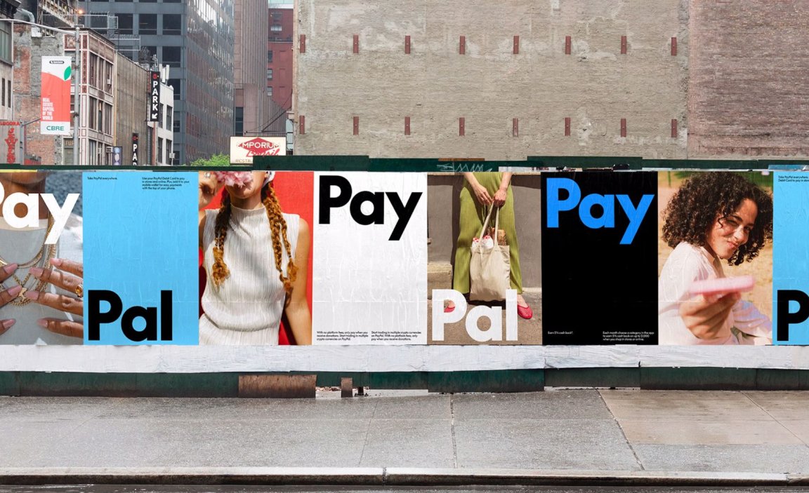
PayPal has also refreshed its entire design system to align with the dynamic and modern look of the new brand identity. The updated design system features a streamlined color palette that dials up the brand’s personality through color-saturated imagery, while emphasizing the timelessness of the PayPal logo with a neutral black and white base. Blues, synonymous with fintech, are used as accents to convey energy and modernity, and the previous yellow palette — often associated with other retail brands — has been eliminated for a more cohesive look.
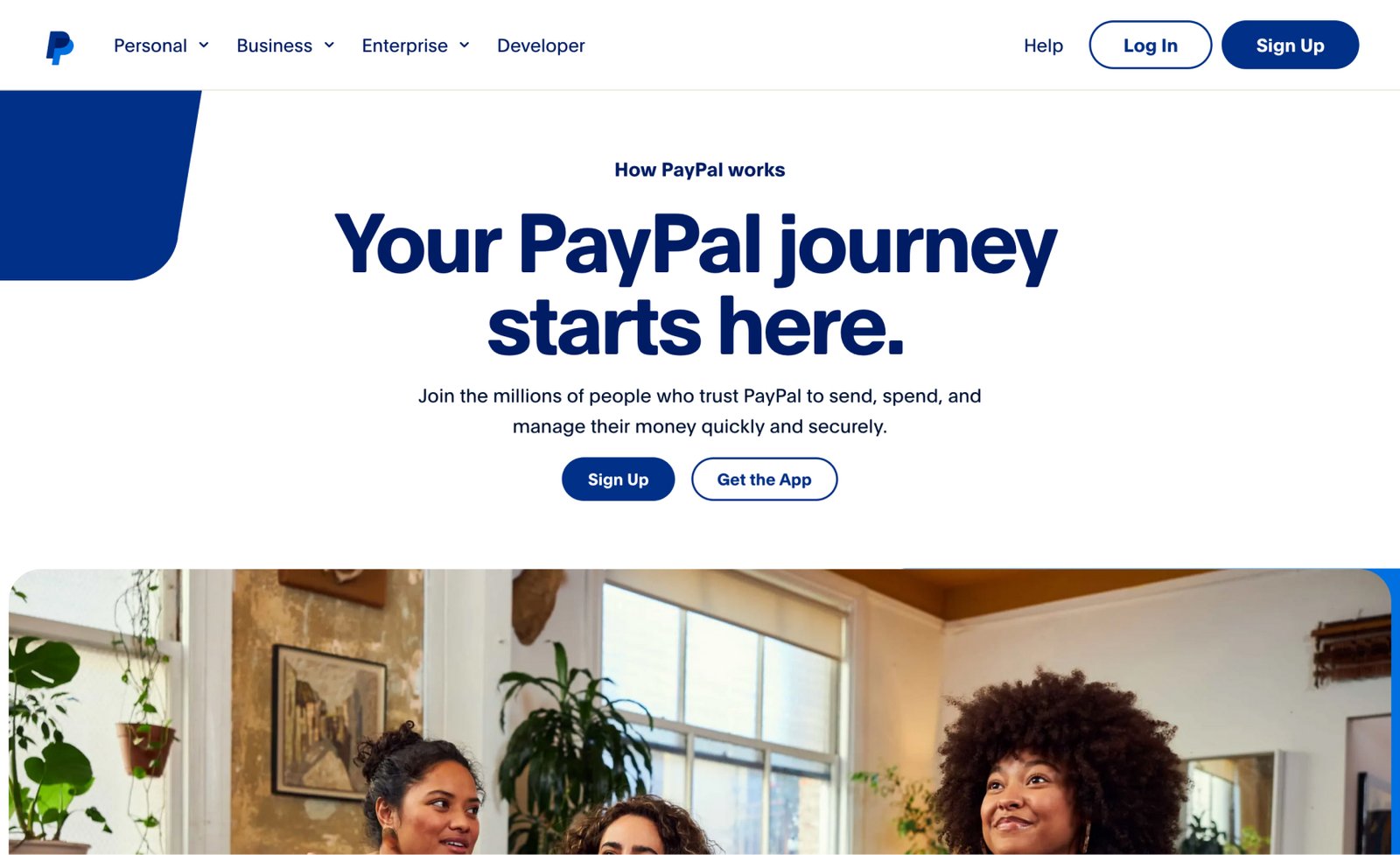
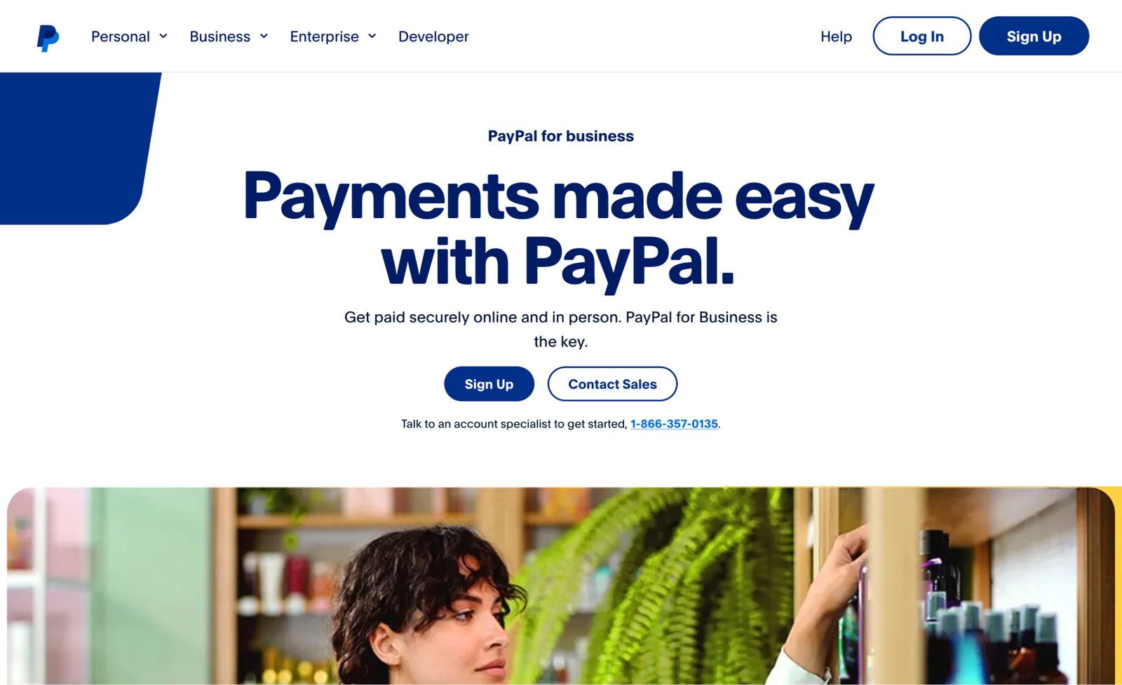
The updated design language extends to UI elements, where the outdated yellow payment buttons have been replaced with black, creating a more refined and modern appearance. The new photo direction emphasizes accessibility, showcasing real, spontaneous, and authentic moments that highlight PayPal’s mission to connect people globally through secure and seamless transactions.
Similar to Verizon’s refreshed design system, PayPal’s new visual identity is designed to reflect the evolving ways people live, work, and play. The cohesive design will be rolled out across PayPal’s marketing materials, digital properties — including its website and apps — and beyond, into every customer touchpoint. This not only supports consistency but also brings PayPal’s vision of simplicity, innovation, and trust to life in every aspect of the brand.


Motion Identity
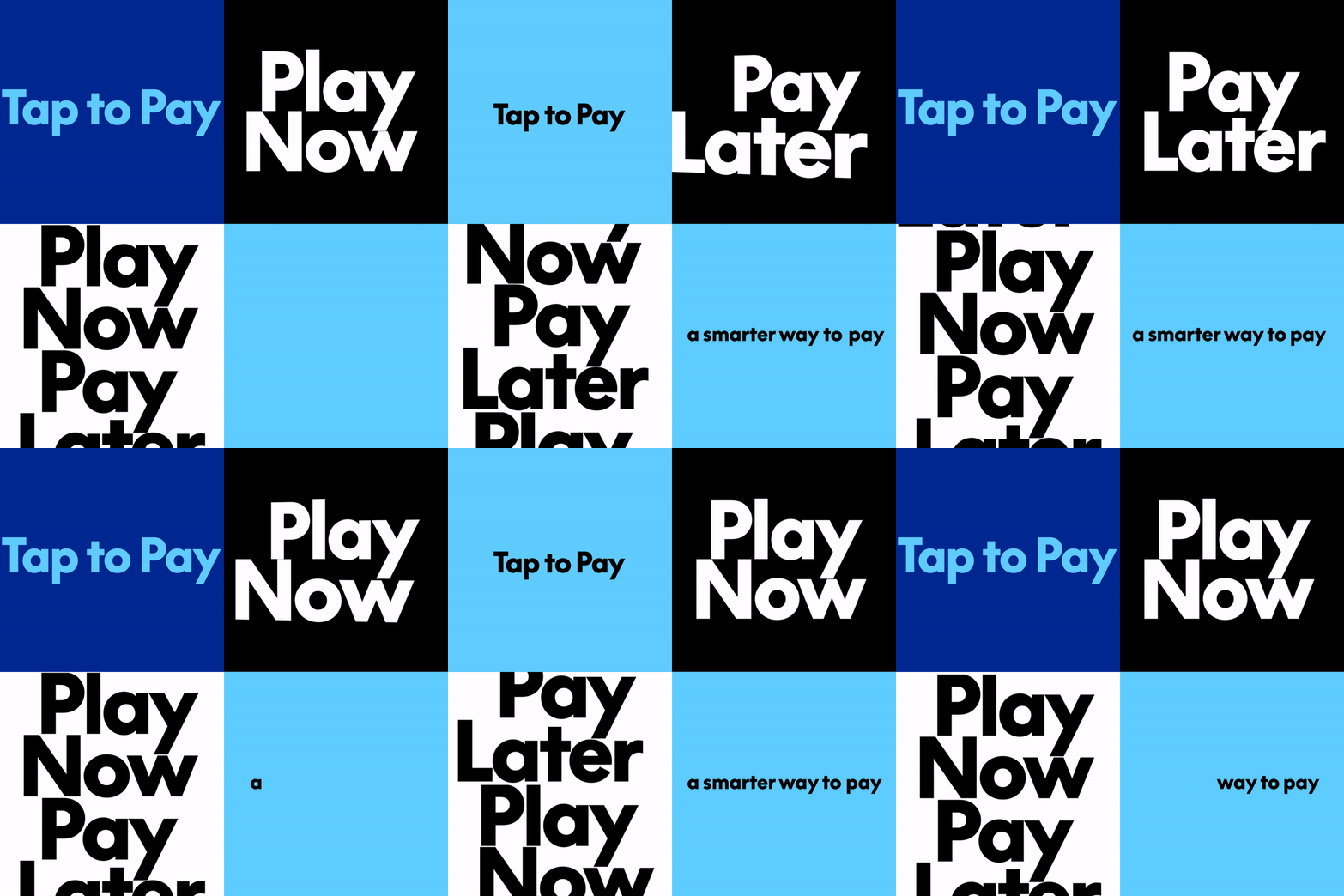
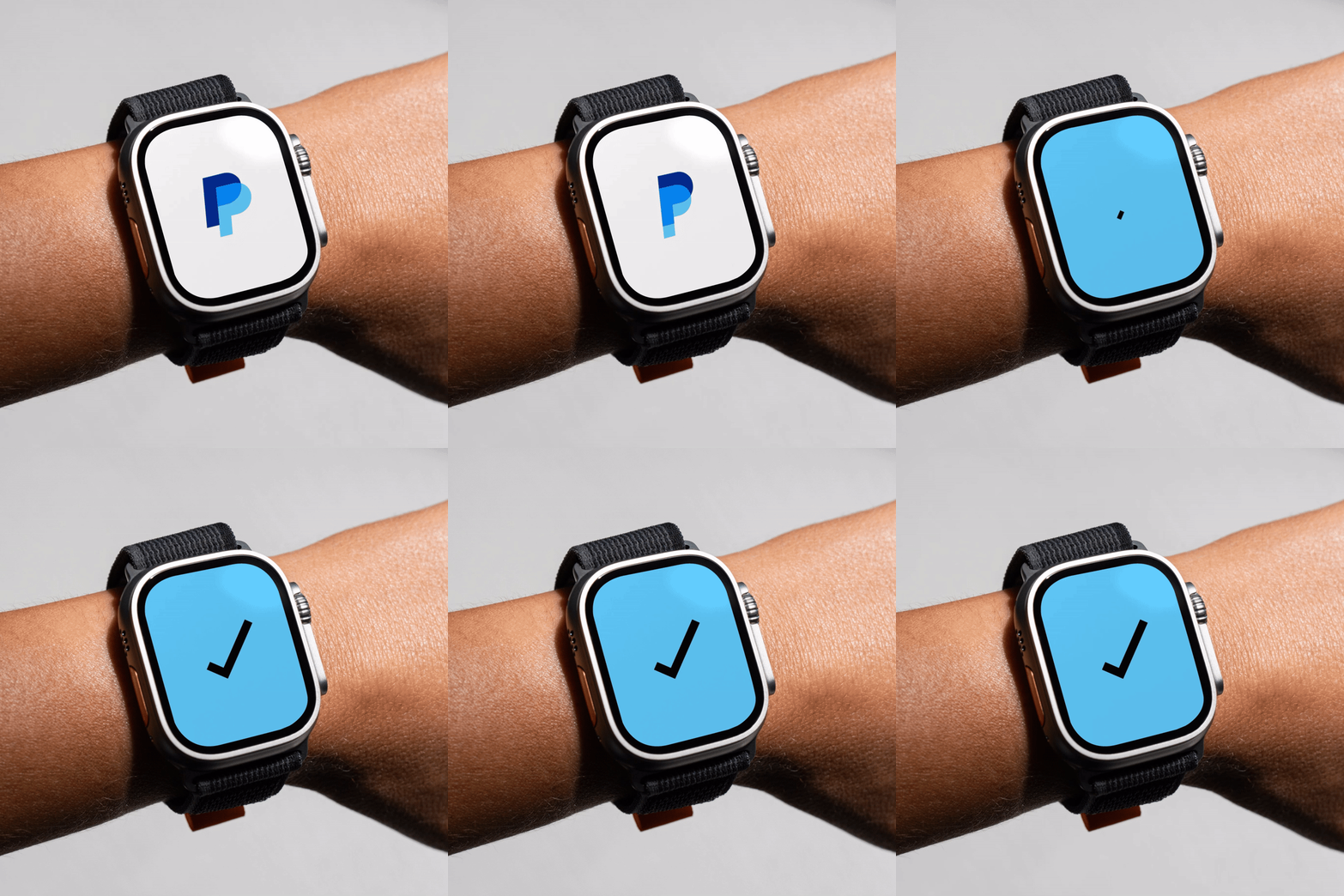
To cap off its new brand presence, PayPal has introduced a motion identity that brings its commitment to simplicity and ease of use to life visually. Emphasizing PayPal’s ease of use, the motion language of the identity draws on everyday transactional gestures and behaviors of making payments, both digital and physical. Brand animations activate the wordmark and typography with taps, clicks, flips, and swipes, bringing the movement of the product experience into the identity itself.
The new identity launches with the updated PayPal Debit Card, with more brand expressions to follow as part of an extended design system. Whether in motion, type, or still imagery, PayPal’s refreshed identity aims to create an experience that is truly accessible — everywhere, and for everyone.

Website
In addition to the new logo and motion branding, PayPal rolled out a revamped website (www.paypal.com) to enhance various aspects of its services. The new site not only looks better but also functions better, featuring an updated UI and enhanced UX to create a more cohesive and streamlined user journey.
